User experience (UX) design is an ever-evolving field, which has been acting as a “bridge” between users and digital products or websites ever since the dawn of the internet. Some would even argue that it’s been around for longer than that.
What makes UX so different from any other design field is the focus on researching user behaviors before creating or suggesting a design solution. Being able to create great user experience design in such a dynamic industry is no easy task but with enough experience, you are able to distinguish specific strategies, patterns, and trends that shape the field as a whole.
What makes an experienced designer even better at what they do is being able to constantly be aware of users’ changing behaviors and creating new design solutions to fit their needs. As with every other industry, there are new trends that emerge in the UX design community every year. And who better to ask about them than our very own website and product design team!
How user experience design is evolving
In the era of Web3, a lot of the well-known design principles we are used to having have started to evolve. Some of them have even completely disappeared and have been making space for newer and more unexpected solutions.
Topics that were perceived as complex or hard to understand without the required degree of knowledge in the near past are now simplified and adapted through design, in order to be recognized by a younger audience. A great example of this is the notion of cryptocurrencies, blockchain technology, and NFTs, which are rapidly expanding their corner of the internet and imposing their own design rules when it comes to user experience and online communication.
Without getting even further into detail, let’s check out the UX design trends our team has noticed since the beginning of this year and whether we think they’re here to stay or not.
Advanced cursor interactions
The cursor we are all used to seeing on our screens hasn't had much change done to its design since it was first demonstrated by Douglas Engelbart in 1968 as a means of navigating a computer's interface. That's why playing around with its shape, color, size, and functionality can be a great way to create web designs that stand out!
In some cases, your website cursor can have the functionality of a button, which can lead to the facilitation of more effective UX and fewer buttons to distract your users from the main call to action, for example.
Personalized experiences
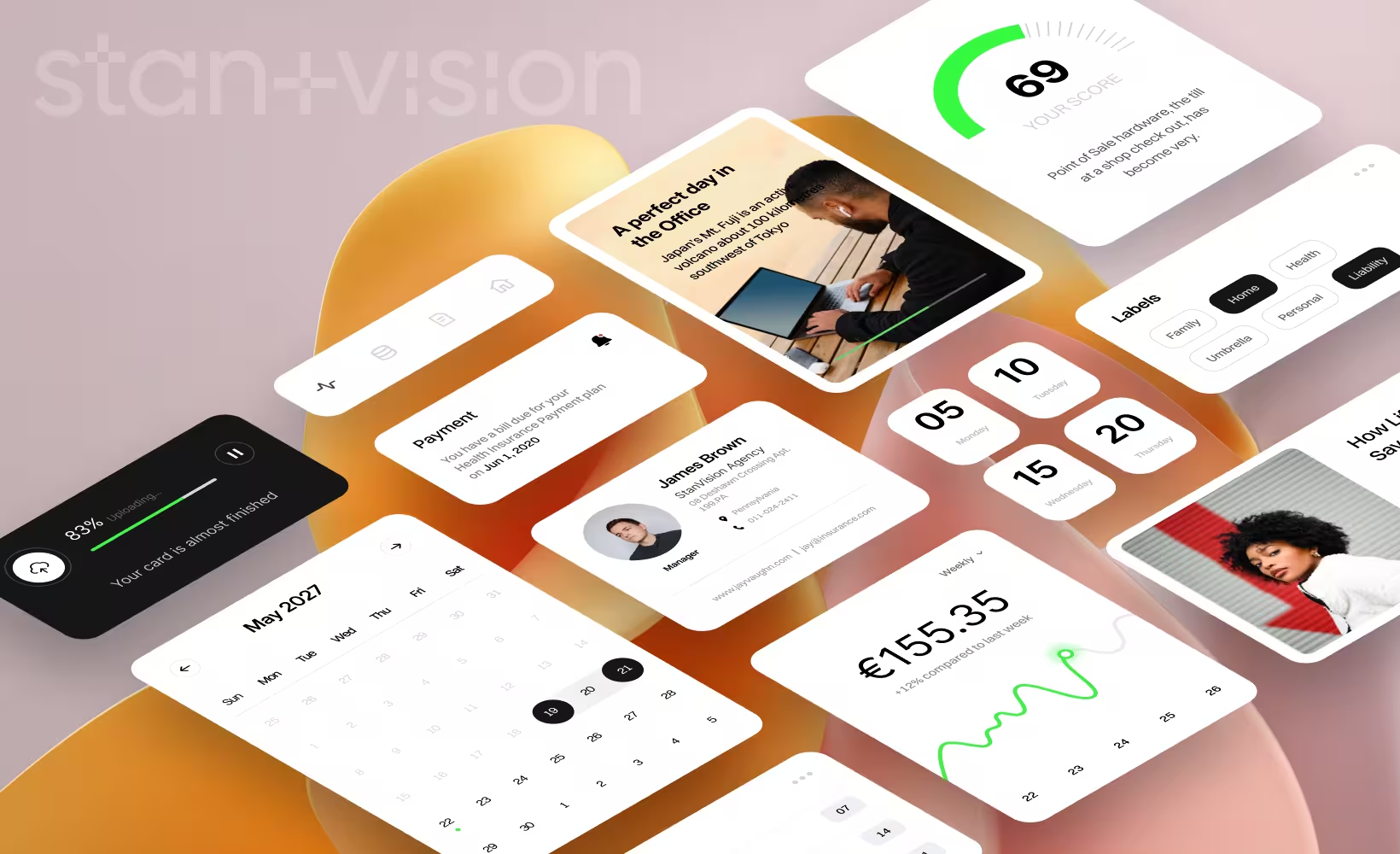
A really good example we like to give when talking about creating personalized user experiences is when you're browsing through an online shop and it recommends just the right thing for you. Designing and implementing such user triggers is key when you want to keep them "hooked" and interested in staying on your website for longer.
It is also beneficial for the users as it helps them make a more informed choice of what to buy or focus their attention on. After all, good UX design is not only about benefiting eCommerce businesses but also their users.
Scrollytelling
Scrollytelling is a way for UX designers to help businesses tell their company's narrative through a scrolling "journey". It is also probably our design team's favorite "trend" to implement when creating websites with a story.
From our experience, it's a great way to grab users' attention by combining scrolling animations with dynamic text, fonts, images, video, and illustrations.
Animated logos
As a design agency, we are often tasked with creating the overall brand presentation for our clients, and that oftentimes includes creating a new logo as well. Animated logos is something we started offering recently as a design service and it's a great way to make your company stand out and attract user attention.
Did we mention it can also benefit your SEO? Yes, having dynamic content on your website can help drive more traffic, so it's no surprise that we're seeing more and more companies that have animated logos.
Supersized typography
Sometimes bigger and bolder is the way to go when talking about memorable web pages and that's where supersized typography comes in. Every good designer knows that font selection is very important for user experience as it's a way to help the user navigate and focus on specific information.
Making a bold text statement on your website sometimes also means taking "risky" decisions such as leaving no white space. But bending the rules around design a bit is what keeps it exciting!
Brutalism
Brutalism in web and product design is a fairly new trend and it is characterized by making things seem raw, unfinished, and against well-established design principles. It is inspired by architectural brutalism where the focus is on big and unconventional shapes and the materials they are made out of.
Some ways in which you can spot a brutalist website is through the use of excessive amounts of hero text, photos that appear to float and are not anchored to a specific section, and colors that you wouldn't expect to be put together on the same page and more.
Dark mode
As users of smart devices, most of us have already experienced the look and feel of "dark mode". It's a way for our devices to save battery and improve performance but it can also benefit our eyesight by reducing glare.
From a design standpoint, dark mode is also a way to make a product, software, or website sleeker and sometimes even appear edgier. As a web design agency, we also like to use it because in some cases it can be better for readability as well.
Empty and error states illustration
Even though part of our job as a product design agency is to make sure that no errors get left behind when we finally get to launch our designs, sometimes it happens. And when it does, we make sure we are well prepared with error state screens and messages that align with the brand personality of our clients.
Creating them adds to the overall user experience by making the situation less annoying for the user and providing them with information on how to continue on with their journey or query.
Frictionless authentication
One of the very first touch points that a user has when opening their device or the app they want to use is the authentication process. In some cases that includes typing in a password but with the rise of new technology, more and more users prefer to use methods such as fingerprint verification or face recognition.
The key benefit of both of these authentication methods is that it helps you remember less passwords, which results in lower friction rates when logging in to an app or website.
Navigation placement
Last but definitely not least is the placement of the navigation bar on your website or app. Traditionally, website navigations are placed at the top as they are often times accessed through desktop, while apps have it the other way around.
Recently, more and more users have started accessing websites through their mobile devices and that's why, in order to improve the mobile UX, we have started thinking of ways to incorporate a different type of navigation design.