
What is the UX design process?
The UX design process is a structured, step-by-step framework for designing digital products. It includes research, problem framing, wireframing, prototyping, and usability testing. Its purpose is to reduce uncertainty before development and prevent expensive mistakes.
Sounds simple. In reality? Most teams skip at least one of these, and pay for it later.
Each stage exists for one reason: don't waste engineering time building the wrong thing.
Why the UX design process protects timelines and budgets
Bad UX is expensive.
Not because the UI looks "meh." But because confusing screens, muddled onboarding, and unvalidated assumptions turn into rework, support tickets, and churn.
We've seen SaaS teams spend months building features users barely touch. And we've seen the opposite: a focused discovery phase that took three weeks and prevented an entire roadmap from going in the wrong direction.
Here's the uncomfortable truth: most delays don't happen in development. They happen because the problem was never sharply defined.
According to IBM's cost-of-change curve (see IBM Systems Sciences Institute findings), issues found after release can cost exponentially more than those caught early. Exact multipliers vary by context, but the pattern holds across industries: early design investment compounds. This principle is also echoed by the Design Council's Double Diamond framework, which structures divergence before convergence to prevent premature solution decisions. The structure isn't academic. It's risk management.
Our own numbers point the same direction. When we relaunched Gridwise's site, conversions rose 24%. GoAudience cut bounce rate 18% in the first month after launch. Different projects, same mechanism: the process found what was costing users before code was written, and the fix showed up in a measured number.
That's what a structured UX design process does. It protects your budget. It protects your timeline. And most importantly, it protects you from building the wrong thing really well.
Below is the exact step-by-step UX design process we use at StanVision when working with SaaS, fintech, and AI products. Not theory. Practice.
The 5 core stages of the UX design process
The UX design process typically includes five essential stages:
- Research & discovery
- Define & problem framing
- Wireframing & information architecture
- Prototyping & interaction design
- Usability testing & validation
Each stage reduces uncertainty before development begins. Skip one, and risk multiplies.
These are the core UX design process steps, and together they form a practical, step-by-step UX design process that modern SaaS teams rely on to scale confidently.
We've run this process across 50+ clients with an average partnership past three years; emerchantpay has trusted us with product design for seven of them. What that tenure teaches you is simple: most product failures are not design failures. They're process failures.
Let's break it down.
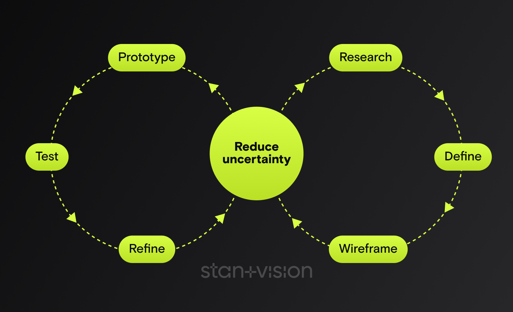
How the UX design process actually works
If we map the UX design process visually, it looks less like a straight line and more like a controlled loop:
Research → Define → Wireframe → Prototype → Test → Refine
Or in strategic terms:
Diverge → Converge → Structure → Simulate → Validate → Improve
This mirrors the Design Council's Double Diamond framework, where teams first expand the problem space (discover), then narrow it (define), then expand solution ideas (develop), and finally refine them (deliver).
The difference in modern SaaS teams?
The loop doesn't end after delivery.
It feeds back into continuous discovery, a concept strongly advocated by Teresa Torres in Continuous Discovery Habits. Instead of large redesign cycles every 18 months, high-performing product teams validate small assumptions weekly.

1. Research & discovery
Goal
Research & discovery is where we reduce risk before a single pixel is designed.
The goal isn't to "understand users" in some abstract way. It's to answer three brutally practical questions:
- Who is this really for?
- What job are they trying to get done?
- Where exactly are they getting stuck today?
If we can't answer those with confidence, everything after this step is guesswork.
In our practice, this stage routinely kills feature work that would have missed. Not because the ideas are bad, but because they're often solving the wrong problem.
Core methods
For B2B SaaS, we usually combine qualitative depth with behavioral signals:
- Stakeholder alignment workshops
- 5 to 8 discovery interviews with real users
- Jobs-to-be-done mapping
- Funnel and onboarding analysis
- Support ticket review
- Competitor teardown (what they say vs. what they actually do)
- Competitive UX audit & content inventory (identify structural gaps, duplicated flows, messaging inconsistencies)
Persona & behavioral intent synthesis. Beyond demographics, we synthesize motivations, anxieties, triggers, and decision context. We map behavioral intent, not just roles, so flows align with how users actually think and decide.
A pattern we keep running into with AI products: founders assume churn comes from missing features or integrations. Discovery interviews keep revealing something else, that users don't understand or don't trust the first output the product shows them. The fix in those cases isn't more features. It's the explanation layer. A handful of interviews is usually enough to surface it.
Common mistakes
Here's what we see going wrong constantly:
- Skipping user interviews because "we already know our audience"
- Confusing stakeholder opinions with user evidence
- Turning discovery into endless research with no decision criteria
- Interviewing only happy power users
And the big one: Starting wireframes before defining the problem.
Discovery doesn't need months. A focused 2 to 3 week sprint is often enough.
But skipping it? That's how teams burn quarters building features nobody asked for.

2. Define & problem framing
Goal
If research uncovers the raw truth, problem framing turns it into direction.
This is where most SaaS teams either sharpen the problem or lose months.
The goal is simple: define the real problem in a way the team can act on.
Not a vague ambition like "improve onboarding." Not a feature request like "add tooltips."
But something sharp:
New trial users fail to complete their first meaningful action within 10 minutes because nothing points them to the primary workflow.
That's actionable. In our experience, teams that skip proper problem framing pivot repeatedly mid-design. Not because designers are wrong, but because the target keeps moving.
Core methods
At StanVision, this stage usually includes:
- Insight synthesis workshop (cluster interview patterns)
- Sharp problem statements
- JTBD refinement
- User journey mapping
- Defining success metrics (activation %, time-to-value, drop-off points)
- Prioritization using impact vs. effort
The request that arrives as "we need a modern UI redesign" is, more often than not, a first-session overload problem wearing a visual costume. When framing surfaces that, the scope changes: restructuring the first three user interactions beats redesigning sixty screens, and it ships in a fraction of the time.
That's the power of defining the right problem.
Common mistakes
Here's where things break:
- Jumping from research insights straight into wireframes
- Framing problems as solutions
- Letting internal politics decide priorities
- Ignoring measurable success criteria
And the silent killer: Trying to solve everything at once.
A strong UX design process forces constraint. It says: this is the core problem. Fix this first. Because a sharp problem statement is speed.

3. Wireframing & information architecture
Goal
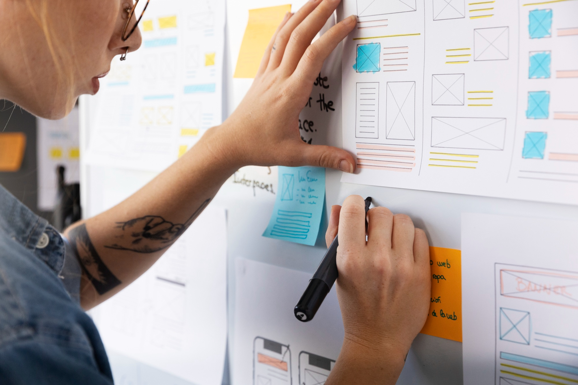
Wireframing is where strategy becomes structure.
Not color. Not branding. Structure.
The goal here is to design how information flows, how screens connect, and how users move from "I just signed up" to "I got value."
In complex SaaS products, the bulk of usability issues trace back to layout and hierarchy decisions, not visual design. We've seen beautifully designed interfaces fail because the structure fought how people naturally scan screens.
Wireframes answer questions like:
- What appears first?
- What's primary vs. secondary?
- What happens after this action?
- What can be removed entirely?
If discovery defines the problem, wireframing defines the path forward.
Core methods
At this stage, we prioritize structure over aesthetics:
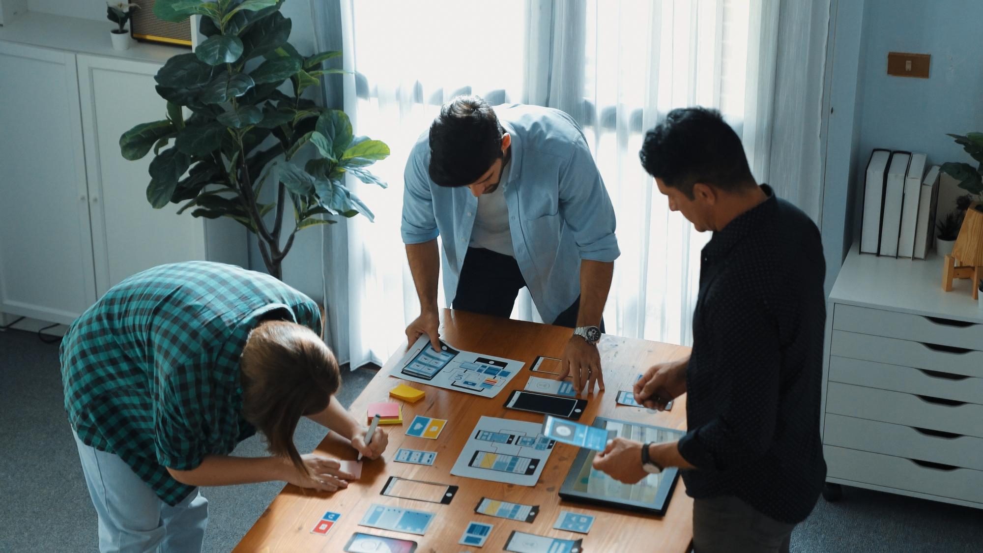
- Low-fidelity wireframes (fast iterations)
- Information architecture mapping
- User flow diagrams
- Content hierarchy prioritization
- Rapid internal validation with product & engineering
The dashboard conversation almost always starts with "we need more widgets" and ends, after wireframing, with fewer elements above the fold. Too many competing priorities is the usual diagnosis, and subtraction is the usual cure: fewer components to build, faster first actions, less user confusion.
Better UX often isn't adding. It's subtracting.
Common mistakes
Here's where wireframing goes wrong:
- Jumping into high-fidelity design too early
- Designing screens in isolation instead of flows
- Overloading dashboards "just in case"
- Treating wireframes as documentation instead of decision tools
And the classic SaaS mistake: Designing for edge cases before optimizing the main path. If most users follow one core workflow, that workflow should feel effortless. Everything else is secondary.
Wireframes are cheap to change. Code is not.
4. Prototyping & interaction design
Goal
If wireframes define structure, prototyping defines behavior. This is where we test how the product actually feels.
Not how it looks in a static screen. But how it responds. Guides. Reacts.
The goal is to simulate real interaction before development, while changes are still cheap.
In our experience, interactive prototypes catch usability gaps that wireframes simply can't reveal. Micro-confusions. Muddy transitions. Missing feedback states.
Small things. Expensive if missed.
Core methods
At StanVision, this stage typically includes:
- Clickable mid-to high-fidelity prototypes
- Key flow simulations (onboarding, first value moment, core workflow)
- Microcopy refinement
- Interaction state design (error, empty, success states)
- Lightweight internal walkthroughs before user testing
A flow that looks perfectly logical on paper often turns out, once prototyped, to ask users for two or three strategic decisions before showing them any value. That hesitation costs momentum. The fix is rarely radical: resequence so something valuable appears in the first minute, then ask for the decisions.
Nothing dramatic. Just better sequencing.
Common mistakes
Here's what usually breaks at this stage:
- Treating prototypes as visual polish instead of behavioral validation
- Ignoring microcopy and system feedback
- Over-animating instead of simplifying
- Handing off static designs to developers without flow context
And one bold opinion: If users have to think about what just happened after clicking a button, the interaction failed. Great interaction design removes doubt. It answers questions before they're asked. And it's far cheaper to fix in Figma than in sprint 7.

5. Usability testing & validation
Goal
This is where opinions die. Usability testing exists for one reason: to see whether real users can complete critical tasks without guidance.
Not whether they like the design. Whether they can use it.
The goal is simple and ruthless: Can someone sign up, understand the product, and reach value without us explaining anything? If the answer is no, we fix it before development, or before scaling traffic.
Nielsen Norman Group's research (Why You Only Need to Test with 5 Users) demonstrates that testing with around five users reveals the majority of usability problems when tasks are well defined. You don't need 50 participants. You need the right scenarios.
Core methods
At StanVision, we typically run:
- Moderated usability sessions (remote or live)
- Task-based scenarios (not opinion questions)
- Think-aloud protocol
- Success rate + time-to-complete tracking
- Severity tagging of usability issues
- Accessibility validation (WCAG checks, keyboard navigation review, contrast verification)
- Rapid iteration cycles after findings
The most common testing outcome isn't a redesign. It's a small group of participants hesitating at the same step, for the same reason, that nobody inside the team could see anymore. A changed headline or a sharper piece of microcopy fixes it. No redesign. Just validation.
Common mistakes
Here's what breaks usability testing:
- Asking "Do you like this?" instead of assigning tasks
- Testing with internal employees instead of real users
- Ignoring uncomfortable findings
- Treating testing as a one-time checkbox
And the dangerous assumption: "We'll fix it after launch." Post-launch fixes cost more, and they interrupt roadmaps and quietly damage trust. Testing before development protects velocity. Testing after release protects survival. The best SaaS teams do both.
A strong UX design process doesn't end with a prototype. It continues into structured collaboration with engineering.
At this stage, we document:
- Core user flows and edge cases
- Interaction logic and state changes
- Error, empty, and loading behaviors
- Microcopy intent and hierarchy rationale
A documented handoff reduces ambiguity, prevents rework, and protects sprint velocity. When engineering understands the "why" behind decisions, implementation quality increases, and mid-sprint redesigns decrease.

How modern SaaS teams adapt the UX design process
Here's something important. The UX design process is structured, but it's not linear. Modern teams don't run discovery once and call it a day. They adapt the process depending on stage, funding, and product maturity.
Early-stage startups
Pre-seed to Series A teams usually compress timelines.
Instead of a 6-week research phase, they might run:
- 5 founder-led interviews in one week
- A 5-day design sprint to validate the core idea
- Rapid prototype testing before writing production code
We've worked with early AI startups where validating positioning and onboarding mattered more than perfect UI systems. The recurring lesson: a short, hard discovery sprint keeps an MVP focused on one core workflow instead of the feature set everyone assumed was mandatory. Teams ship faster that way, and they walk into fundraising with cleaner traction stories.
Speed doesn't mean skipping steps. It means tightening them.
Growth-stage SaaS teams
At Series B and beyond, the risks change.
Now it's about:
- Reducing churn
- Optimizing activation
- Simplifying complex dashboards
- Scaling design systems
Here, continuous discovery becomes critical. Instead of large upfront research blocks, teams run ongoing user interviews every sprint or month. Small insights compound. Recurring friction points get caught while they're still cheap, instead of surfacing as support ticket spikes two quarters later.
That's the difference between reactive UX and proactive UX.
What not to compress
If timelines are tight, here's what we advise clients:
You can compress:
- Documentation
- Visual polish
- Non-critical edge cases
You should not skip:
- Talking to real users
- Sharp problem framing
- Validating core flows before development
Skipping those three is where budgets explode. A mature UX design process isn't about perfection. It's about making smarter bets.

UX frameworks compared
Founders often ask us: "Which framework do you use?" The honest answer? All of them. Depending on context.
Frameworks aren't religion. They're tools. Use the wrong one at the wrong time and you slow yourself down.
We don't follow them blindly. We apply them where they reduce risk fastest.
Below is how they work in real SaaS environments, not in workshop slides.
Double diamond
UK Design Council's Double Diamond
Best for: Complex problem spaces, enterprise SaaS, strategic repositioning.
The Double Diamond framework formalized by the UK Design Council structures work into four stages: Discover, Define, Develop, Deliver. Its real power isn't the names. It's the discipline of diverging before converging.
What we like:
- Forces deep exploration before committing to solutions
- Aligns stakeholders around a shared problem definition
- Reduces expensive mid-project pivots
Where it fails:
- Too heavy for early MVP validation
- Can drift into research paralysis without time constraints
We typically apply Double Diamond thinking when a product direction feels murky or internal alignment is fractured.
Design sprint
Google Ventures' Design Sprint
Best for: Early validation, new feature bets, MVP concepts.
The Google Ventures Design Sprint compresses strategy, ideation, prototyping, and usability testing into five focused days.
What we like:
- Fast cross-functional alignment
- Immediate user feedback before writing production code
- Strong executive alignment
Where it fails:
- Not ideal for systemic redesigns
- Requires strong facilitation and tight scope
We've run 5-day sprints that eliminated months of speculative development, but only when the business question was sharply defined.
Lean UX
Best for: Product teams shipping weekly or bi-weekly.
Jeff Gothelf's Lean UX aligns design tightly with agile development. Instead of heavy documentation, teams form hypotheses, build small experiments, measure results, and iterate.
What we like:
- Hypothesis-driven decisions
- Minimal documentation overhead
- Strong alignment with product analytics
Where it fails:
- Without real user research, it becomes "ship and hope"
Lean UX works beautifully when discovery is ongoing and metrics are sharply defined.
Continuous discovery
Teresa Torres' Continuous Discovery
Best for: Growth-stage SaaS optimizing activation, retention, and expansion.
Teresa Torres popularized Continuous Discovery as a habit, not a phase. Teams conduct regular user interviews, map opportunity spaces, and connect insights directly to roadmap decisions.
What we like:
- Reduces big-bang redesign risk
- Surfaces friction early
- Builds a culture of evidence-based decisions
Where it fails:
- If insights aren't translated into product bets
In teams we've advised, introducing regular user interviews shifts roadmap debates from opinion battles to evidence-backed prioritization within a quarter or two.
Quick comparison table
| Framework | Double diamond | Design sprint | Lean UX | Continuous discovery |
|---|---|---|---|---|
| Speed | Medium to slow | Fast | Continuous | Ongoing |
| Depth | High | Medium | Medium | High over time |
| Best use case | Strategic redesign | Validate new ideas quickly | Agile product teams | Growth optimization |
The key insight? Here's the contrarian truth: Most SaaS UX failures don't happen in wireframes. They happen because the Define stage was rushed or skipped entirely.
Bad layout is fixable. Bad problem framing is expensive. The UX design process isn't one framework. It's the discipline of reducing uncertainty before scaling decisions.

Common failure patterns when teams skip steps
We've seen this movie before.
A team skips discovery because "we're short on time."
They jump into high-fidelity design because "we need something to show investors."
They launch without testing because "we'll fix it in v2."
Three months later?
- Activation is flat
- Support tickets spike
- The roadmap is full of reactive fixes
Here are the most common breakdown patterns we see.
1. The feature avalanche
No sharp problem framing. So every stakeholder adds "just one more thing."
Result: bloated dashboards, complex onboarding, confused users.
Our audits keep finding onboarding flows where half the steps exist because nobody ever challenged them. Cutting a flow down to the steps that actually deliver value is one of the most reliable wins in SaaS onboarding.
More features rarely fix muddled structure. They amplify it.
2. The aesthetic illusion
High-fidelity UI. Beautiful branding. Weak information architecture.
It looks impressive in Dribbble shots. But real users hesitate.
This usually happens when teams skip low-fidelity wireframing and jump straight into polished visuals.
Design isn't decoration. It's decision-making.
3. The stakeholder echo chamber
No real user interviews. Only internal opinions.
Roadmap decisions become political instead of evidence-based.
We've walked into projects where three departments had three completely different definitions of the "main user." No wonder nothing converted.
A single alignment workshop could have prevented months of misdirection.
4. The post-launch panic
No usability testing. Launch. Immediate friction.
Now every fix competes with new features. Engineering velocity slows. Trust erodes.
Teams that postpone usability testing to "save two weeks" tend to spend the following sprints fixing avoidable issues discovered by paying customers.
That's not speed. That's expensive optimism.
A structured UX design process isn't bureaucracy. It's operational insurance.
Working with SaaS, fintech, and AI companies, we've noticed a pattern: teams that treat UX like decoration redesign more often. Teams that treat it like infrastructure redesign less, and grow faster. That's not philosophy. That's pattern recognition.
And in SaaS, uncertainty is the most expensive line item on your roadmap.

B2B SaaS vs consumer products: how the UX design process differs
While the core stages of the UX design process remain the same, execution differs between B2B SaaS and consumer apps.
B2B SaaS
- Higher cognitive load
- Multi-role decision environments
- Complex dashboards
- Longer onboarding paths
In B2B, structure and hierarchy matter more than visual novelty.
Consumer products
- Faster emotional engagement
- Shorter attention spans
- Simpler workflows
- Higher visual influence on perception
In consumer apps, friction tolerance is lower.
Same UX design process. Different emphasis.
Example timelines: what this looks like in practice
Here's how the UX design process might scale:
2-week sprint (feature validation)
- 3 to 5 user interviews
- Problem framing workshop
- Rapid wireframes
- Clickable prototype
- 5 usability tests
8 to 12 week redesign
- Deep discovery research
- Stakeholder alignment
- Full information architecture overhaul
- Iterative prototyping
- Multiple usability testing rounds
The structure stays consistent. Depth changes.
UX design process deliverables checklist
At each stage, you should expect tangible outputs:
Research & discovery
- Interview summaries
- Insight clusters
- Problem hypotheses
Define & framing
- Sharp problem statements
- Success metrics
- Prioritization matrix
Wireframing
- Core user flows
- Low-fidelity wireframes
- Information architecture map
Prototyping
- Interactive prototype
- Microcopy draft
- Edge-case states
Usability testing
- Test script
- Session recordings
- Severity-ranked findings
If these artifacts don't exist, your UX design process is probably incomplete.

Signs your UX design process is breaking down
If two or more of these apply, it's time to reassess:
- Activation hasn't improved in 6+ months
- Your team redesigns the same flows repeatedly
- Stakeholders argue about priorities every sprint
- Support tickets frequently mention confusion
- Roadmaps change mid-cycle due to "unexpected" feedback
These aren't feature problems. They're process signals.

When to run this internally, and when to bring in a UX partner
Internal teams are powerful when:
- Discovery is ongoing
- Metrics are sharply defined
- User interviews happen regularly
- There's cross-functional alignment
An external UX partner becomes valuable when:
- Growth has plateaued
- Teams disagree on the core problem
- Major redesign risk feels high
- Activation or churn isn't improving
That second list is where we usually enter. It's how we ended up running product design for emerchantpay across seven years and counting, and partnering with Tolstoy for seven. Companies like Rillet raised $100M while scaling from 30 to 100 employees with us as their design partner; Primer raised $175M over a three-year partnership. Long tenures and funded clients aren't the goal of the process, but they're decent evidence it works.
Sometimes you don't need more design. You need sharper direction.

Summary
If you remember nothing else from this guide, remember this:
- The UX design process exists to reduce uncertainty before development
- The five stages (research, define, wireframe, prototype, test) work as a loop, not a line
- Skipping problem framing creates the most expensive mistakes
- Usability testing with around five users can prevent months of rework
- Mature SaaS teams treat UX as infrastructure, not decoration
- Post-launch iteration and continuous discovery keep the loop alive after release
If this sounds obvious, good. It should. The problem is most teams don't consistently follow it.
A strong UX design process doesn't slow you down. It protects you from building the wrong thing quickly.
If you skip the Define stage, expect pain later. We've seen it too many times.

Final thoughts
The UX design process isn't about making things pretty. It's about making fewer expensive mistakes. It's about making better decisions earlier.
Every stage (research, framing, wireframing, prototyping, usability testing) exists for one reason: don't burn engineering time on assumptions.
In our practice at StanVision, the biggest gains rarely come from massive redesigns. They come from focus:
- Removing steps users don't need
- Reordering flows to surface value faster
- Reframing the real problem before touching the UI
If your activation is flat, churn feels unpredictable, or your roadmap keeps shifting, it's rarely a "feature" issue.
If the failure patterns section felt uncomfortably familiar, that's not coincidence. It's usually a signal your UX design process needs tightening. It's usually a process problem. And process is fixable.
If you'd like an outside perspective, we offer focused UX audits and discovery workshops for SaaS, fintech, and AI teams. In 60 to 90 minutes, we can usually identify the friction points that have been hiding in plain sight.