Key takeaways
- Purple works in UI design because it sits between blue's trust and red's energy, which lets one color signal both stability and creativity. That's why it clusters in tech, streaming, and AI products.
- Google made purple the default: Material Design 3's baseline primary color is purple (#6750A4), so every unthemed Material app ships purple out of the box.
- Shade choice is the whole decision. Lavender and lilac read calm and approachable; ultraviolet and plum read premium and ambitious. Same hue family, opposite messages.
- Purple's biggest risk in 2026 is sameness. When every AI startup ships a purple gradient, purple stops differentiating. It still works; it just no longer works by itself.
Purple used to be the rarest color in the room: the dye cost a fortune, so it belonged to royalty and nobody else. Now it's the closest thing tech has to a default. Twitch, streaming overlays, AI startups, half the SaaS landing pages you'll see this week. The color of exclusivity became the color of the feed.
That shift is worth understanding if you design interfaces, because purple's popularity isn't arbitrary. It does specific psychological work on screens, Google baked it into the most widely used design system in the world, and it carries just enough risk of cliché that using it well takes actual judgment. Here's the working knowledge: what purple signals, the exact Material Design palette, where it fits in web and UI design, and how to use it without disappearing into the crowd.
What purple means in design
Purple is a blend of opposites: blue's calm and trust on one side, red's energy and passion on the other. That in-between position is its entire psychological toolkit. It can read as tranquil or ambitious, traditional or futuristic, depending on the shade and what you pair it with. Few colors cover that much signaling range, which is exactly why brands that want to look both credible and creative keep reaching for it.
The cultural layer stacks on top. Purple's royal history still whispers luxury and prestige, which is why premium brands use deep plums and violets. Its newer associations run toward creativity, individuality, and inclusivity, which is why streaming platforms, gaming communities, and AI products wear it. And its link to mindfulness and introspection makes it a fit for wellness brands. One color, three usable stories; the shade you pick decides which story gets told.
Color theory explains the mechanics underneath: how hue, saturation, and value shift a color's message, and why purple pairs the way it does. We cover that foundation properly in our guide to color theory in product design; this article stays on purple itself.
Purple in Material Design: the actual palette
If you've wondered why so many Android apps ship purple, the answer is that purple is Google's factory setting. Material Design 3's baseline color scheme is built on purple: the default primary color is #6750A4, paired with a light lavender primary container (#EADDFF) and deep violet container text (#21005D). Any Material app that never customizes its theme launches wearing exactly these values.
Material handles purple through tonal palettes: each key color generates thirteen tones from 0 (black) to 100 (white), and the system assigns roles from that ramp, so the same purple family produces your buttons, containers, and surfaces at guaranteed contrast steps. Two practical takeaways from that system, whether or not you use Material: build your purple as a ramp of tones rather than a single hex value, and let the contrast math, not taste alone, decide which tone carries text. It's a discipline worth stealing for any UI design work, Material or not.
The flip side of a default: shipping unthemed baseline purple now signals "we didn't design this." If you use purple in a Material context, move away from #6750A4 far enough to own your shade.
Purple in web and UI design
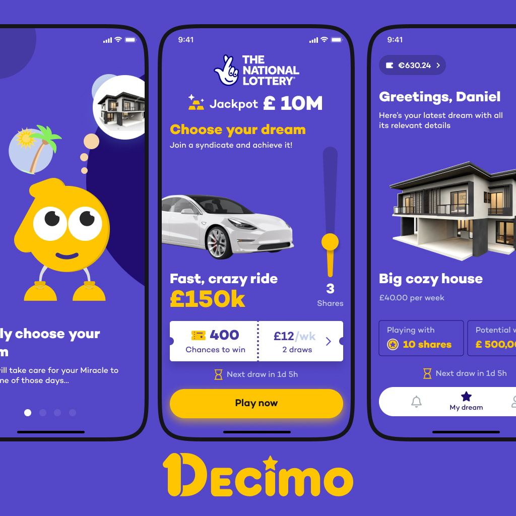
On the web, purple earns its keep in two distinct registers. Soft purples, lavender, lilac, mauve, read calm and approachable, which is why beauty, wellness, and consumer brands pair them with warm neutrals. Bold purples, ultraviolet, plum, electric violet, read premium and ambitious, which is why fintech, developer tools, and AI products run them on dark backgrounds.
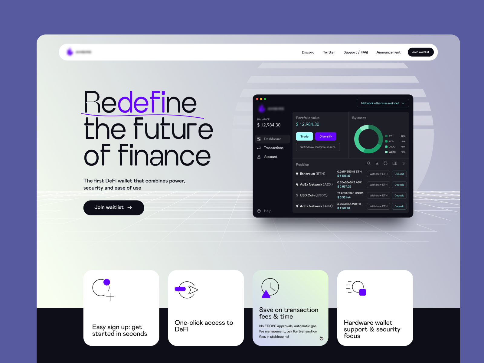
The pattern in our own work: purple performs best as a committed accent rather than a flood. A purple CTA on a neutral page pops; a fully purple page asks the user to live inside the brand, which very few products earn. Dark UI with purple accents has become the house style of gaming and dev tools for a reason: the contrast is comfortable over long sessions and the color survives dark mode better than most.
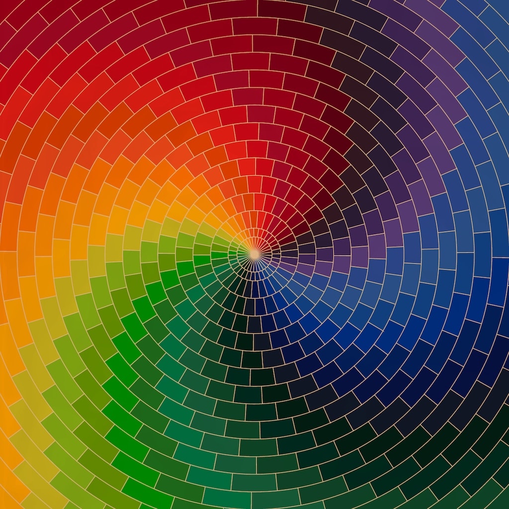
Gradients are where purple currently does its loudest work. Purple-to-blue and purple-to-pink transitions carry half the AI product landscape right now, which cuts both ways: they photograph beautifully and they've become the fastest way to look like everyone else. If you ship a purple gradient in 2026, the differentiation has to come from somewhere else in the design.
Brands that made purple theirs
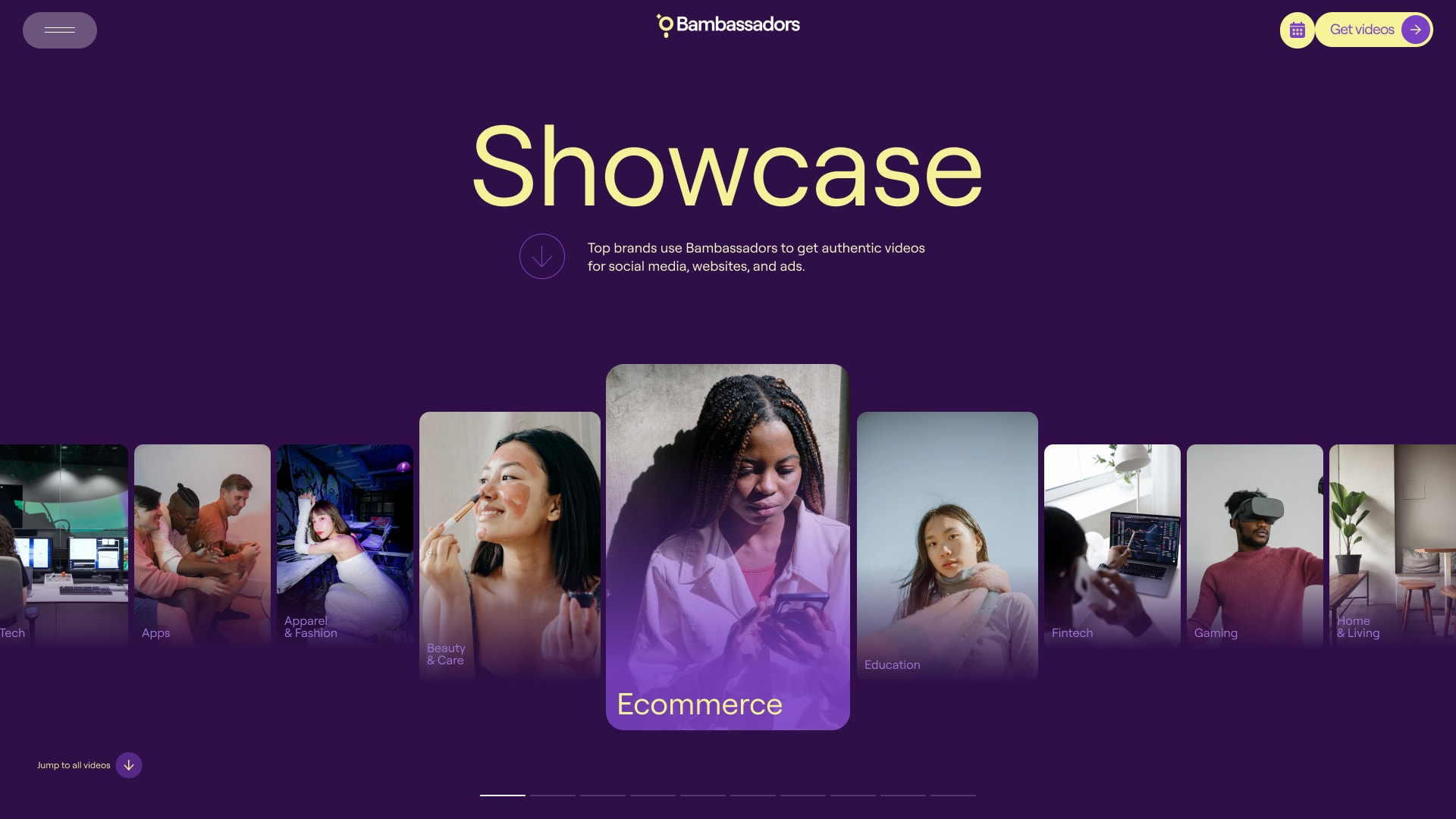
Twitch is the strongest case study: a bold, saturated purple carried consistently through logo, UI, and community, distinctive enough that the color alone now identifies the platform. Discord built its identity on "blurple," a blue-leaning purple that keeps the creative signal while staying comfortable in a dark, long-session interface. Spotify leans on purple-heavy gradients in its Wrapped campaigns, borrowing the color's personal, expressive register for its most shareable moment of the year.
The common thread: each one committed to a specific, ownable shade and used it everywhere. None of them use "purple" generically; they use their purple.
How to use purple well: five working rules
- Pick the shade for the message, not the trend. Lavender for calm and approachability, plum and ultraviolet for luxury and ambition. If you can't say what your purple should signal, you're not ready to pick a hex value.
- Pair it deliberately. Metallics push purple toward premium. Yellows and greens push it playful and energetic. Soft neutrals push it modern and minimal. The pairing does as much signaling as the purple itself.
- Match it to the industry's baseline. In wellness, beauty, and creator tools, purple blends in pleasantly. In finance or healthcare, it still stands out, which makes it a stronger differentiation play there, if the brand can carry it.
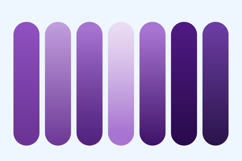
- Test the contrast before you commit. Mid-tone purples are contrast traps: too dark for black text, too light for white. Check every text-carrying purple against WCAG ratios (4.5:1 for body text), and prefer the tonal-ramp approach from the Material section, where each tone has a known job.
- Use gradients and texture to own it. A signature gradient, a specific pairing, a texture treatment: the goal is a purple someone could pick out of a lineup. If your purple could be swapped with a competitor's without anyone noticing, it isn't doing brand work yet.
Purple's decade isn't ending; it's maturing. The color still covers more signaling range than almost anything else on the wheel, Material keeps it installed as tech's default, and users keep associating it with creativity and quality. What's changed is the bar: purple alone no longer differentiates, so the brands winning with it are the ones specific enough about their shade, their pairings, and their reasons. That's less a color trend than a design standard, and it's the difference between wearing purple and owning it.
Frequently asked questions
What does purple mean in design?
Purple blends blue's calm and trust with red's energy and passion, so it can signal creativity, ambition, luxury, or mindfulness depending on the shade. Historically tied to royalty and rarity, it now also reads as the color of tech, gaming, and AI products. Lighter purples lean calm and approachable; deeper purples lean premium and powerful.
What is the Material Design purple palette?
Material Design 3's baseline scheme is built on purple: primary #6750A4, primary container #EADDFF, and on-primary-container #21005D in the light theme. Material generates a tonal palette of thirteen tones from each key color and assigns UI roles from that ramp, which is why unthemed Material apps ship purple by default.
What colors go with purple in UI design?
Soft neutrals (beige, warm gray, off-white) for a modern, minimal read; metallic golds and silvers for a premium read; yellows and greens for energetic contrast; deep near-black backgrounds for the dark-UI register common in gaming and developer tools. The pairing sets the tone as much as the purple itself.
Is purple still a design trend in 2026?
Yes, but it has moved from trend to default, especially in tech and AI, where purple gradients are now the category's uniform. It still performs psychologically; it just no longer differentiates on its own. The current bar is owning a specific shade and treatment rather than using purple generically.

Stan Kirilov
Stan has led design for over 20 years, first as a hands-on designer, now as Experience Director at StanVision. He works with SaaS and fintech companies, from first-time founders to global brands, on products and websites built to convert, not just to look good.
He serves on the Awwwards jury and still reviews every project that ships. His standard is simple: if a design doesn't perform, it isn't finished.
.svg)