

Almost every redesign inquiry we get starts the same way: the team knows their site feels wrong, but nobody can name what's actually wrong with it. That's the trap of bad website design. The people who built the site stopped seeing it months ago, while every new visitor sees the problems in seconds and quietly leaves.
So here's the list I wish more teams ran before calling anyone: the ten mistakes that make a website design bad, how to spot each one on your own site, and how to fix it. None of this is cosmetic. When we relaunched Gridwise's site, conversions rose 24%. Design mistakes cost real pipeline, which means fixing them pays in the same currency.
What makes a website design bad?
Bad website design comes down to one thing: making visitors work harder than they need to. Confusing menus, clashing colors, slow pages, walls of text, buttons that don't look like buttons. Each mistake adds friction, and friction compounds: research on first impressions shows users judge a site in a fraction of a second, long before they've read a word. A visitor who hits two or three of these problems doesn't send feedback. They hit the back button, and most never return.
The encouraging part: bad design is a list of specific, fixable mistakes, not a talent problem. Here are the ten we see most.
The 10 most common website design mistakes
1. Confusing navigation
When menus are overloaded, labels are vague, or key pages are buried, visitors give up before they find what they came for. The fix is a planned navigation hierarchy: your five to seven most important destinations in the main menu, descriptive labels instead of category names only your team understands, and a regular sweep for broken links.
2. Clashing colors and bad contrast
Two mistakes that usually travel together. Clashing palettes make a site feel amateur; a cohesive scheme of three to four colors aligned with your brand fixes that, and color theory is worth thirty minutes of anyone's time.
Bad contrast is the quieter killer. Light gray text on white backgrounds, colored text on colored sections, thin fonts over photos: text that fails contrast standards is genuinely unreadable for visitors with low vision and tiring for everyone else. Check any suspect combination against WCAG contrast ratios (4.5:1 for body text) with a free contrast checker. This is the most under-diagnosed mistake on this list, because on the designer's bright monitor, everything looks fine.

3. No mobile responsiveness
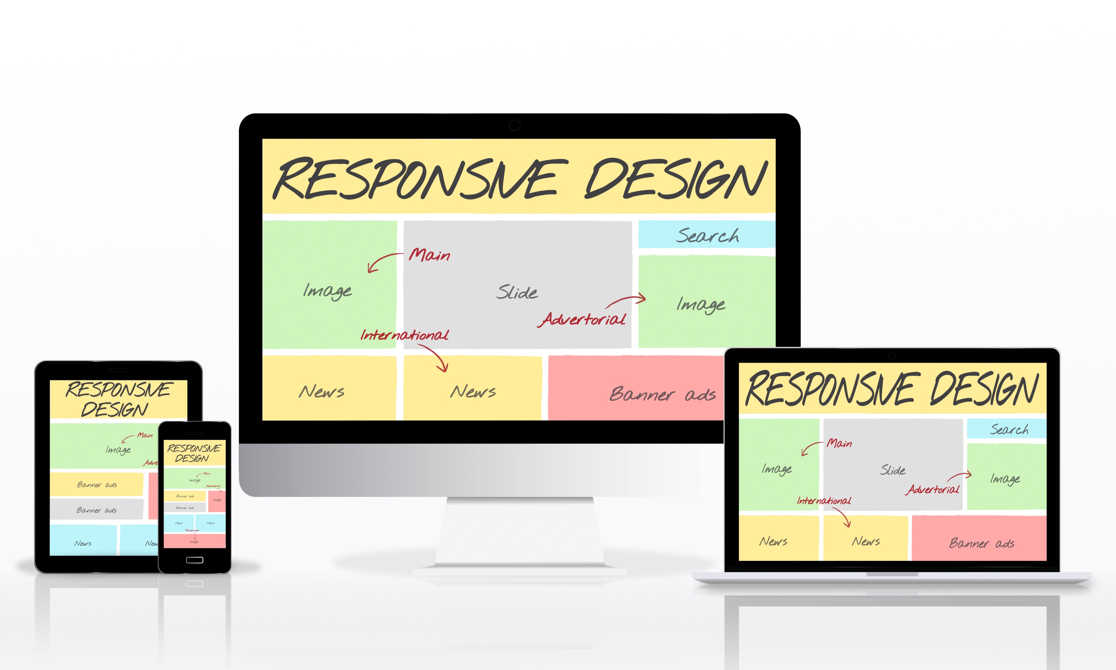
More than half of web traffic is mobile. A site that doesn't adapt to small screens: oversized images, buttons too small to tap, text that requires zooming, is turning away half its audience at the door. Test your key pages on a real phone, not just a resized browser window, and treat every mobile failure as a priority bug.
4. Slow load times
Visitors expect a page in about two seconds; every second past that sheds a measurable share of them. The usual culprits are uncompressed images, bloated scripts, and cheap hosting. Compress and convert images to modern formats, cut scripts you don't use, and serve assets from a CDN. Speed is also a ranking factor, so this fix pays twice.

5. Cluttered pages
When every section shouts, nothing gets heard. Pages crammed with text blocks, competing widgets, and stacked promotions feel chaotic, and visitors respond by scanning nothing. White space isn't wasted space; it's what makes the important content findable. Organize each page around one job, and move everything that doesn't serve that job somewhere else or nowhere.

6. Unreadable typography
Decorative fonts, tiny sizes, and long lines of centered text all tax the reader. Stick to one or two legible typefaces, keep body text at a comfortable size, and let headings do the size-and-weight talking. If using more than two fonts feels necessary, the problem is usually hierarchy, not font supply.
7. Weak or invisible CTAs
A call to action that blends into the layout, or says something inert like "Submit," wastes the traffic every other fix earns. Every important page needs one obvious next step: a button that looks like a button, contrast that makes it pop, and a label that says what happens ("Start your free trial," "Get the audit"). One primary CTA per screen beats four competing ones.
8. Outdated and broken elements
Dead links, 2018-era visuals, copyright footers two years behind, stock photos everyone has seen: each one tells visitors nobody is maintaining this site, and they extend that judgment to the business. Schedule a quarterly sweep for broken links and dated content. If the whole design feels like a time capsule, that's a redesign conversation, and the most common website redesign mistake is rebuilding the visuals while keeping every structural problem on this list.
9. Walls of text with no hierarchy
Visitors scan before they read. A page without headings, short paragraphs, and visual anchors gets skipped wholesale, no matter how good the writing is. Break content into scannable sections, front-load the point of each one, and bold only what a scanner must not miss.
10. Ignoring accessibility
Missing alt text, keyboard traps, forms without labels, and the contrast failures from mistake two: accessibility problems exclude real visitors and increasingly carry legal risk. The basics are not expensive: semantic headings, labeled forms, alt text on meaningful images, and contrast checks. Accessible sites are also easier for everyone else to use, which is the pattern with every fix on this list.
These ten cover the site itself. The product behind it has its own failure list, and we keep that one in 10 common UX mistakes that frustrate users.
How to find these mistakes on your own site
The hard part isn't fixing bad design; it's seeing it on a site you look at every day.
Run usability tests
Tools like Hotjar or Crazy Egg show you real behavior through heatmaps and session recordings: where visitors click, where they stall, where they leave. Ten recordings will teach you more about your navigation than ten meetings.
Read your bounce and engagement data
High bounce rates on key landing pages usually mean design friction: visitors arrived interested and left anyway. Check engagement metrics in Google Analytics page by page, and treat any page that underperforms its traffic quality as a design suspect.
Check responsiveness properly
Run key pages through a mobile-friendly test, then do what the tools can't: open the site on an actual mid-range phone over mobile data. Watch for images that overflow, buttons that miss, and text that needs a pinch to read.
Ask your visitors
Surveys, feedback widgets, and five-minute user interviews surface the problems analytics can't explain. Ask what was hard to find, what felt confusing, and what they'd change. Recurring answers are your priority list.

Why fixing bad design pays
First impressions and credibility. Visitors judge a site before reading anything on it, and that judgment transfers directly to the business. A dated, cluttered site makes a good company look like a risky one; a professional site does the opposite before a single sentence is read. Consistent branding across colors, type, and layout is what makes the impression hold.
Conversions. Good design is a guided path: obvious navigation, one next step per page, nothing competing for the click. Remove the friction and more of the same traffic converts, which is exactly what the Gridwise number measured.
Search rankings. Google factors speed, mobile experience, and engagement into rankings. The fixes on this list, faster pages, responsive layouts, lower bounce, are also SEO work wearing a design hat.
Retention. A site that's pleasant to use gets explored, revisited, and shared. One that isn't gets one visit. The difference compounds over every marketing dollar you spend sending people there.

This is the work we do as a B2B web design agency: find the mistakes, fix them in order of what they cost, and measure the result. If your site has a few items from this list, start with contrast, speed, and CTAs; they're the cheapest fixes with the fastest payback.