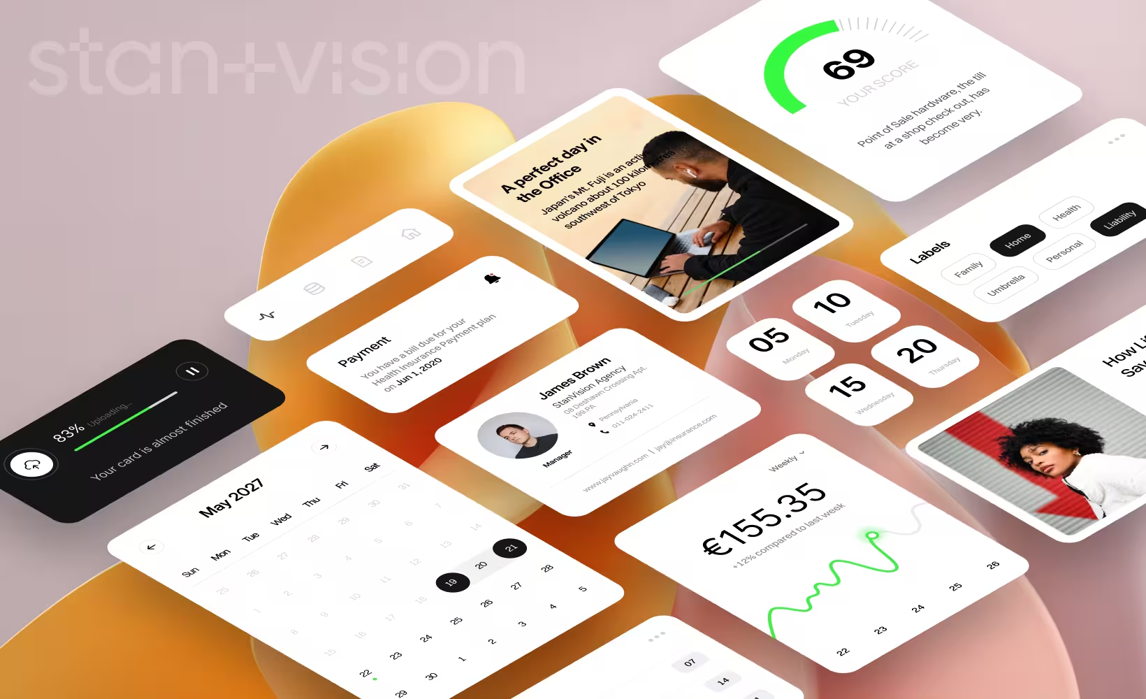

It might be easy to say that bad websites are the ones which simply look bad. As always, the devil is in the details and a proper examination of a website's functionalities is the way to go when trying to find solutions.
We've gathered a list of common web design mistakes and examples that lead to subpar user experience. From slow loading times to cluttered designs, we'll explore crucial issues in web development.
1. Poor web design
Poor web design can have a significant impact on a website's success.
- It often leads to a high bounce rate as visitors quickly become frustrated with confusing layouts, slow load times, or cluttered interfaces, causing them to leave the site prematurely.
- Low conversion rates are a common consequence, as users are less likely to trust or engage with a poorly designed website, resulting in missed opportunities for businesses.
- Bad web design leaves a negative impression on potential customers, damaging a brand's credibility and trustworthiness.
Ultimately, subpar web design extends far beyond aesthetics, and can negatively affect user experience. This often damages the website's ability to attract, retain, and convert visitors effectively. For businesses running YouTube ads, poor web design can undermine campaign results, as potential customers arriving from ads may abandon the site due to an unprofessional or difficult user experience.
2. Lack of white space
White space, often referred to as "negative space", is a fundamental element in web design that significantly contributes to an enhanced user experience. It serves as breathing room between content, allowing for better readability.
A website page with an excessively cluttered layout, where text, images, and buttons are tightly packed together, leaves no room for the eye to rest. This lack of white space might overwhelm users and make it challenging to keep visual interest or navigate the site efficiently.

Text walls
The biggest mistake in web design is adding too much text to the page. Site visitors might seek info but text walls are often scary. Internet users prefer texts that are quick to read at a glance.
Cluttered layout
For instance, consider a website showcasing multiple products in a cramped grid, with minimal spacing between each item. Users trying to browse through this cluttered layout may find it difficult to distinguish one product from another or click on the intended item, leading to frustration and likely site abandonment.
How to improve?
Web designers should prioritize content hierarchy, ensuring that essential elements are more prominent and separated from the less important ones. Secondly, designers can use appropriate margins and padding to create breathing space around content which easily engages users. Finally, maintaining a clean and minimalist design approach can help prevent clutter and promote a more comfortable and enjoyable browsing experience.
3. Non-responsive design
Responsive design is a vital aspect of modern web development, as it ensures a seamless and consistent user experience across different devices. With the usage increase of smartphones and tablets, mobile-friendly web design has become of greatest importance. Failing to optimize a website for mobile devices can frustrate users. Non-responsive websites often feature small text sizes that strain the eyes and hidden navigation menus that make it challenging for users to explore the site effectively.
A non-responsive website where content and images are poorly scaled on a mobile device, forcing users to pinch, zoom, and scroll excessively just to access information. This not only challenges usability but can also put off potential visitors.

How to improve?
First and foremost, designers need to use fluid grids and flexible layouts that adapt to different screen sizes. Media queries can be employed to apply specific styles and layouts for various devices, ensuring content remains accessible and visually appealing.
Additionally, optimizing images and minimizing the use of heavy elements can enhance load times on mobile connections. By prioritizing these responsive design principles, web developers can create websites that adapt gracefully to the diversity of devices in today's digital landscape, delivering a superior user experience.
4. Inconsistent colours or visual elements
Inconsistent color schemes or visual elements on a website can lead to confusion and frustration for users, undermining the overall user experience. When colors or visual elements vary significantly across different pages or sections of a site, it can give the impression of disjointedness and lack of attention to detail, potentially deterring users. For instance, consider a website where each page uses a different set of colors for headings and buttons, making it challenging for users to establish a visual hierarchy or navigate seamlessly.

How to improve?
To enhance the visual design elements of a website, designers should adhere to a consistent and coherent color scheme and visual style throughout the entire site. This includes using a defined palette of colors, consistent typography, and standardized visual elements such as buttons and icons. Establishing design guidelines and style guides can be invaluable in ensuring that all team members adhere to these standards. Regular reviews of the website can help identify and rectify any inconsistencies, ensuring a polished and user-friendly visual design that promotes a cohesive and enjoyable user experience.
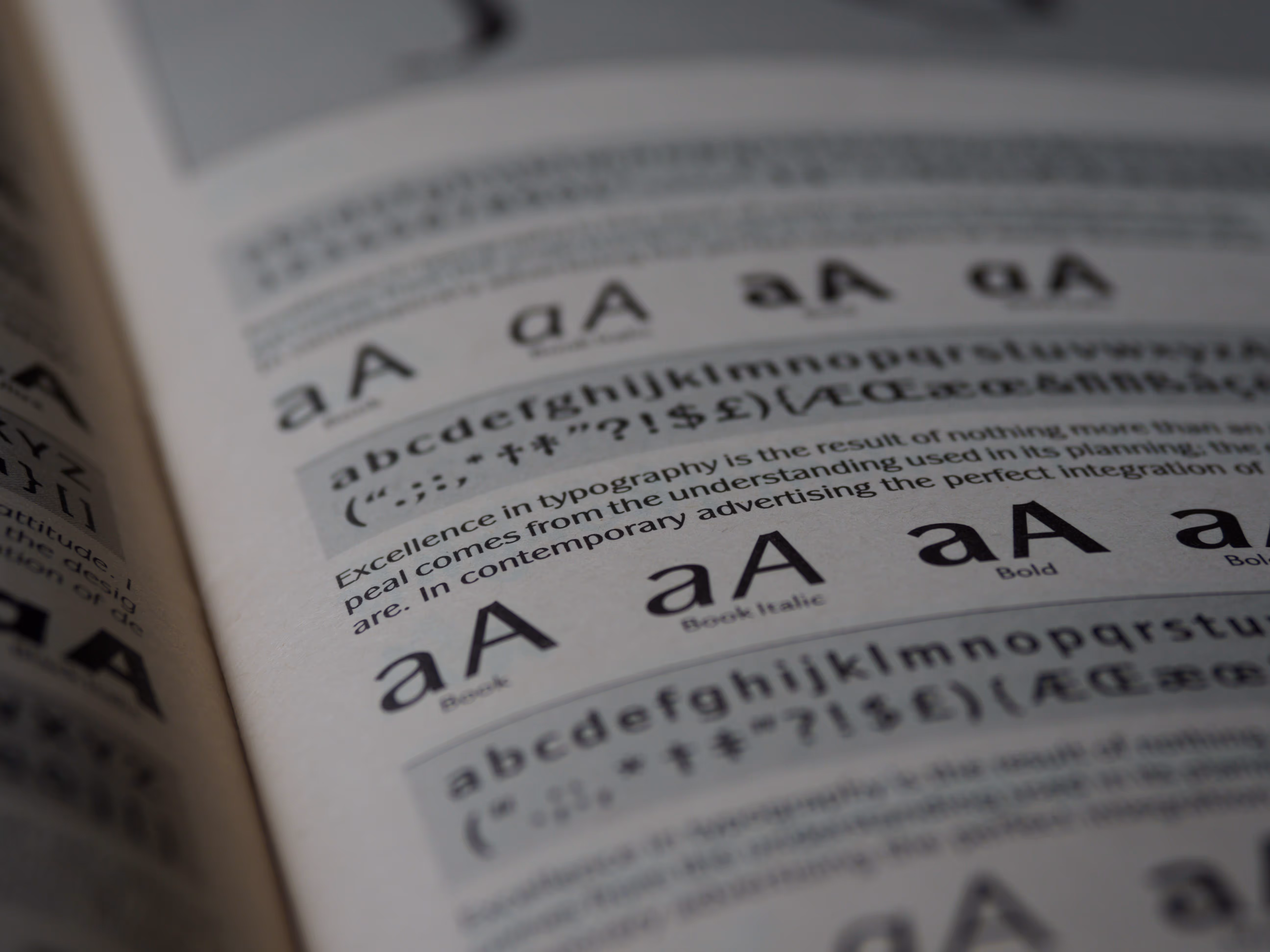
5. Poor typography choices
Appropriate typography is a cornerstone of effective web design, with far-reaching implications for both readability and aesthetics. The choice of fonts plays a pivotal role in determining how easily users can consume content and how structured the user flow is.
Poor typography choices can undermine the user experience, making text difficult to read due to factors like overly decorative fonts, improper line spacing, tiny text sizes or too many different fonts.
For example, imagine a website that employs a cursive font for body text or uses minuscule fonts for paragraphs – such decisions not only affect legibility but also detract from the overall visual appeal.
How to improve?
To improve typography on a website, designers should prioritize readability and consistency. Selecting fonts that are easy to read on screens and providing line spacing can enhance content accessibility. Maintaining a consistent typographic hierarchy throughout the site ensures that headings, subheadings, and body text are visually distinguishable and coherent to guide users' attention.
Additionally, designers can use font pairings that complement each other, creating a balanced and aesthetically pleasing typographic landscape. By addressing poor typography choices and sticking to best practices, web designers can significantly elevate overall customer satisfaction.
6. Poor navigation
Poor navigation is among the most common mistakes in web design, often resulting in user frustration and increased bounce rates. When navigation is poor, users encounter difficulties in locating information, products, or services, leading to a bad website usability.
Issues like disorganized menus, unclear links, and excessive clicks make it challenging for visitors to efficiently access the content they seek. A web page where the main menu lacks clear categories, forcing users to click through multiple pages to find specific information speaks of bad website design. This not only wastes the users' time but also increases the chances of them leaving the site out of frustration.

How to improve?
To improve navigation creating clear, intuitive, and user-friendly navigation menus must be a priority. This involves organizing content logically, using descriptive labels for menu items, and ensuring that links are easy to identify. Implementing a breadcrumb trail, search functionality, and a well-structured sitemap can enhance navigation options.
Regular usability testing and user feedback are crucial for identifying and addressing navigation issues, ultimately leading to a more satisfying and efficient user experience on the website.
7. Slow loading speed
Slow loading speed is a frequent issue that can poorly impact user interactions with a website. Common causes of slow-loading websites are the use of large images or media files, excessive plugins or scripts, and flawed server resources.
Studies have shown that even a one-second delay in page loading can result in a 7% reduction in conversions and a 16% decrease in user satisfaction. Additionally, slow-loading websites tend to have higher bounce rates, as impatient users are more likely to leave the site before it fully loads. This can lead to missed opportunities for engagement and revenue.

How to improve?
To check and improve website loading speed, users can employ various tools and strategies. A free tool like Google's PageSpeed Insights or GTmetrix can provide detailed reports on a website's performance, highlighting areas that need improvement. To enhance loading speed, you can consider optimizing images and media, minimizing the use of plugins, and enabling browser caching. Switching to a faster web hosting provider can also make a significant difference.
By regularly monitoring and addressing loading speed issues, website owners can ensure a smoother and more enjoyable experience for their visitors, ultimately benefiting their site's performance and user satisfaction.
8. Low-quality images
Low-quality images can significantly lower a website's visual effect and credibility. They not only fail to engage users but can also convey an impression of unprofessionalism and lack of attention to detail. Using high-resolution, visually attractive images that align with the website's content is critical in creating an immersive and positive user experience.
When it comes to product images, professionalism is key. High-quality product images that showcase details and provide a clear, close-up view can enhance the audience's trust and interest in what you offer.
Bad websites often display pictures and graphics that are unrelated to their content and don't strategically include high-quality visual content. Lack of effective use decreases visual impact and blocks effective communication of the message. Low-resolution images also spoil site aesthetics and reduce its reputation as a professional site. The pictures often lack the sharpest, most detailed details, which leads to poor user experience.
How to improve?
To fix low-quality image issues, it's essential to avoid excessive use of generic stock images that lack authenticity and relevance. Conducting thorough testing to ensure optimal legibility and performance across various devices is also crucial, as the quality and size of images can significantly impact loading times and user satisfaction.
By investing in high-quality imagery and being mindful of their usage, website owners can bolster their site's aesthetics and credibility, ultimately fostering a stronger connection with their audience.
9. Unclear CTA buttons
Clear and compelling Call-to-Action (CTA) buttons are vital elements of any website, serving as the driving force behind user interaction and conversions. They provide a direct path for visitors to take the desired actions, such as making a purchase, signing up, or downloading content. However, common mistakes with CTAs can sabotage their effectiveness.
Some websites fail to use them altogether, missing out on opportunities for user engagement. Others make the mistake of creating unenticing CTAs, which do not prompt users to take action. Additionally, not indicating the clickability of CTA buttons can lead to confusion.
For instance, imagine a website with CTA buttons that blend seamlessly into the background or use generic, uninspiring text like "Submit" or "Click Here." Such issues can result in missed conversions and frustrated users.

How to improve?
To improve CTA buttons, designers should prioritize clarity and visual appeal. CTAs should be prominently displayed, contrasting with the background color and using persuasive, action-oriented text like "Get Started" or "Buy Now." They should also be designed to look clickable, with button-like styling, hover effects, or distinct colors.
Regular A/B testing can help refine CTA button designs to maximize their impact on user engagement and conversion rates, ultimately enhancing the website's effectiveness in achieving its goals.
10. Poor user experience
User experience (UX) is at the core of effective web design, as it directly influences how visitors interact with and perceive a website. An exceptional user experience requires intuitive navigation, clear calls to action, and smooth user flows. Poor UX, on the other hand, can have harmful consequences, causing frustration, higher bounce rates, and decreased user engagement.
A website with convoluted menus, sluggish loading times, or confusing layouts makes users more likely to abandon such a site, leading to missed opportunities for conversions or engagement. Additionally, poor UX can affect a brand's reputation and discourage potential users from returning or recommending the website to others.
The readability of text is crucial when designing a user-friendly interface. Some websites have text readability issues and are unclickable. When a user struggles to navigate a website or cannot use a button, it can create frustration and negatively impact interaction. For that reason, businesses must perform rigorous tests to ensure readable and consistent text across different mobile devices and screens
How to improve?
In the digital age, where user attention spans are limited, prioritizing an optimal user experience is essential for the success and credibility of any website.
To enhance user experience, website owners can start by conducting thorough user research to understand their audience's needs and preferences. Implementing clear and intuitive navigation structures, optimizing website performance for faster loading times, and providing helpful feedback mechanisms are critical steps.
Regular user testing and feedback collection can help identify pain points and areas for improvement. For more in-depth guidance on UX mapping methods, you can explore our key UX design methods to execute your strategy effectively.
By actively investing in user experience design, website owners can create a more engaging, user-friendly, and ultimately successful online presence.
11. Complex registration process
A complex registration process is a clear indicator of a poorly designed website. It refers to the intricate and often cumbersome steps users are required to go through when signing up for an account or accessing certain features. Such processes typically involve an excessive number of form fields, mandatory requirements, and multiple confirmation steps, making it challenging and time-consuming for users to complete their registration.
A bad website design example would be one with a registration process that demands extensive personal information, email verification, phone verification, and captchas—all in one go. This complexity can put off potential users.

How to improve?
To enhance the registration process, websites should prioritize simplicity and user-friendliness. This involves minimizing the number of mandatory fields, only requesting essential information, and providing clear instructions along the way. Offering social media or single sign-on options can streamline the process significantly, reducing friction for users.
Regular usability testing and feedback collection can help identify and rectify any pain points in the registration flow, ultimately resulting in a more efficient and user-friendly experience that encourages users to complete the process and engage with the website.
12. Ignoring SEO
Ignoring Search Engine Optimization (SEO) is a critical oversight in web design and digital marketing. SEO, including White label link building, is the practice of optimizing a website's content, structure, and other elements to rank higher in search engine results pages (SERPs). When website owners neglect SEO, they miss out on a significant opportunity to enhance their online visibility and reach.
Without effective SEO strategies, a website is less likely to appear in search results, making it harder for potential users or customers to find. This lack of visibility can have a deep impact on website performance, as it limits organic traffic, reduces opportunities for conversions, and challenges the website's overall success in the digital landscape.

How to improve?
First and foremost, website owners should conduct thorough keyword research to identify the terms and phrases their target audience uses when searching online. These keywords should be strategically integrated into the website's content, headers, and meta tags.
Additionally, optimizing images, improving site speed, and ensuring mobile-friendliness are crucial for SEO success.
Regularly updating and creating high-quality content can also boost SEO rankings. Keeping up with search engine algorithm changes and staying informed about SEO trends is essential to maintain and improve website performance in the competitive online market.
By implementing these SEO best practices, website owners can increase their visibility, attract more visitors, and ultimately achieve their online goals.
13. Accessibility issues
Ensuring accessibility on websites is important as it promotes inclusivity, allowing all users, including those with disabilities, to have equal access to online content and services. Ignoring accessibility issues not only limits the reach of a website but also runs counter to the principles of digital equity.
One crucial aspect of web accessibility is providing proper alt text (alternative text) for images. Alt text is a brief description of an image that is read aloud by screen readers to visually impaired users. This simple feature allows individuals who cannot see the image to understand its content and context. It's essential to ensure that alt text is descriptive, concise, and conveys the image's purpose, as this greatly enhances the user experience for people with visual impairments.

How to improve?
To improve accessibility, website owners should follow the Web Content Accessibility Guidelines (WCAG), which provide a comprehensive set of recommendations for making web content more accessible. Key steps include creating clear and organized page structures with headers, using descriptive and meaningful link text, and ensuring keyboard navigation is available and easy to use.
Additionally, providing proper alt text for images and captioning for multimedia content like videos can significantly improve accessibility for all users, including those with disabilities.
By prioritizing accessibility, websites can offer a more inclusive and user-friendly experience to a broader audience.
14. Broken links and 404 errors
The website has a lot of broken links which redirect to a different page. Clicking on these links causes an error message. If users find the error, they'll likely leave the site and seek information in a similar manner, which increases the bounce rate and decreases user engagement. 404 errors may also cause confusion and undermine the brand's reputation and credibility. Often the smallest details undermine trust among customers. In addition, some links are redirecting directly to other web pages.

15. Outdated web design
Outdated design on a website can significantly erode its credibility and effectiveness. It can convey a sense of stagnation and give the impression that the website may not be regularly updated or maintained. This lack of freshness and relevance can deter visitors and undermine the trust they place in the site's content or services. An outdated design often includes elements like clunky, old-fashioned layouts, obsolete color schemes, and outdated typography, which can make a website look unprofessional and out of touch.
Consider an example of an outdated website with an image of a design that incorporates elements like excessive gradients, outdated fonts, and a heavy reliance on Flash animations. Such design choices were once trendy but are now considered passe, affecting the site's aesthetic appeal and overall user experience negatively.
How to improve?
To improve outdated design, web designers should prioritize a modern, user-centric approach. This involves updating the layout and visual elements to align with current design trends and user expectations. Utilizing contemporary colour schemes, typography, and responsive design principles can help bring the website up-to-date. Regular maintenance and content updates are also crucial to ensure that the website remains relevant and engaging for visitors. By investing in a design refresh, websites can regain credibility, attract more users, and better fulfil their intended purposes.
How to avoid poor website design
In the world of websites, steering clear of bad design is essential. Your online presence should not only be visually pleasing but also user-friendly. To accomplish this, follow these practical steps:
1. Get professional help
Consider hiring a skilled web design team. Their expertise can make a significant difference in creating a website that captures attention and offers a good user experience. If you're looking for high-quality web design services, you can check out Stan Vision's range of services web design services.
2. Understand your audience
Knowing your audience is crucial. Conduct user research and analyze their behaviour to make design choices that cater to their needs and preferences. This user-focused approach is essential for creating a site that appeals to your visitors.
3. Create a consistent brand identity
Consistency is key in web design. Developing a consistent brand identity ensures that your website's elements, from colours to typography, align with your brand's message and values. This consistency enhances the user experience and reinforces your brand's credibility. You can explore our article on branding in web design for more insights. (link)
By following these steps, you can set a solid foundation for a website that not only looks good but also delivers what your users expect. Avoiding poor website design is about creating a digital space that genuinely connects with your users and promotes trust, ultimately contributing to your online success.
FAQ
How do you know if a website is bad?
A bad website may have a slow loading speed, poor mobile responsiveness, outdated design, complex navigation, low-quality content, broken links, security issues, inconsistent branding, accessibility problems, complex registration or checkout processes, poor SEO or too many elements. These issues can put off users and lower a website's effectiveness.
How do I check the quality of a website?
To check the quality of a website, it's important to check its loading speed, mobile responsiveness, design, navigation, content, links, security, branding, accessibility, user journey and SEO. Consider user-centricity and alignment with goals and industry standards.
What makes a website reliable or unreliable?
A reliable website is characterized by accurate, current, and credible information, secure and responsive design, consistent branding, accessible content, and minimal errors or broken links. An unreliable website has outdated or inaccurate information, poor design, security vulnerabilities, and lacks credibility or consistency.
Can a bad website design hurt my business?
A badly designed website may be harmful to your business. Generally speaking, these can lead to a bad public image.