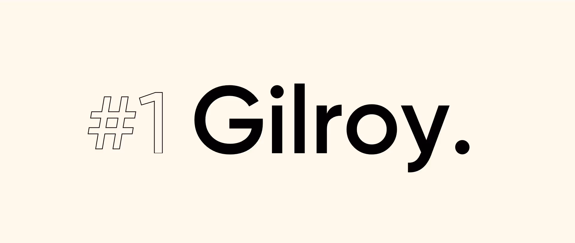
Gilroy by Radomir Tinkov
Gilroy is hands-down one of our top favourites for 2020!
This modern sans serif font was designed by Radomir Tinkov and it comes in 20 weights and 10 uprights with matching italics. It has a geometric touch to it and it is the older brother to the original Qanelas font family.
We love it so much because it includes Cyrillic languages support, which makes it the perfect match for web, signage, corporate and editorial design. You can get the Gilroy-ExtraBold and Gilroy-Light for free (for personal use) and download the full set plus commercial usage rights from Tinkov’s website.
You can check out how we used Gilroy in our SMSBump case study!
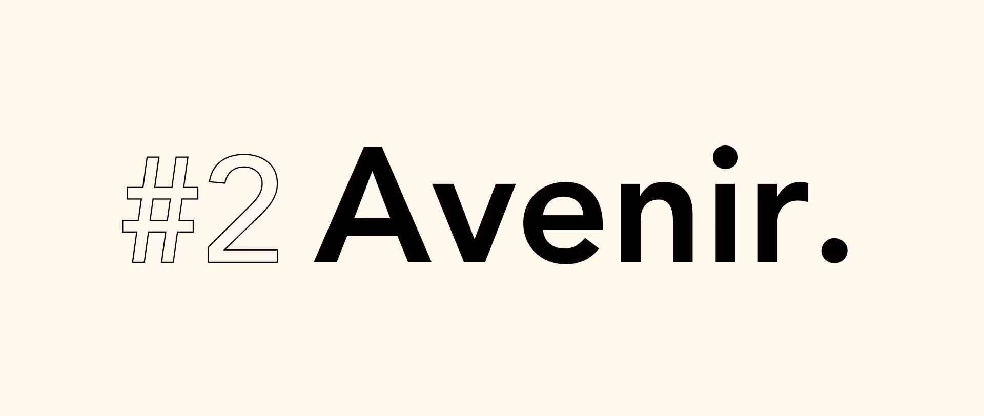
Avenir by Adrian Frutiger
Avenir may have been designed way back in 1988 but it is still widely used by designers all around the globe. Adrian Frutiger created the font, after having an interest in sans serif typefaces. The designer wanted to modernise these types of font and prepare for the transition to the 21st century.
Avenir means “future” in French, hinting at the slight influence the author had from the Futura font when creating this one.

Aktiv Grotesk by Bruno Maag
Some of the most popular fonts over the past 50 years have been Grotesque ones. Designers preferred them thanks to their modernity, neutrality, seriousness and their ability to be adapted to a broad range of media and contexts.
Aktiv Grotesk is Bruno Maag’s 21st-century interpretation of a grotesque sans typeface, available in 24 weights with matching italics, which range from Hairline to Black. We really like using this font for headings or short copy at mid-to-large sizes. It can also support up to 130 languages, making it one of the most international fonts out there.
Sharp Grotesk by Lukas Sharp
Sharp Grotesk was released in 2017 by Lucas Sharp, who was inspired by nineteenth-century wood type combined with Adrian Frutiger’s technical design process.
It is a sans-serif typeface, which is available in 21 widths and 7 weights, which are mostly italics. This equals a total of 249 fonts!
A creative way in which we used Sharp Grotesk can be found on our Instagram feed!
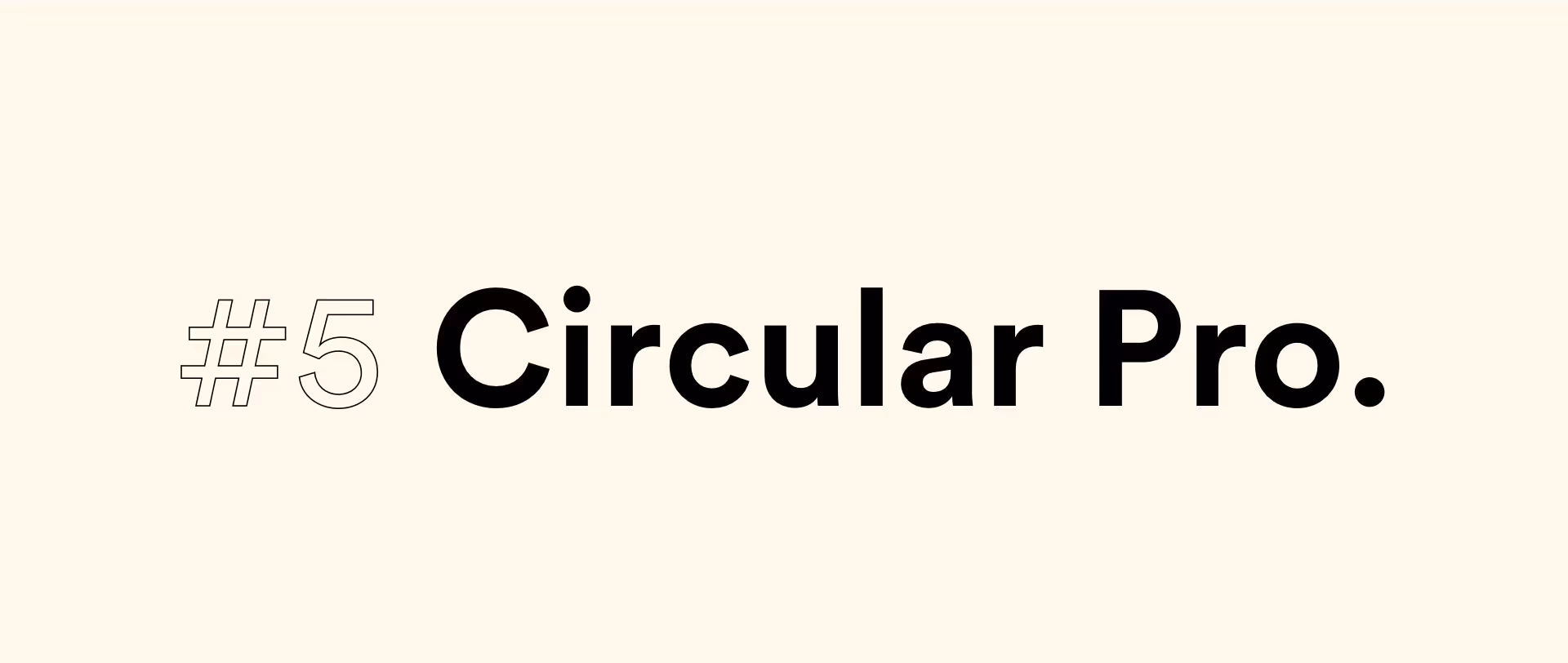
Circular Pro by Laurenz Brunner
Laurenz Brunner is the designer behind this geometric sans-serif typeface created and released back in 2013.
Circular is very easy to identify and it comes in only four weights – book, medium, bold, and black. It is heavily based on geometric forms, yet it still has some warmth to it thanks to its quirks, like the lowercase t.
We liked Circular Pro so much, that we used it as our main font for our website!