Raya is a content strategist and UX researcher at StanVision, with a background in media production and editorial work. She turns dense product and research material into writing people actually finish.
Her process starts with user behavior and market data, not adjectives. Blog posts, UX copy, long-form research: whatever the format, the test is the same. If a reader can't act on it, it gets rewritten.

Let’s face it: web design can feel like trying to learn a new language, blindfolded, while being chased by a deadline. Between writing code, making things look good on every screen size, and figuring out what a div even is, beginners often find themselves deep in the HTML rabbit hole before launching their first page.

When designing a digital product, it’s easy to get lost in a sea of features, feedback, and ideas. That’s where UX feature mapping steps in—not just as a design task, but as a strategic powerhouse within the ux design process that helps align teams, prioritize what matters, and build experiences users want.

Creating seamless user experiences is more important than ever. UX journey mapping plays a crucial role in understanding how users interact with a product or service, helping businesses identify pain points and opportunities for improvement in the customer experience. A UX journey map is more than just a diagram—it’s a strategic tool that provides insights into user behavior, emotions, and touchpoints throughout their journey. Customer journey maps provide a single source of truth for teams, improving internal alignment. Customer journey mapping tools can help visualize and understand the various stages of the customer journey, offering both simple and advanced options to cater to different user needs and preferences.

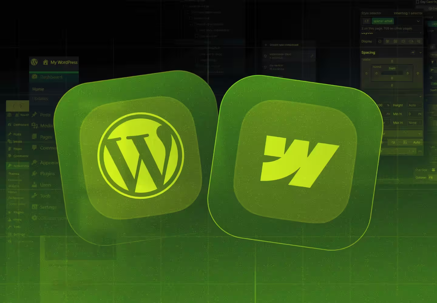
When it comes to building a website, two of the most popular platforms available today are Webflow and WordPress. Each platform offers unique benefits and drawbacks, with both WordPress and Webflow excelling in various contexts such as SEO capabilities, customization options, ease of use, and eCommerce functionality. WordPress, originally a blogging platform, has evolved into a comprehensive content management system (CMS) with extensive customization capabilities through plugins, making it suitable for managing various types of websites beyond just blogs.

Design is crucial in product development, impacting user satisfaction, engagement, and overall success. User Interface (UI) and User Experience (UX) are two fundamental design aspects. While these terms are often used interchangeably, they have distinct roles in creating digital products. Understanding the difference between UI and UX is essential for businesses, designers, and developers aiming to create seamless, engaging, and user-friendly experiences.

Did you know that micro-interactions—like buttons changing color on hover or a progress bar filling up—can significantly boost user engagement and satisfaction? These small design details often determine whether an interface feels obvious or frustrating to use.

Did you know that every $1 invested in UX design can yield an ROI ranging from $2 to $100? A well-crafted product design specification plays a crucial role in guiding the design process to ensure that your product delivers maximum value to users while standing out from the competition. In this article, we’ll guide you through creating a product design specification (PDS). Whether you’re building a digital product or launching a new app, this document is key to aligning your team and setting clear expectations to create a product that truly resonates with your users.

Did you know that 94% of first impressions of a website are design-related? Bad website design can drive away potential leads and hurt your credibility. Bad websites, characterized by poor design, usability issues, and a lack of user-centricity, can significantly harm your online presence. We’ll explore common bad website design mistakes, share real-world examples, and provide actionable solutions to ensure your website stands out for the right reasons.

In the digital design world, a saying holds now more than ever: "Less is more." As we see the web becoming increasingly cluttered with content, ads, and distractions, the appeal of minimalist web design is growing stronger. If you’ve ever been overwhelmed by a website's too many options, pop-ups, or flashy animations, you’ll appreciate the calming effect of a well-executed minimalist design. We’re exploring the principles of minimalist UI design and how less is more when it comes to user engagement, especially in the world of SaaS.

We all know Figma is the backbone of any design project, right? But sometimes even we, the designers, need a quick reminder of just how much we can do with it, especially when it comes to utilizing design assets. It isn’t just for wireframing and prototyping – it’s a total game-changer when it comes to presentations and mockups too. Whether we’re showcasing a slick new SaaS product or just presenting some fresh user flows, Figma’s got our back.

As designers, we know that the world of UX/UI design is changing daily. With this shifting environment, particularly in dynamic industries like SaaS, staying ahead of the curve means constantly developing our skills and knowledge. Embracing methodologies like design thinking is crucial for creating user-centered experiences and adapting to organizational challenges. Whether we’re deepening our expertise, shifting careers, or simply expanding our design toolkit, continuing education is a key part of our growth.

When you’re diving into the world of UI/UX design, there’s one foundational tool that helps shape every digital experience — wireframes. Whether you’re designing a mobile app, a web page, or even a SaaS platform, understanding wireframe design is crucial for creating seamless user experiences that are intuitive, functional and in favour of your final product.