
Key takeaways
- Fintech UX design is the practice of making financial products feel simple, secure, and trustworthy at the same time. The stakes are unique: a confusing interface doesn't just lose a user, it loses their money's trust.
- Trust is designed, not declared. Security badges don't build confidence; predictable interfaces, transparent numbers, and honest friction at the right moments do.
- Onboarding and KYC are where fintech products die. Every additional verification step costs users; the craft is making required friction feel purposeful instead of bureaucratic.
- Personalize the path, never the numbers. Adapt what users see first, never how balances, fees, or risk figures are displayed.
Fintech is the vertical where design mistakes cost the most. Fintech UX design is the practice of making financial products simple, secure, and trustworthy at the same time, and the tension between those three is the entire discipline. A confusing checkout on an e-commerce site loses a sale. A confusing transfer screen in a financial product loses something bigger: the user's confidence that this app should be anywhere near their money.
We've spent years inside this tension. Fintech is home turf for our product design work: payments infrastructure, banking products, financial dashboards. Our longest client relationship, emerchantpay, is a payments company we've designed for across desktop and mobile for seven years running. What follows isn't theory. It's the set of practices that keep surviving contact with real users, real regulators, and real balances.

Why fintech UX is different
Every product category claims its design is hard. Fintech's difficulty is structural, and it comes from three directions at once.
The trust bar is absolute. Users hand over banking credentials, portfolios, and financial identities. They don't extend the benefit of the doubt they'd give a social app; a single moment of confusion ("did that transfer go through?") reads as risk, not inconvenience.
Compliance is a design constraint, not a legal footnote. KYC, AML, GDPR, PCI-DSS: regulation dictates what data you collect, how you verify identity, and what you must disclose. Bad fintech products treat compliance as a form to bolt on; good ones design it into the flow so it feels like protection rather than bureaucracy.
The data is dense and the cost of misreading it is real. Balances, transactions, market movements, fees. Financial interfaces carry more numbers per screen than almost any other product type, and a user who misreads one can lose actual money. Hierarchy isn't a polish concern here; it's a safety feature.
Everything below follows from those three facts.
Fintech UX best practices that hold up
1. Simplicity, but never at the cost of precision
The first rule of financial interfaces: the product can be complex, the experience can't. Transfers, statements, and investments should take the minimum number of decisions to complete. But fintech simplicity has a boundary other verticals don't: you cannot simplify the numbers. Rounding a balance, hiding a fee behind a tap, or summarizing away a risk figure isn't clean design, it's a trust violation. Simplify the path to the number, never the number.
2. Design onboarding and KYC as the product's first promise
Onboarding is where fintech products die, because it's the one flow regulation won't let you shorten at will. Identity verification, document upload, multi-step checks: the friction is mandatory. The craft is making it feel purposeful. Break the process into small steps with a visible progress indicator, explain why each piece of data is needed at the moment you ask for it, let users save and resume, and make document capture work with a phone camera on the first try. Users forgive friction they understand; they abandon friction that feels arbitrary.

3. Build trust through behavior, not badges
Security badges and lock icons are wallpaper; users stopped seeing them years ago. Trust in a financial product is built behaviorally: interfaces that respond instantly and predictably, confirmations that state exactly what happened ("$200 sent to Maria, arriving Tuesday"), honest system status while things process, and no dark patterns anywhere near money. One deliberate exception to the speed rule: consequential actions deserve deliberate friction. A confirmation step before a large transfer isn't an obstacle, it's the interface taking the user's money as seriously as they do.
4. Balance security with usability, deliberately
Multi-factor authentication, session timeouts, and verification steps protect users and frustrate them in equal measure when implemented lazily. The pattern that works: biometric authentication as the default path (Face ID, fingerprint), "remember this device" options for known contexts, and step-up verification that scales with risk, so checking a balance is instant while changing a payout account triggers the full check. Security the user never feels on low-stakes actions, and visibly present on high-stakes ones, is the target state.
5. Make dense data readable at a glance
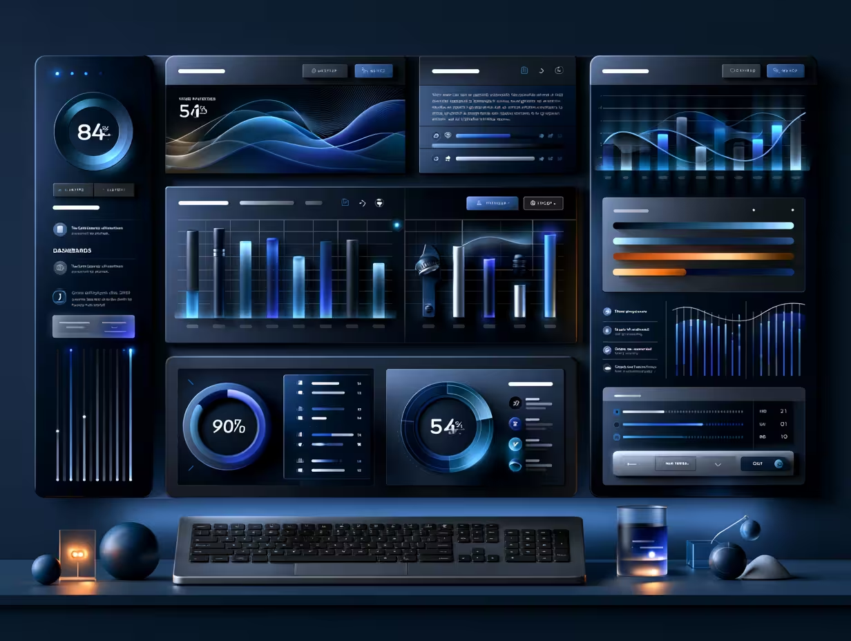
Financial dashboards live or die by hierarchy; no part of our UI/UX design work gets stress-tested harder than this in fintech. The discipline: one primary number per view, trend direction visible without reading, progressive disclosure for everything secondary, and charts that answer a question rather than decorate a screen. Spatial layering has earned its place here; the three-tier pattern (background data, active workspace, contextual actions) we described in our breakdown of current UX trends works hardest in financial products, because data density punishes flat hierarchy faster than anywhere else.
6. Personalize the path, never the numbers
Personalization is powerful in fintech and dangerous in equal measure. Adapting what a user sees first (the accounts they use, the actions they repeat, the insights that match their behavior) makes a financial product feel like theirs. But how a balance, fee, or risk figure is displayed must stay identical for everyone, always. Users and regulators both expect consistency in financial presentation, and an interface that reshuffles how money is shown reads as manipulation. Personalize the path, never the numbers.
7. Design for the financial literacy spread
Your users range from first-time investors to finance professionals, on the same screens. Plain language as the default, precise terms available on demand (tap-to-explain, not walls of jargon), and guided modes that experts can skip. The failure modes are symmetrical: jargon alienates novices, and condescension alienates professionals. The products that get this right, the ones that quietly became verbs, teach without ever feeling like they're teaching.
8. Accessibility is a compliance issue here, not just a virtue
WCAG contrast, screen reader support, and keyboard navigation matter in every product; in financial services they're increasingly a regulatory expectation as well. And fintech adds a specific trap: never encode meaning in color alone. Red-green profit/loss indicators are invisible to a meaningful share of users; pair color with direction, symbol, or text every time.

9. Test with real money psychology in mind
Usability testing in fintech has a wrinkle: people behave differently with real stakes. A flow that tests fine with sample data can collapse when the balance is real and the transfer is rent. Test critical flows with realistic amounts and realistic anxiety, instrument drop-off on every step of onboarding and transactions, and treat a spike in support tickets on any money-moving flow as a design defect until proven otherwise. On emerchantpay, seven years of continuous iteration have taught us that fintech design is never shipped, only currently correct.
Where the discipline is heading
The near future of fintech UX is the trends already arriving: AI-driven interfaces that surface what each user needs, conversational layers that can execute real transactions (with the trust and confirmation design that demands), and embedded finance placing financial actions inside non-financial products. We track those separately in our fintech UX trends breakdown; this article stays on what doesn't change. The products winning in fintech, including clients of ours like Primer, which raised $175M while building payments infrastructure used by demanding merchants, win because the fundamentals above are non-negotiable long before any trend gets layered on.
One boundary worth naming, because teams confuse them: everything in this article is product UX, the experience inside the logged-in product. The fintech marketing site (the public pages that convert visitors into signups) is a different design problem with different rules; we cover it in our guide to fintech web design.
Frequently asked questions
What is fintech UX design?
Fintech UX design is the practice of designing financial product interfaces (banking apps, payment platforms, investment tools, financial dashboards) so they're simple to use, secure by design, and trustworthy in feel. It differs from general product design in three ways: the trust bar is absolute, regulatory compliance shapes every flow, and the data density is higher than almost any other product category.
Why is UX so important in fintech?
Because the cost of confusion is money. A user who can't tell whether a transfer completed, misreads a fee, or abandons onboarding doesn't just churn; they lose confidence in the product's safety, and they tell others. In a category where competitors are one app store search away, experience quality is the retention mechanism, and switching costs no longer protect bad interfaces.
What are the biggest fintech UX challenges?
Balancing security with usability (verification that protects without exhausting), onboarding and KYC flows that regulation won't let you shorten, presenting dense financial data readably, serving users across a wide financial literacy range, and building trust behaviorally rather than through badges. Most fintech UX failures trace back to treating one of these as an afterthought.
What makes a fintech app's UX good?
Fast, predictable interfaces for everyday actions; deliberate confirmation friction for consequential ones; onboarding that explains why each verification step exists; data hierarchy that surfaces one primary answer per screen; and absolute consistency in how money is displayed. Good fintech app design feels unremarkable in the best way: users stop thinking about the interface and just trust it.
How do you choose a UX design agency for fintech products?
Look for shipped fintech work, not fintech mockups: real products with real compliance constraints solved, named clients in payments or banking, and partnerships that lasted beyond one engagement (fintech design is iterative by nature, so tenure is signal). Ask specifically how they've handled KYC flows, data-dense dashboards, and security step-up design; teams that have done it answer concretely.

Stan Kirilov
Stan has led design for over 20 years, first as a hands-on designer, now as Experience Director at StanVision. He works with SaaS and fintech companies, from first-time founders to global brands, on products and websites built to convert, not just to look good.
He serves on the Awwwards jury and still reviews every project that ships. His standard is simple: if a design doesn't perform, it isn't finished.

.svg)