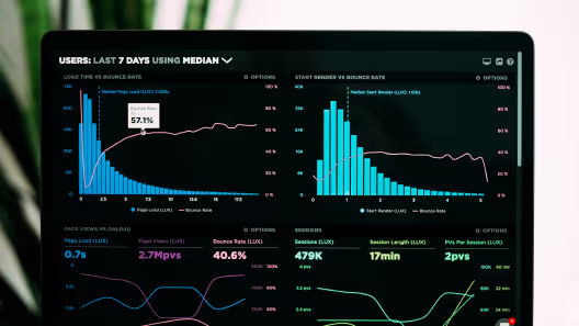
High performing websites get more traffic, they are ranked higher in search engines and perform better overall when talking about converting users. The good news is that Webflow takes most of the important factors out of the equation and provides an out of the box solution that automatically sets your website up for success.
Here is a short list of the tools that Webflow has integrated into its website builder in order to achieve higher page speed performance results:
- CDN (Content distribution Network)
- Minify CSS, JS & HTML
- Caching
- Generating cleaner HTML
In fact these built-in automations are what made us transition out website from WordPress to Webflow in the first place.
Apart from benefiting from these tools, as a website designer and developer, you can also implement some strategies in order to further improve your website’s page speed load time.
Image optimisation & compression
Although Webflow can make your images responsive and optimize their size for different devices, that doesn’t mean you don’t have to make sure they are well compressed and optimized beforehand. For example, if you download a single image directly from Unsplash or Pexels and upload it in Webflow you will most probably be fine and not need to optimize further . If you however have 20-30 images on the same page, you will most probably end up with performance issues. Especially, if you are in Admin mode and trying to edit something, it saves the original image and that can result in very slow load time.
What format to use? PNG vs JPEG vs SVG
JPEG
You’ll probably use JPEG for all photography related graphics that don’t have transparent backgrounds or elements in them. You can make your image borders rounded in Webflow so don’t be deceived by the fact something has a border radius and it should be exported with it. The proper way is to export it without border radius and do it afterwards in Webflow. This way you can guarantee if someone replaces the image, it will remain with the same border radius.
PNG
Every image that uses alpha channel or transparency falls into the PNG category. It doesn’t have such compression as JPEG and is often used for interface elements (screens, mockups, UI) where you don’t want the things to get blurry. Usually, this is what happens when you use JPEG.
SVG
All vector graphics should be converted into SVG before being uploaded to Webflow. These will be your Icons, logos, and any other elements which you would incorporate as part of your design. This is the smallest possible format and if you have vector elements you should definitely use SVG.
After deciding the format, make sure to export it no more than 2X of the required image size. 2X is good for retina displays. For example, if your original image is 500x500px, you can export your asset in 1000x1000px but no bigger than that.
After exporting it, we recommend using a service like TinyPNG to compress further.
Lazy load images

To make websites load faster, Webflow have turned the lazy load on by default. This feature “instructs” the browser you are using to not load the image before a user has scrolled through the section it’s positioned in.
However, the only time you need to turn this option off is for all above the fold images as you will probably want them to load immediately when the website loads.
Reduce the use of web fonts
A font can come up with many different widths and variations. For example, Roboto comes with 9 widths and you probably won’t use more than 2-3 of them. Make sure to load only what you need.
Key Google PageSpeed metrics
It’s always good to check in with Google and their PageSpeed metrics. Mobile is always first of course as Google is checking how mobile friendly your website is and determines it’s ranking accordingly. Of course, the ranking of your website is also linked to how well your SEO is set up and executed.
First Contentful Paint (FCP)
The FCP is one of the most important metrics that you need to keep in mind when setting up your website for page speed success. The First Contentful Paint refers to how long it takes a browser to show a piece of content that is on your website. This content is called DOM content and it can be an image, non-white canvas element, or an SVG.
When coming up with an FCP score, the calculation is based on your website’s page FCP time and that of other real websites. For example, a good FCP time is anything below 1.5 seconds. That will put your website in the 99-percentile in terms of performance.
Speed Index
Developers have created the Speed Index metric in order to measure how quickly your website’s visual content is displayed when first loading. It is measured in milliseconds and the lower it is the better. Generally, if your Speed Index is below 3.4 seconds, then you have a pretty fast loading website.
The other cool thing is that you can easily check any website from gtmetrix and the tool can even let you compare the speed between different devices.
Largest Contentful Paint (LCP)
Similar to FCP, LCP refers to the time that the largest in size content on your web page loads. When measuring your Largest Contentful Paint, you should always aim for it to be at 2.5 second or less. This means that your webpage will provide a good user experience and not make users frustrated due to slow load time.
Time to Interactive (TTI)
TTI refers to the amount of time it takes for a certain page to load and become fully interactive. This becomes possible once the initial useful content, which has been measured by the FCP, has rendered on the screen, the event handlers have registered for the majority of the already visible page elements, and the response time to user interaction is up to 50 milliseconds. If your TTI score is up to 3.8 seconds, your color-coding is considered fast, however once it exceeds 5 seconds it starts to get slower, resulting in a poor user experience.
Total Blocking Time (TBT)
TBT refers to the amount of time during which the main thread has been blocked before being able to respond to user input, which includes actions as simple as a keyboard press or a mouse click. One could calculate this by adding the blocking time for all long tasks which run on the main thread between FCP and TTI for more than 50 milliseconds. The blocking time occurs once the long tasks exceed 50 ms. For example, if a certain main thread timeline detects a 90 ms long task, the blocking time would be 40 ms.
Cumulative Layout Shift (CLS)
CLS measures the visual stability of a website by calculating the amount of all unexpected layout shifts a user experiences while loading a certain page. A layout shift refers to the change in position of any visible element, altering the page’s entire structure. In order to ensure a high-quality user experience, a good CLS score needs to be less than 0.1. If it’s between 0.1 and 0.25 it would require some improvement, and if it exceeds 0.25, it’s considered poor.


