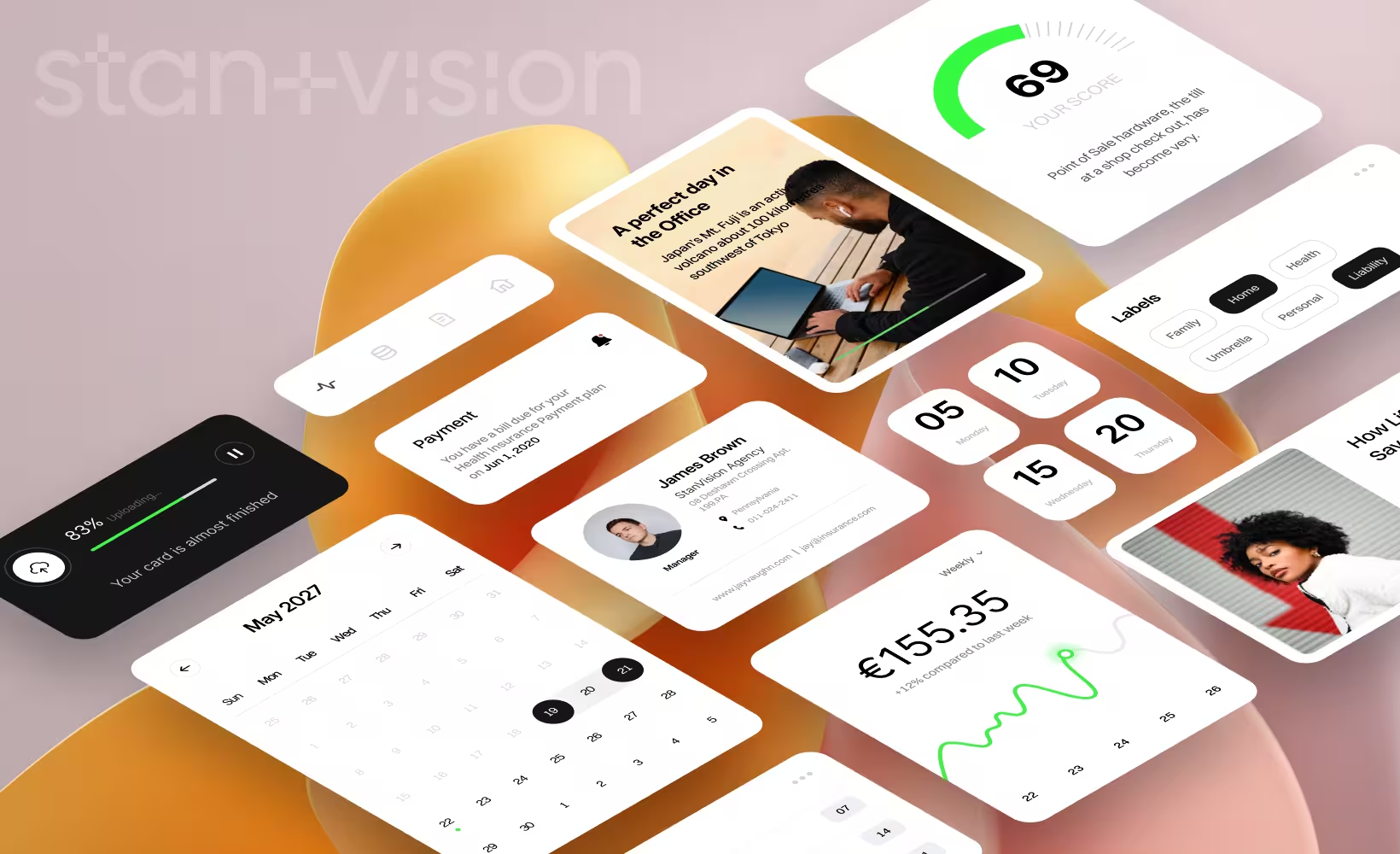

Intro: UX vs UI
UX design (user experience) decides how your product actually works. UI design (user interface) decides how it looks and signals what to do. We’ve seen beautiful product UIs drop first-task completion by ~20–30% because users couldn’t find the first action. UX moves outcomes. UI earns trust.

What is UX design?
Definition (UX meaning): UX design is how a product actually works in real life: what users try to do, where they hesitate, and why they drop. In our practice, UX isn’t a phase—it’s continuous decision-making based on research, tests, and what users fail to complete on their first try. (NN/g and IxDF definitions of UX)
Core responsibilities (roles in design)
- Mapping critical flows (signup, onboarding, core action, billing)
- Finding friction with usability tests and session replays
- Prioritising what to cut, not what to add
- Defining IA, permissions, empty states, errors
- Accessibility beyond checklists (keyboard paths, focus order) (WCAG principles)
Typical outputs
- User flows for activation + onboarding
- Wireframes that remove steps (not add features)
- Clickable prototypes tested with 5–8 real users
- Usability notes with clear fixes ("3 of 5 users missed the CTA")
Business impact We’ve cut onboarding from ~12 minutes to under 4 by removing two steps nobody used. Activation jumped ~2x in a week. No redesign. Just fewer decisions. UX pays for itself when users can do something useful in the first 30 seconds.

What is UI design?
Definition (UI meaning): UI design is how the product communicates visually: what stands out, what looks clickable, and what gets ignored. In our work, UI isn’t about making things pretty. It’s about making the right action obvious in under two seconds. (IxDF definition of UI).
Core responsibilities (roles in design for modern product teams)
- Visual hierarchy for core actions (primary CTA, secondary actions, destructive states)
- Component design for scale (tables, forms, filters, empty states)
- Readability under real conditions (dense dashboards, long forms)
- Design systems that don’t slow teams down
- Motion that explains change (loading, success, error)
Typical outputs
- Design system + tokens (type scale, spacing, colors)
- Reusable components with states (hover, error, loading)
- High-fidelity screens tied to real flows
- UI QA notes (contrast issues, broken hierarchy, cluttered states)
Business impact We’ve seen a single hierarchy fix (making the primary action visually dominant) lift demo clicks by ~15–20% in under two weeks. Same UX flow. Better UI signal. When the primary action stands out, people click. When it doesn’t, they hover, scan, and leave.

UI vs UX: key differences
Real-world examples
Example 1: Good UI, weak UX
- Context: Fintech product with a polished marketing site and shiny dashboard.
- What broke: New users landed in the product with 7 choices and no clear “first action.” Three CTAs competed for attention.
- Impact: Trial → activation stalled at ~18–22%.
- Fix: We removed two CTAs, hard-prioritized one primary action, and collapsed onboarding to a single guided step.
- Result: Activation moved to ~34% in ~10 days. Same UI style. Different UX decisions.
Example 2: Strong UX, weak UI
- Context: B2B data tool with solid flows built by product + engineering.
- What broke: Dense tables, weak hierarchy, low contrast. Users completed tasks—but hesitated to upgrade.
- Impact: Demos converted, paid upgrades lagged. Sales calls flagged “looks complex” as an objection.
- Fix: We rebuilt hierarchy (one dominant primary action), simplified tables, and introduced clear empty states.
- Result: Demo → paid conversion lifted ~15–20% in two weeks. UX stayed. UI finally signaled confidence.
Example 3: Strong UX + strong UI
- Context: Growth-stage product rebuilding onboarding and pricing.
- What worked: One clear first action in onboarding + visual hierarchy that made the next step obvious.
- Impact: Time-to-first-value dropped from ~6–7 minutes to ~2 minutes. Trial starts up ~28%. Fewer “confused” tickets.

Why UI and UX must work together
- UX sets direction. UI gives the signal. We’ve shipped flows that were logically solid but stalled because the primary action didn’t visually stand out. Fixing hierarchy alone lifted clicks ~15–20% without touching the flow.
- Good UI can’t save broken UX. We’ve watched beautiful dashboards lose ~20–30% of trials because users couldn’t find the first step. No amount of polish fixes seven competing choices on day one.
- UX without UI leaves money on the table. Solid flows + weak hierarchy slow upgrades. When we clarified tables and empty states on a B2B tool, demo → paid moved ~15–20% in two weeks.
- Speed compounds when both align. One clear first action (UX) + dominant visual cue (UI) cut time‑to‑first‑value from ~6–7 min to ~2 min. Fewer support tickets. More momentum.

Common mistakes teams make
- Treating UI as decoration. Teams ship prettier screens without fixing flows. We’ve seen this stall activation ~10–20% because the first action still isn’t obvious.
- Explaining instead of enabling. Long tooltips and tours replace a clear first step. Users bounce when they have to read before doing.
- Overloading day one. Seven choices on the first screen feels “powerful.” It kills momentum.
- Designing for edge cases. Rare workflows shape the UI while the main path stays slow.
- Skipping real tests. Internal reviews miss the moment a user hesitates and asks, “What now?”
Short summary
Bad UX is expensive. Bad UI is quiet friction. When both align, users move faster, support drops, and conversion climbs. If trials stall or onboarding feels heavy, a short audit usually surfaces 2–3 blockers hiding in plain sight. We’ll show you what to cut first.
FAQ
What is UX design?
UX design is how your product actually works for real people: the steps they take, where they hesitate, and why they drop. We focus on first actions, removing steps nobody needs, and testing with 5–8 users. That’s how activation moves—by making progress obvious in the first 30 seconds.
What is UI design?
UI design is how your product communicates visually: hierarchy, contrast, states, and what looks clickable. The goal isn’t beauty—it’s speed of understanding. When the primary action is visually dominant, we’ve seen demo clicks lift ~15–20% without changing the flow.
Why is UX more than wireframes?
Wireframes are a tool, not the outcome. UX is the decision-making behind flows, trade‑offs, and what to remove. We’ve doubled activation by cutting steps, not by drawing nicer boxes. If users pause and ask “What do I do now?”, the UX failed—no wireframe fixes that alone.
How do UI and UX impact conversion rates?
UX removes friction in the path to value. UI removes hesitation at the moment of action. Together, they compound. We’ve seen time‑to‑first‑value drop from ~6–7 minutes to ~2 when the first step was simplified (UX) and made visually dominant (UI), lifting trials and upgrades.
Is UI or UX more important for growth?
Neither wins alone. Strong UX with weak UI slows upgrades. Strong UI with weak UX burns trials. Growth comes from alignment: one clear first action (UX) and a dominant visual cue (UI). Treat UX like infrastructure and UI like the signal—or you’ll pay in churn.