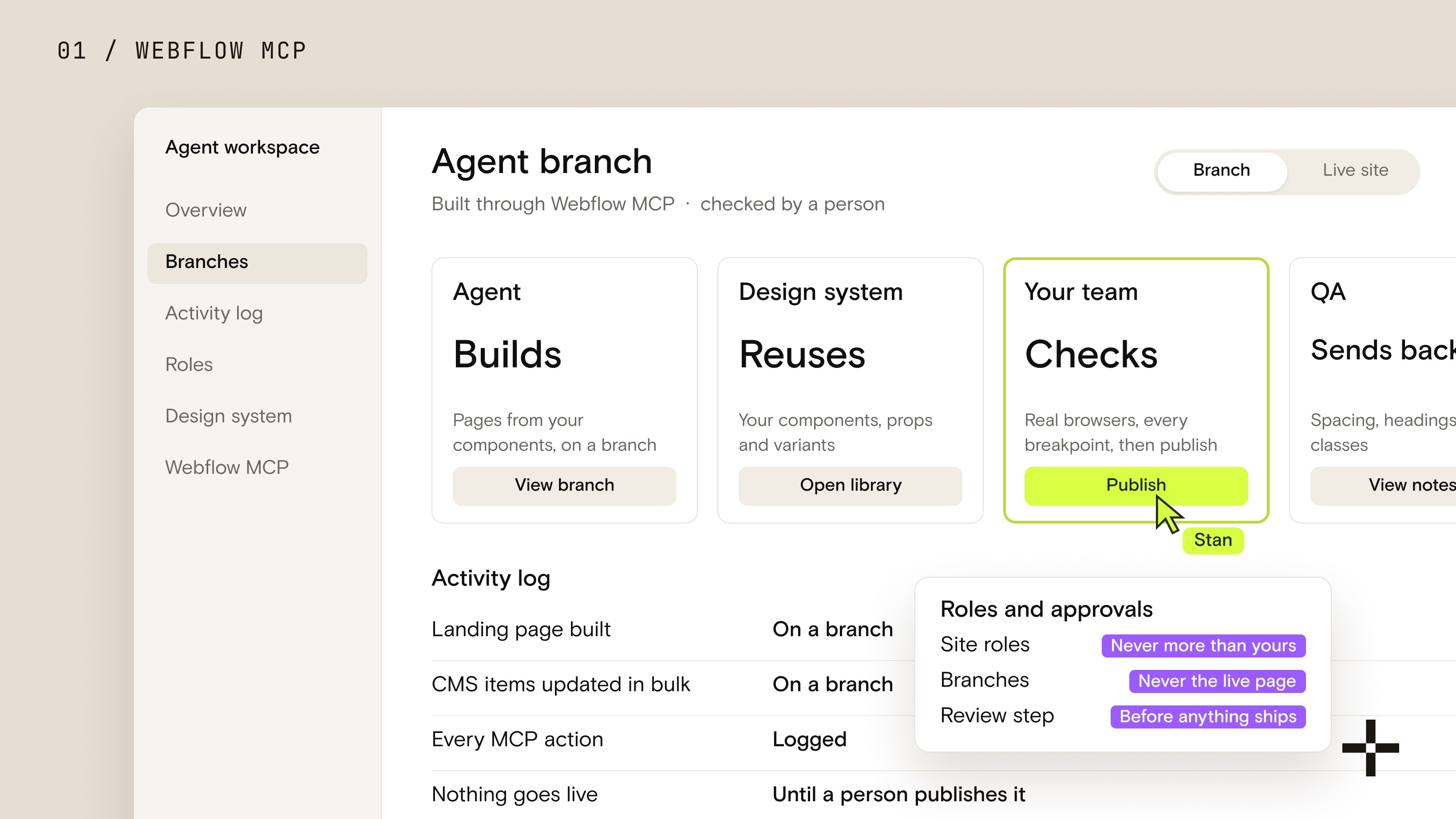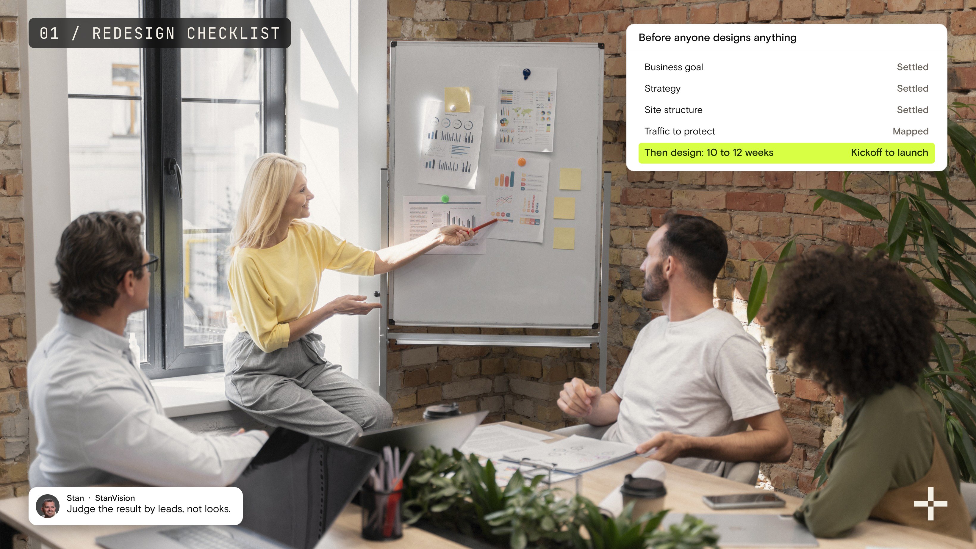

Good SaaS website design does three things: it makes the product understandable in seconds, it proves the product works before asking for anything, and it removes every step between interest and action. Everything else, the typography, the motion, the color system, exists to support those three jobs. When a SaaS website underperforms, one of the three is broken. It is almost never the visual layer.
I'll show you what that looks like in practice, with 24 of the best SaaS websites in 2026 and the framework we use when a SaaS website redesign lands on our desk.
First, a story. A founder came to us frustrated and needed a redesign urgently. The site had a load time north of six seconds, a shiny hero video, and a signup rate under one percent. The product was genuinely good. The website was the bottleneck. We stripped the messaging down, replaced the video with a short interactive demo, and moved real numbers above the fold. Activation jumped by roughly a third in the first week. Same product, same traffic.
That project reminded me of the thing I keep relearning: SaaS websites rarely fail because of design. They fail because a visitor lands, stares for five seconds, thinks "what the hell does this thing do," and closes the tab.
Why listen to me on this? I've spent 20 years designing SaaS products and marketing sites, I sit on the Awwwards jury, and our team has shipped over a hundred SaaS product and website redesigns. When we work on SaaS design projects, real revenue is on the line, so we measure what moves and what doesn't. This article is that measurement, written down.
Why SaaS website design decides your conversion rate
SaaS buyers have no patience left. They compare five tools at once, six tabs open, Slack going off. If your site doesn't explain what you do in the first 3 to 5 seconds, they're gone, and they're not coming back.
In 2026 the website is the product demo. Nobody books a call just to understand what your product does. If a visitor has to scroll to find the value, you already lost the sale. On one fintech redesign, the founder was shocked to learn that nearly half of all visitors never reached the hero CTA. Not because they didn't care. The message took too long to land.
Here's where most teams crash:
- They obsess over features and ignore the only thing buyers want: outcomes.
- They hide the product behind illustrations instead of showing it.
- They rely on buzzwords because the positioning was never settled.
- They bury proof at the bottom of the page.
- They explain instead of demonstrating.
- They polish aesthetics and ignore speed.
Confusion is more expensive than design. Every second of hesitation costs conversion, and hesitation is exactly what we hunt for when we map how users move through a site.
What makes a high-converting SaaS website
This is the framework we use internally on every SaaS redesign. Six principles. When conversion collapses, one of these is broken.
1. One message a visitor can repeat back
If someone can't answer "what does this do, and why should I care" in under five seconds, nothing else on the page matters. Most founders try to explain everything. The best ones commit to one unmissable message and build from there. On GoAudience we replaced a 14-word, jargon-heavy hero with a 6-word statement of what the product did. Demo clicks went up 27% in nine days. Same product, same design. Good copy is not poetry. It's a weapon.
2. Product-first visuals and interactive demos
Stop hiding behind warm illustrations. Buyers want to see the product, not the idea of the product. Every high-converting redesign we've shipped used real interface elements, animated flows, or 10-to-15-second micro demos. When we redesigned Tolstoy, during a seven-year partnership, we replaced generic animations with a real interactive shoppable video. The moment people could use the product instead of imagining it, engagement spiked and demo requests climbed with it. Let users experience the value instead of reading about it.
3. Frictionless user journeys
Friction doesn't always look like a bug. Sometimes it's a wall of text, a confusing layout, or a CTA that asks too much too early. The pattern we see over and over: users don't quit because the product is bad, they quit because the path to value asks for too many decisions. The fix is almost always the same. Commit to one recommended route, cut the steps that don't earn their place, and rewrite the microcopy to guide the decision instead of explaining everything around it. Friction is invisible in Figma; you find it by watching real users hesitate.
4. Trust signals and social proof
No one believes your marketing. They believe your customers. The highest-converting SaaS pages put logos above the fold, use real testimonials, and show case study numbers early. One fintech platform we redesigned (a client we can't name) had a serious number, $4.2B in annual transactions, buried near the footer. We moved it into the hero, cut the headline from 14 words to 6, and replaced a stock illustration with a real product screenshot. Signups rose 32% in the first week. Nothing else changed. Proof outruns persuasion, and it's the foundation of trust in SaaS UX.
5. Speed and Core Web Vitals
Slow websites are silent revenue killers. You don't notice them in Figma; you feel them in analytics. When we rebuilt GoAudience's site, bounce dropped 18%. Speed and message discipline did most of that work. Fast reads as trustworthy. A 6-second load reads as broken.
6. Mobile as the primary device
For some teams we work with, 60 to 75% of demo requests start on mobile, yet most SaaS sites behave like desktop pages squeezed into a phone. On Zipchat the primary CTA sat halfway down the mobile page. We added a persistent sticky CTA and trial starts rose 18% in ten days. Tiny change, real number.
The pattern across all six: underperforming SaaS websites don't have a design problem. They have a message problem, a proof problem, or a friction problem. Fix those three and engagement, activation, and revenue start moving together. Design is not the art layer. Design is the conversion engine. It's also why our web design work starts with message and proof, not moodboards.
Best SaaS website examples in 2026
This is not another inspiration collection pulled from Dribbble. Each site below earns its place because it converts, communicates value fast, or demonstrates a UX pattern worth stealing. I've noted what each one gets right and where it slips, because the slips teach as much as the wins.
Superhuman: speed as the value proposition

Superhuman commits to one promise: email at the speed of thought. Zero confusion on landing, no abstract AI language, a CTA that asks for action immediately. The micro-motion reinforces speed without turning the page into a slot machine. The trade-off: the layout runs tight and visually heavy in places. A product that sells focus could let the message breathe more.
Clay: outcomes before interface
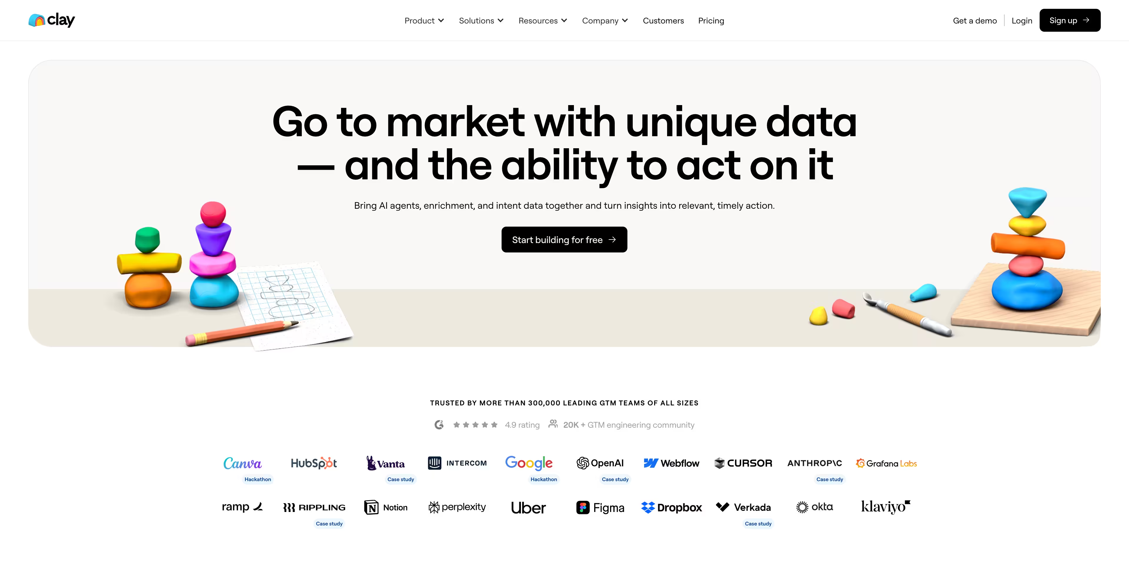
Clay sells personalization at scale without showing the product in the hero at all. Enterprise logos and a sharp value headline do the work. The clay-like 3D shapes give the brand a tactile, human feel instead of another robot-future aesthetic. Some dark-on-dark sections hurt scannability, but the page is a ruthless selling machine built on proof.
Ramp: financial control in plain language
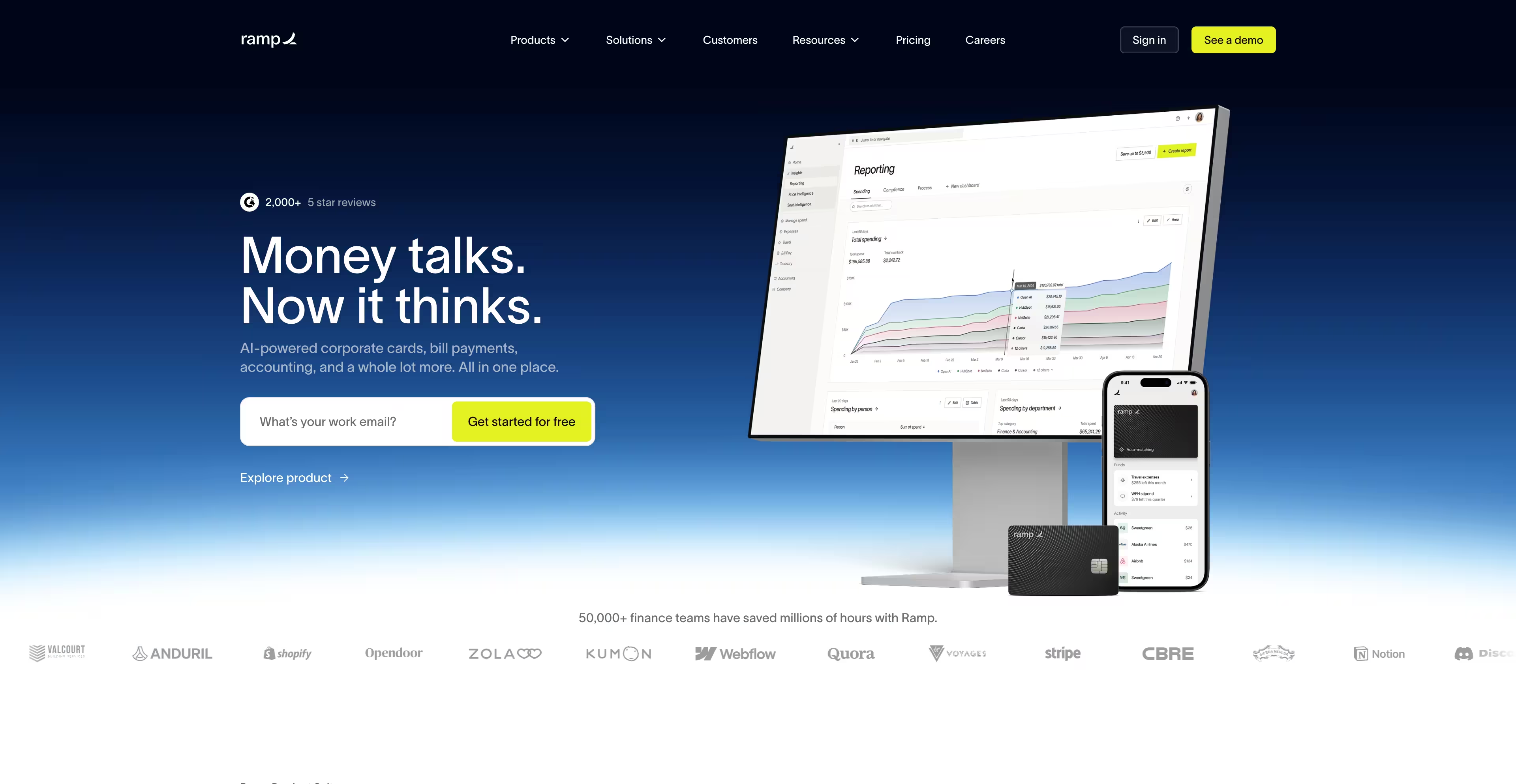
Ramp explains the product in plain words and shows real people behind it, not dashboards floating in space. One idea, reinforced on every line: run a smarter finance operation. The design is intentionally invisible. The cost is personality; it's almost too restrained. But for structure and message discipline, Ramp is a benchmark.
Zoom: the human hero
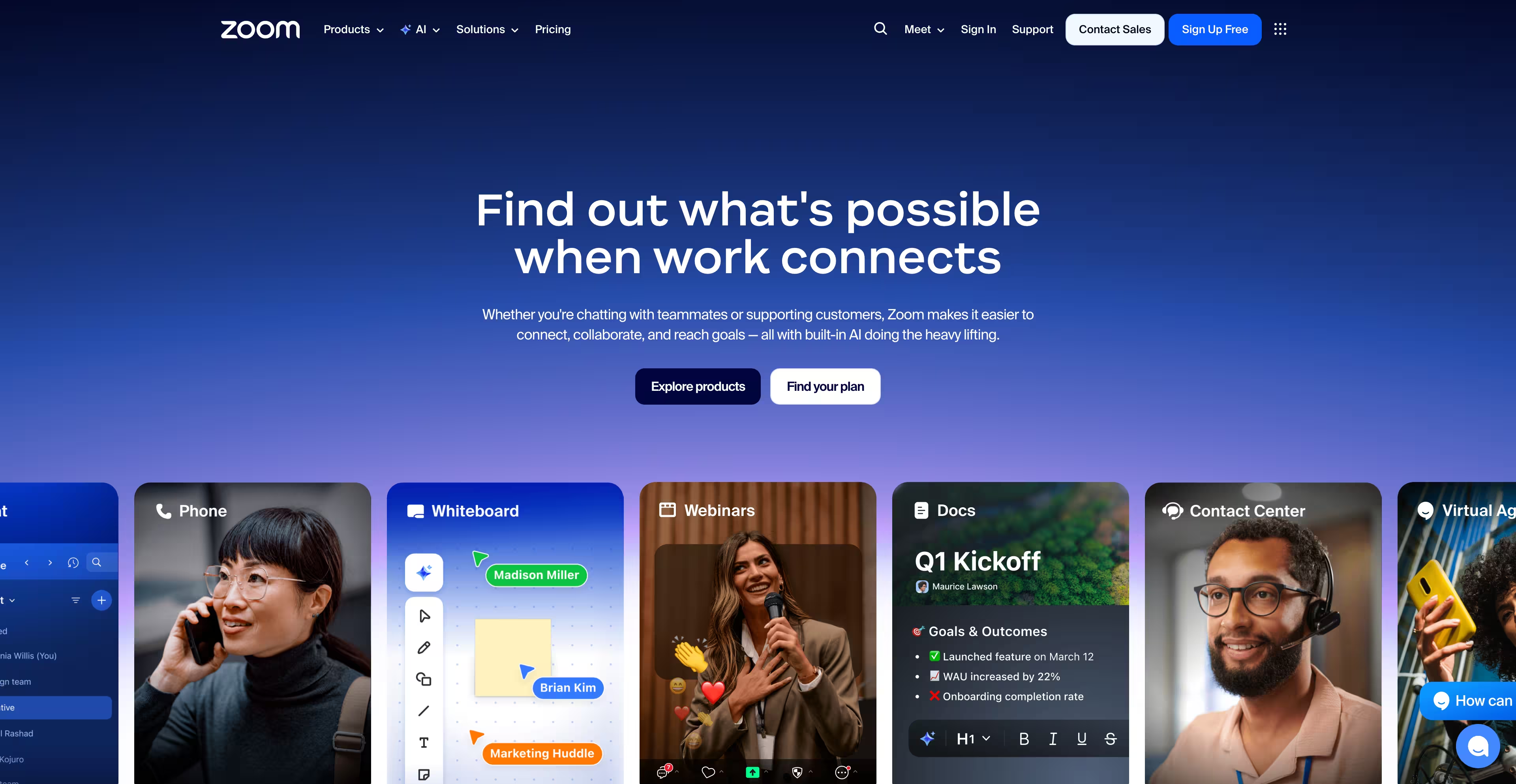
Zoom connects the technology to real people immediately and states its AI-collaboration positioning up front without overexplaining. Below the fold the page turns generic and the momentum fades. Strong foundation, storytelling that quits too early.
Palantir: proof through impact
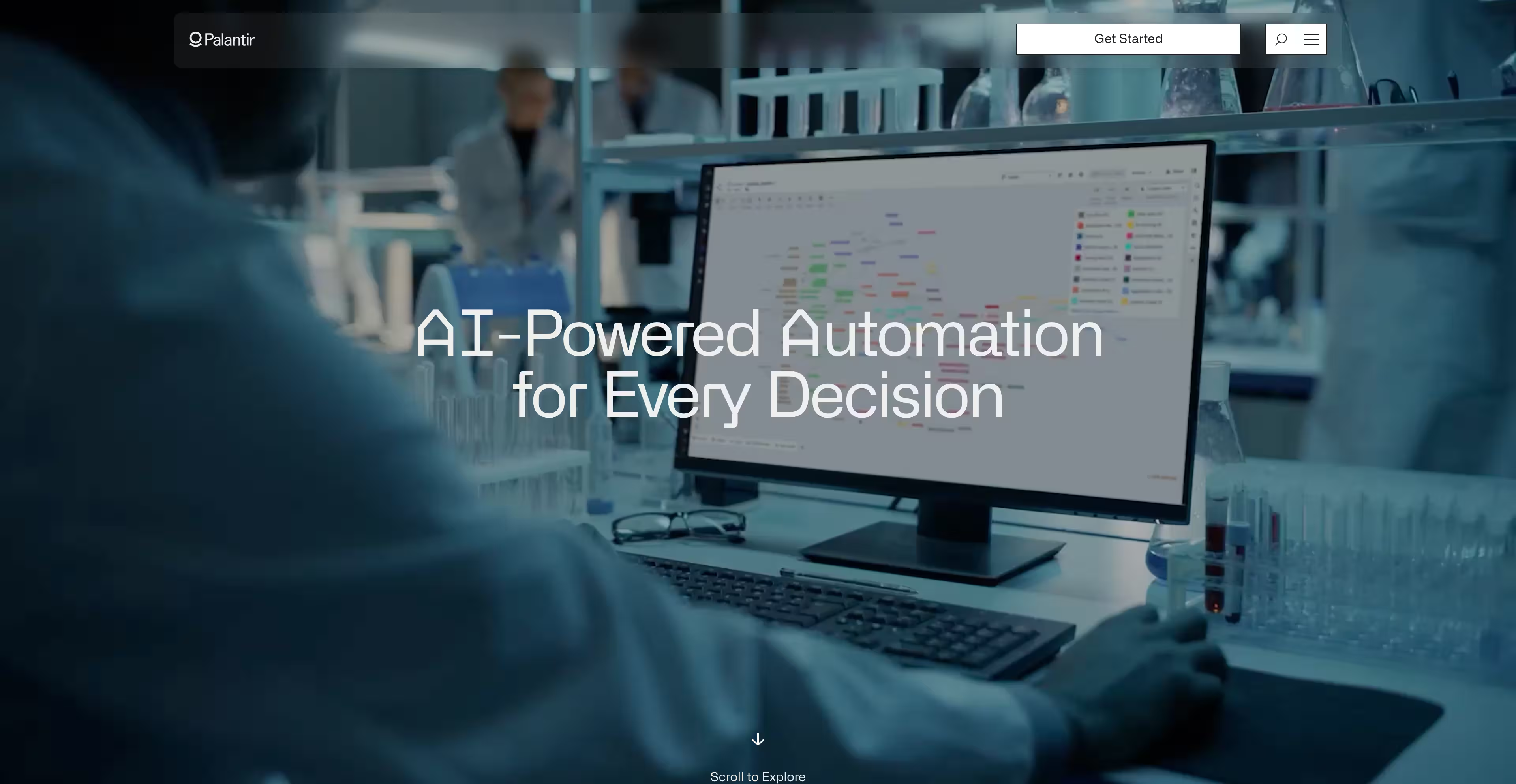
Palantir doesn't persuade with adjectives. Real software demos, real-world footage, a serious industrial tone. You understand instantly that this is mission-critical software, and the confidence of that identity is rare. The miss: hamburger navigation. Enterprise buyers hunt for information; don't make them dig.
Intercom: atmosphere as differentiation
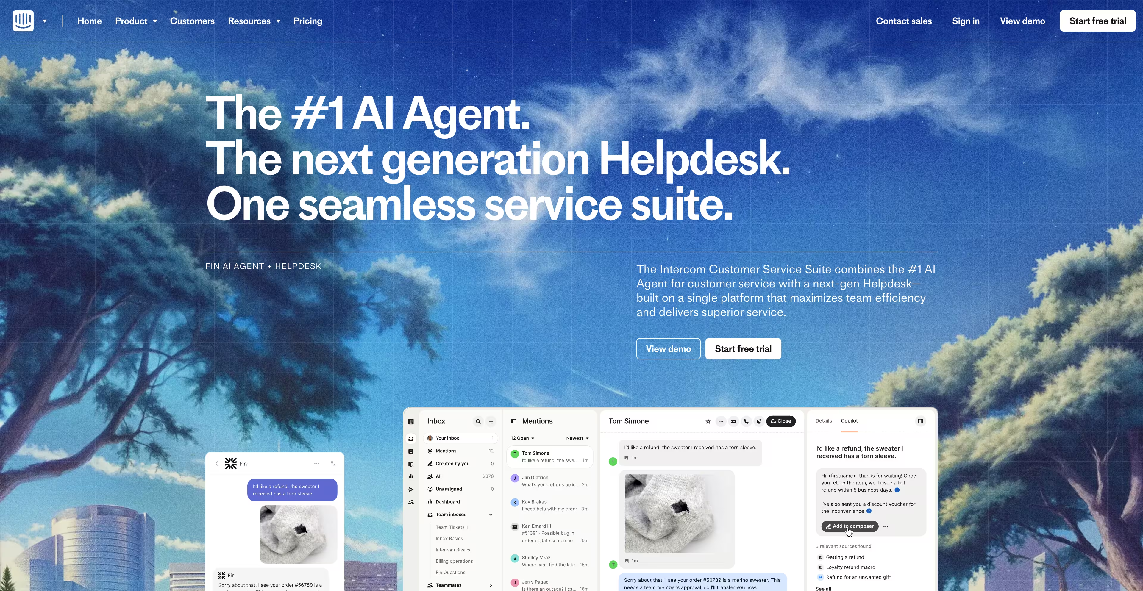
Intercom mixes real UI with landscape-style artwork to create warmth in a category that is usually cold. The storytelling carries the value and the visuals reinforce it. The push I'd make: more product depth earlier. Enterprise buyers still want to see the engine quickly.
AlphaSense: show, then explain

AlphaSense opens with a real product animation and a direct value statement about turning research into faster decisions. Outcome, proof, path forward. The heavy content grid lower on the page adds noise, but the lead is the lesson: product first, marketing theory second.
Samsara: results in their real environment

Samsara uses real-world footage, trucks, factories, logistics, plus dashboard views that show operational scale. The product appears in the context where it matters, which builds credibility no gradient background can. The visual language could be more unified, but the message lands.
Zscaler: confident, surgical color
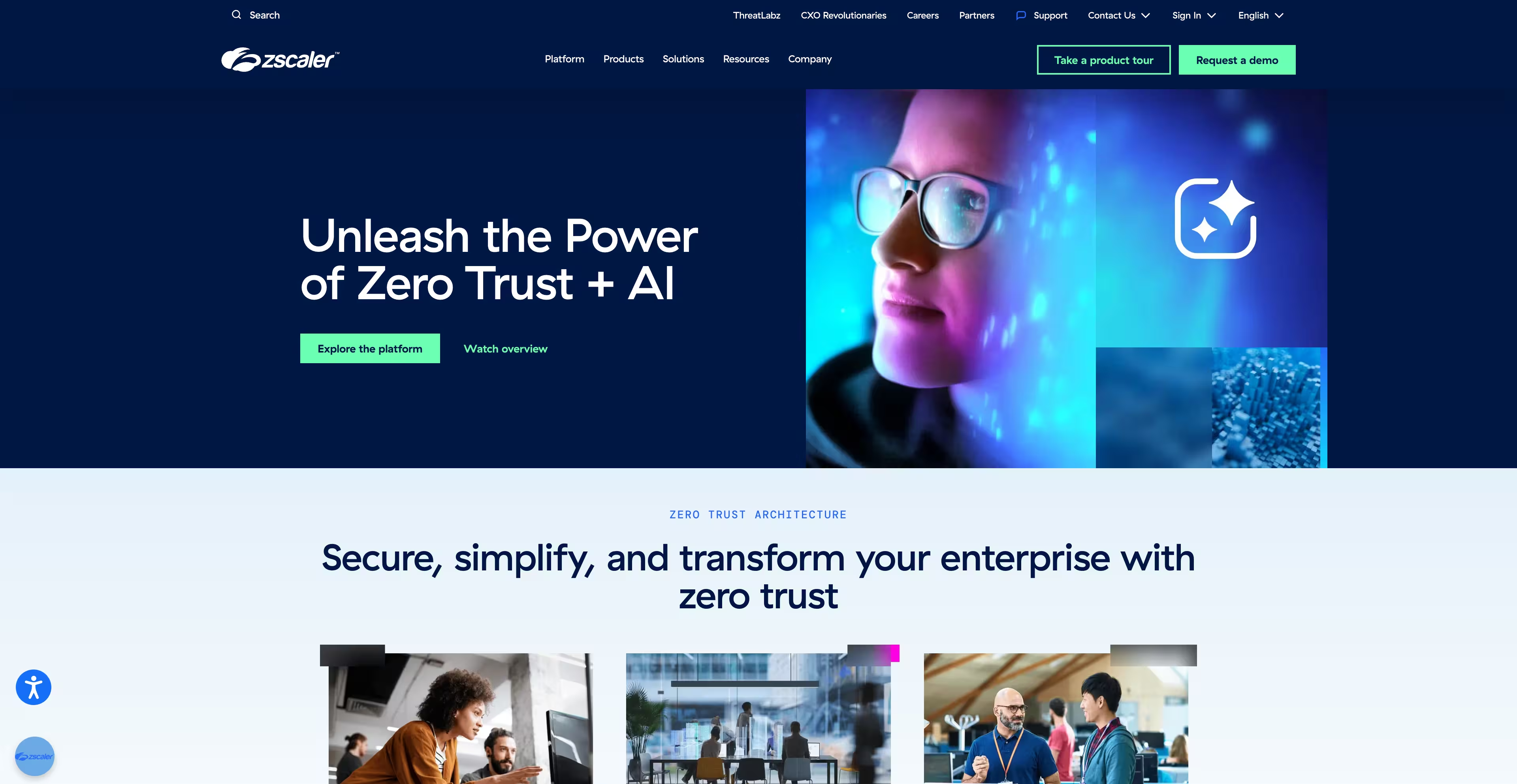
Zscaler uses its bold green surgically to route attention to CTAs and benefits, and states its AI positioning without hedging. It leans too hard on lifestyle photography for a security product; buyers want to see the shield, not just the soldiers.
Databricks: borrowed authority, deployed well

Databricks might be the strongest example of credibility-led conversion on this list. Real logos, real partners, and Sam Altman right after the hero. Enterprise buyers care about proof, and this page is built from it. The orange-on-dark palette slides into low-contrast readability trouble, but the strategy holds.
Celonis: one accent, zero noise

Celonis strips down to black, white, and one high-impact green, then explains process intelligence with diagrams and motion that make a complicated product understandable. Later text-only sections lose energy, but the takeaway stands: simplicity is a weapon in cluttered categories.
Stripe: focus at enterprise scale

Stripe's page is calm and intentional, guiding you into the product without noise. The hero message is simple and confident, backed by UI visuals that show power instead of describing it. Trust is the core design asset: recognizable logos, live case studies, and a narrative about scale and reliability on every scroll.
Snyk: security that ships fast

Snyk speaks to the exact tension engineering teams feel: ship fast without breaking security. The hero answers that outcome and the UI examples show real workflows instead of fear-based messaging. The page stacks text quickly; more pacing would reduce fatigue.
Synthesia: the demo is the hero
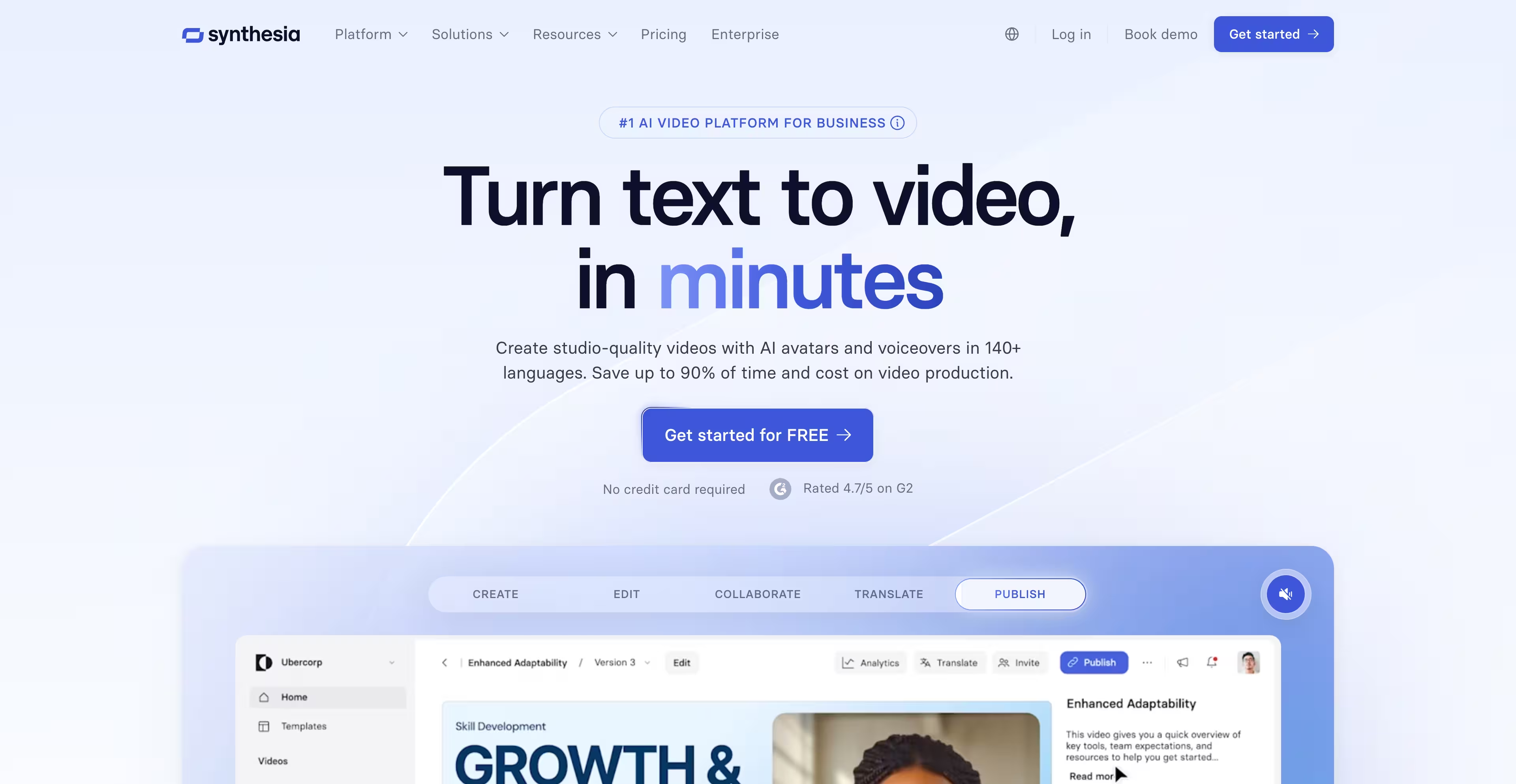
Synthesia sells something that feels like magic and proves it instantly: you watch a video being generated in front of you. No explanation could work faster. Once you scroll, the visual energy drops, and the emotional lift from the hero deserves a stronger follow-through.
Mentimeter: real interactions, human tone
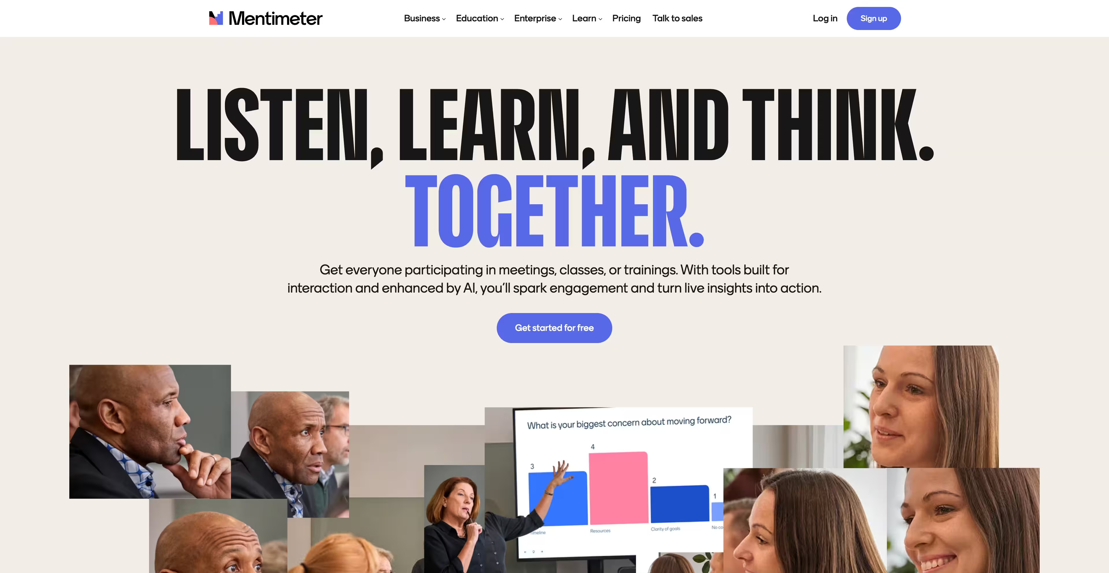
Mentimeter shows real meeting environments and live interactions, positioning itself as a two-way conversation tool rather than another deck app. Friendly, accessible, human. The hero visuals play it slightly safe; leaning harder into live-interaction moments would sharpen it.
Bubble: capability shown, not claimed
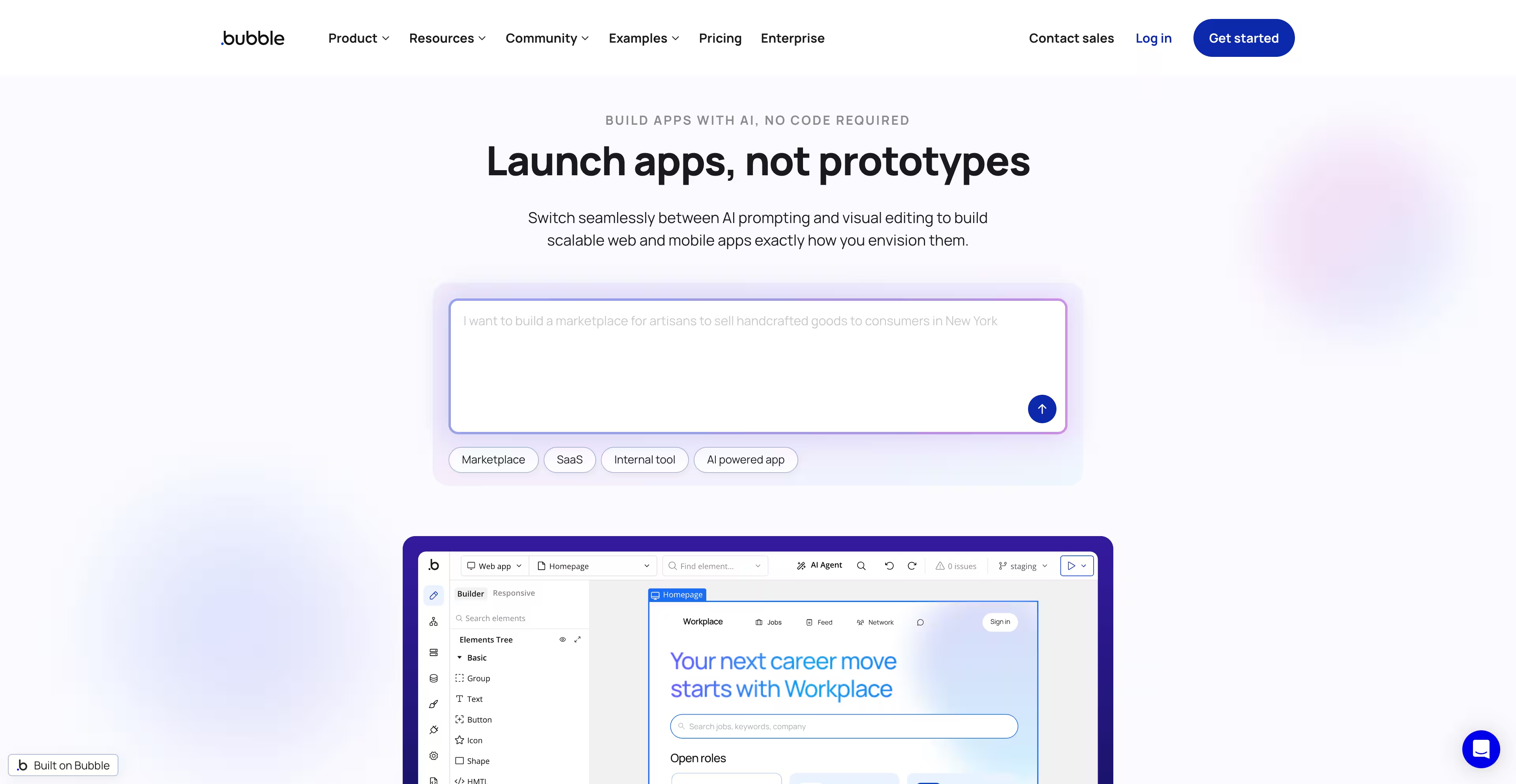
Bubble opens with a real prompt and a live example of what the product can build. Outcome-first, and it hooks because you see results instead of promises. The page gets visually busy in places, but the core move is right: show what's possible.
Airtable: outcomes over features
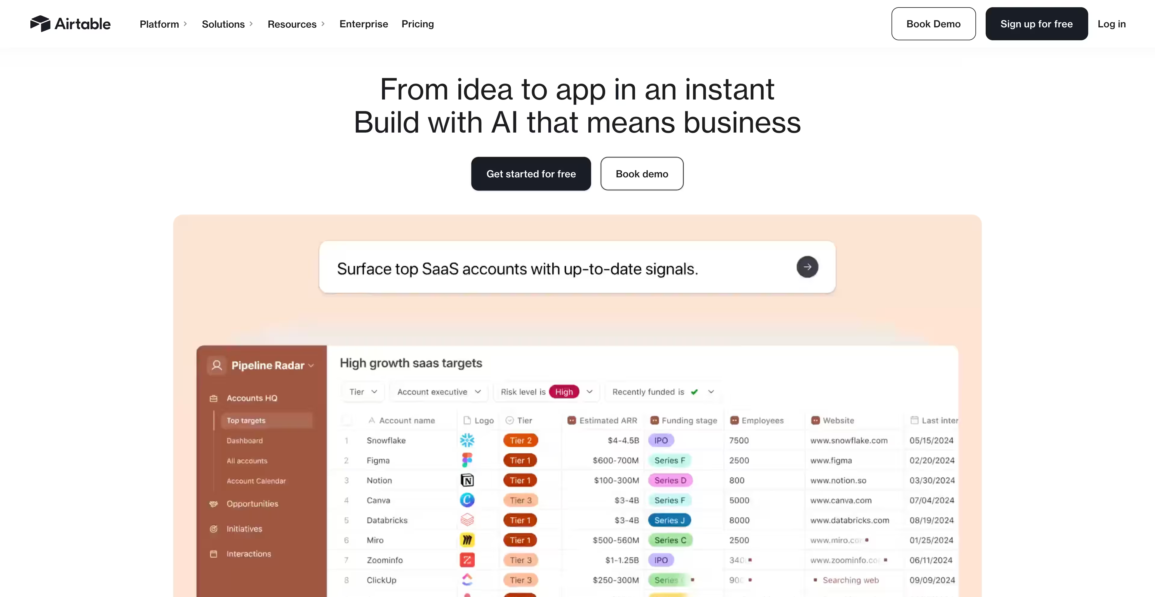
Airtable's shift toward enterprise and AI-powered results comes through immediately. The hero focuses on what teams achieve, followed by tight narrative sections on how workflows change. One of the strongest product-led SaaS homepages running right now, because it respects attention and proves value fast.
NitroPack: proof you can feel

When we redesigned NitroPack's website and refreshed their brand direction, the biggest unlock was simplifying the first interaction. Instead of talking about speed, the page lets you feel it: enter your URL, run a test, watch results appear. During testing we watched users skip the feature sections entirely and go straight for the input field. The fastest way to sell speed is to demonstrate it, and that single hero interaction lifted conversions by roughly 23% in the first two weeks. Speed is emotional. When users feel it in the first five seconds, they convert.
Brex: brand power with discipline
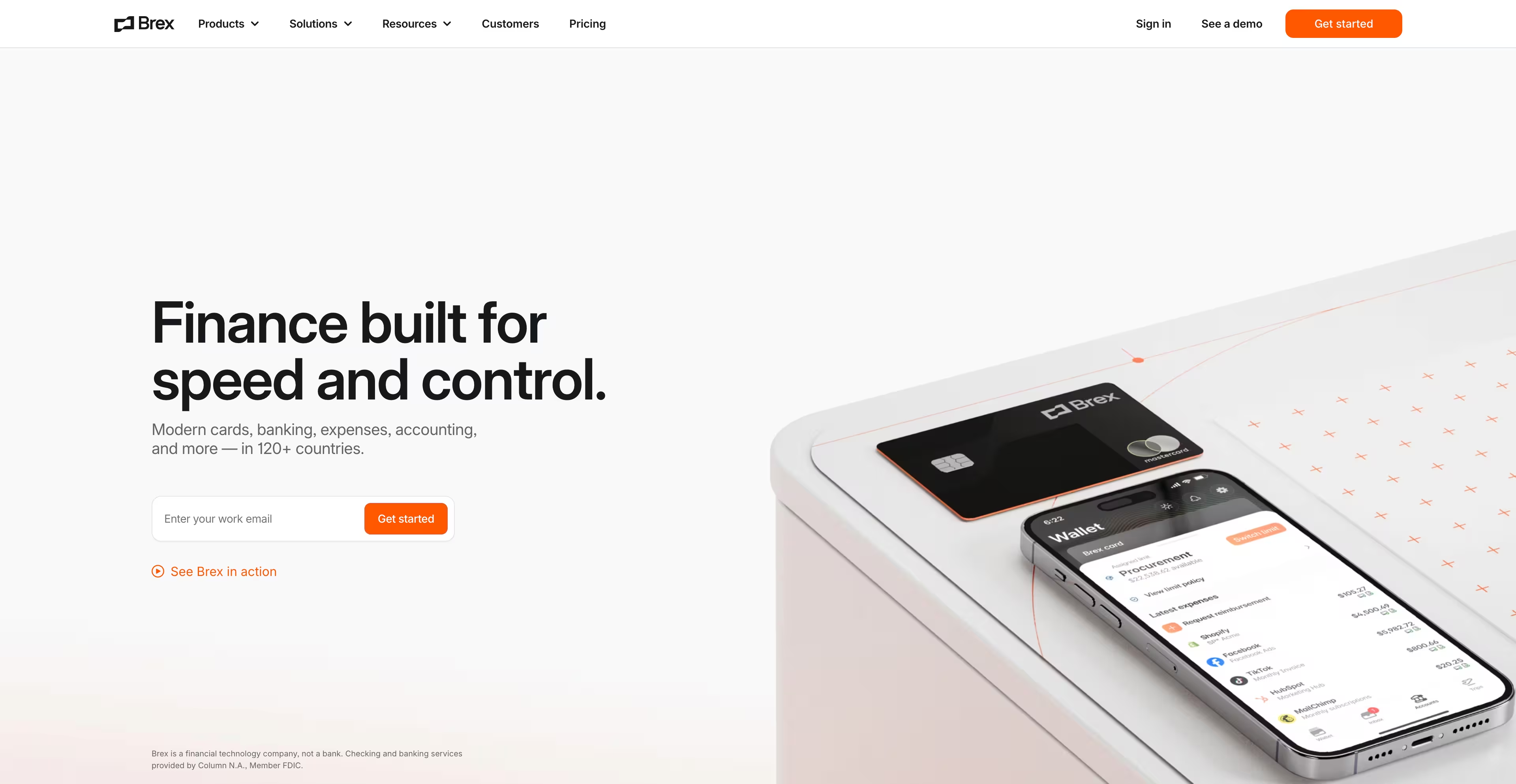
Brex blends bold branding with real product storytelling. People photographed on branded orange backdrops make the visuals unforgettable, and the 3D product elements read as premium rather than decorative. Slightly deeper product detail earlier in the flow would speed up first-visit understanding.
Supabase: built for developers, not tourists

Supabase talks directly to engineers: real code, benchmarks, and examples that prove capability in seconds. The full-dark design works because the audience lives in terminals. Substance builds the trust here, not slogans.
Payhawk: enterprise maturity, stated calmly

Payhawk owns a deep, distinctive green across the whole page and pairs it with real customer numbers and case studies above the fold. The product explanation lands immediately. More motion would balance the static structure, but this is enterprise storytelling done right.
Tailscale: complicated made friendly

Tailscale proves simplicity converts. Friendly typography, real UI flow, and a palette that breaks from cybersecurity-dark sameness. The message is exactly right for the product: it makes complicated infrastructure feel easy.
Vanta: friction removed at the door

Vanta opens with an email field and a CTA, inviting you to start instantly. No gates, no long explanations, product UI in the lead. The monochrome purple gets visually heavy in stretches, but the core lesson holds: reduce effort, increase conversion.
Rippling: people and product in balance
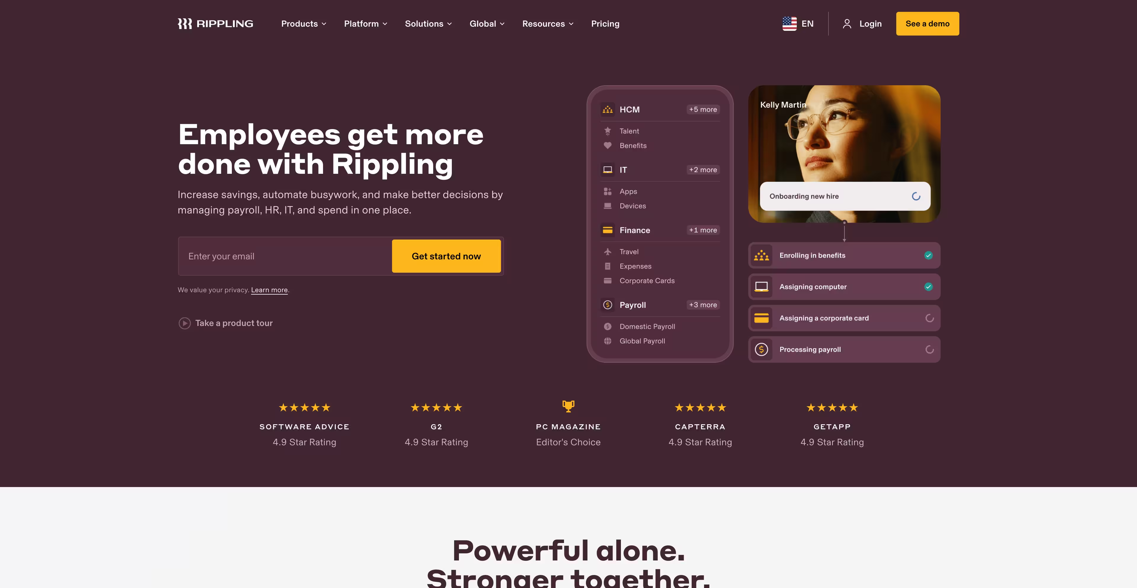
Rippling blends UI components with expressive portraits, making a workforce platform feel personal in a category full of blue-and-white sameness. The homepage is intentionally short, pushing depth to secondary pages. A little more upfront guidance on scope would help first-time visitors.
UiPath: reliability over decoration

UiPath opens with an AI input interaction that signals modern automation without jargon, then backs it with real examples and active thought leadership. Many of the UI elements feel generic, but when your product is mission-critical, reliability speaks louder than decoration.
SaaS website design trends for 2026
These are the modernity indicators buyers now use to judge whether a SaaS company's website is current, and every one of them earns its place by moving conversion, not by looking fashionable.
1. AI-powered personalization
Static one-size pages are dying. Visitors expect the hero message and product screens to adapt to their industry, role, or use case. On one platform we work with (a project we can't name publicly), adapting the hero message and product visuals to visitor type produced a measurable conversion lift. This is the direction serious SaaS teams are already moving.
2. Dynamic demos instead of pretty mockups
Show the real thing. Short micro-demos beat "book a call" gates every time. If a buyer can't understand your product without talking to sales, the website already failed.
3. Brutally simple hero messaging
The best-performing SaaS sites say one thing, loudly. One message, one CTA, one next step. No poetry.
4. Real proof above the fold
Logos, metrics, screenshots, and case study stats at the top, not near the footer. Show the win first, then explain the how.
5. Product plus human
The AI wave made every SaaS site look robotic, and now they all look the same. The strongest brands mix UI with real people and real environments. Humanity sells; screens alone don't.
6. Motion that explains, not entertains
Micro animations that show how something works beat cinematic intros that slow the page. A 6-second loading animation is lost revenue.
7. Opinionated minimalism
Black and white plus one bold accent is winning across enterprise SaaS. Simpler layouts convert better because the product becomes the centerpiece.
8. Try-before-you-talk signup
Input fields in the hero, interactive calculators, run-your-own-test flows. The fastest-growing tools remove friction instead of setting demo traps.
9. Performance as a competitive advantage
Speed is UX, and speed is money. If your homepage loads slower than two seconds, visitors bounce before your message exists.
The SaaS homepage framework that converts
A homepage has one job: make a visitor instantly understand what you do, why it matters, and what to do next. Here's the structure we use on redesign projects:
- Hero: one-sentence value prop, a support line on how it works, primary and secondary CTA.
- Product in motion: an interactive demo or short looping video of the real interface.
- Proof above the fold: three numbers max, plus logos or a testimonial.
- Problem to solution: the real pain points and how the product removes them.
- Benefits, not features: three or four outcomes.
- Social proof that matters: a case study snippet with real names and companies.
- Pricing preview: no paywall confusion, a plain next step.
- Final CTA: the "ready to start" moment.
The golden rule: if a visitor can't explain what you do and why it matters in ten seconds, you lose them.
Checklist: how to design or redesign a SaaS website
- Define your positioning and message: who you help, what you solve, why you're different
- Write a 6-to-10-word hero statement that lands instantly
- Add a primary CTA and a secondary CTA (demo vs. explore)
- Show the product immediately: real UI and motion, not illustrations
- Put proof above the fold: metrics, logos, testimonials
- Map the user journey to one path to action
- Find the friction points and remove them
- Convert features into outcomes
- Replace long explanations with micro demos or interactive elements
- Simplify navigation to 5 to 7 top-level items
- Build a pricing preview that isn't a trap
- Write scannable content: short lines, bullets, whitespace
- Make signup effortless: cut fields, add social auth, offer try-without-email
- Fix speed: LCP, CLS, image weight, animation load
- Design for mobile as the primary device
- Personalize by role, industry, or intent where the traffic justifies it
- Add credibility boosters: awards, ratings, press, numbers
- Audit analytics and heatmaps before redesigning anything
- Test one change at a time, measure, repeat
Closing
Most SaaS websites don't have a design problem. The message doesn't land, the proof is buried, or the friction is invisible until you watch a real user hit it. I've seen beautiful sites lose visitors in five seconds because the hero never said what the product does, and I've watched teams pour money into paid traffic while signups quietly died in onboarding.
The painful part: the fixes are rarely complex. They're small, they're knowable, and they've usually been ignored for months. Fix the message, move the proof up, cut the friction, and engagement, activation, and revenue start compounding together. That work is exactly what our conversion optimization practice exists for, and it's why Gridwise saw a 24% conversion lift after we rebuilt their site around those three jobs.
Most teams don't need another redesign. They need someone to say out loud what's obviously broken. If you want that kind of honesty, let's talk.