Key takeaways
- The UX/UI trends defining 2026: generative UI, AI-driven personalization, spatial design on flat screens, dark mode as a baseline, functional micro-interactions, and multimodal interfaces. The common thread is AI reshaping how interfaces get built.
- Personalization is architecture, not decoration. Swapping a greeting is 2022; restructuring the entire UI path per user type is what moves retention now.
- Depth needs a job. Spatial aesthetics only work when layering serves hierarchy; blur without purpose is noise, and even Apple retreated from maximum glassmorphism.
- Some trends deserve a funeral: Corporate Memphis illustration, desktop hamburger menus, and AI features without a use case are actively hurting products in 2026.
UX/UI trends in 2026 aren't about new color palettes or fresh icon sets. They're about AI in design rewriting the relationship between designers, developers, and the products they build. Interfaces that generate themselves. Personalization that goes way beyond "Hello, [First Name]." Spatial design aesthetics leaking out of headsets and onto every flat screen you own.
After shipping over 15 SaaS, fintech, and AI products in the last 18 months, we've watched some of these design trends hit hard and others quietly die. Here's what's actually working, what's already fading, and what it means for your product.
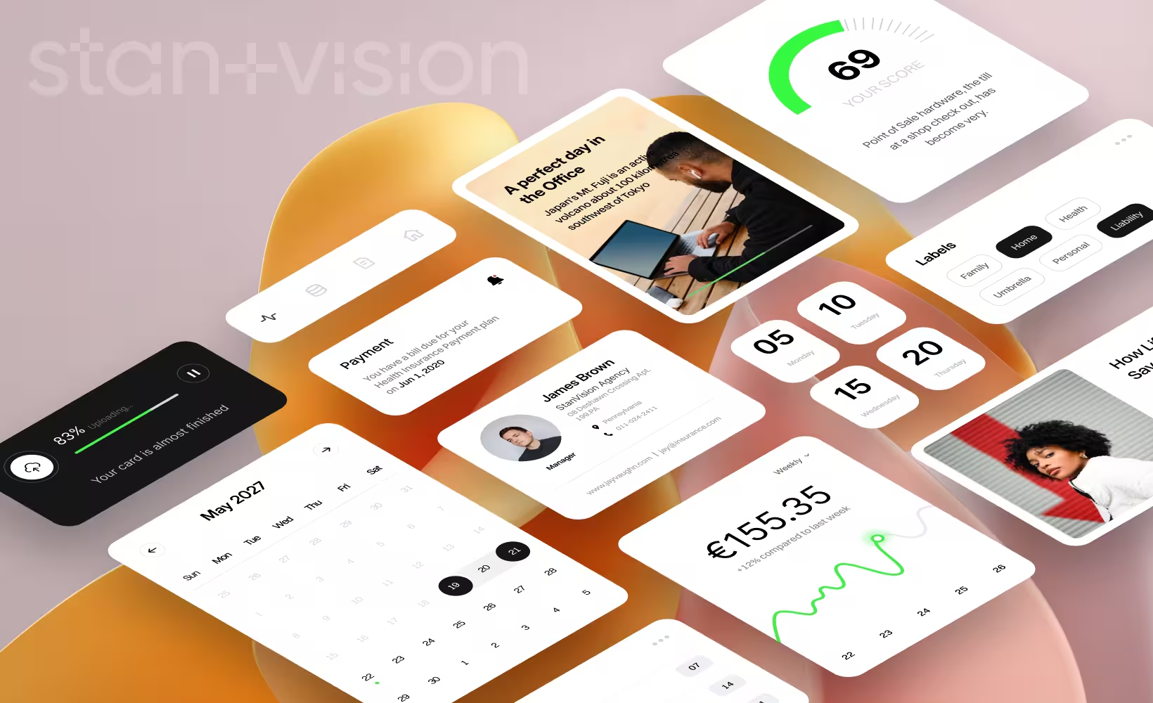
2026 UX/UI trends at a glance
Before we go deep, here's a quick reference. Bookmark this.

Generative UI: interfaces that build themselves
Here's a strong opinion: generative UI will kill the traditional design handoff within two years. If your team still passes static Figma mockups to developers and calls that a "process," you're building for 2022.
Generative UI means interfaces aren't pre-designed. They're created dynamically by AI based on what the user needs, right when they need it. Not a template with variables swapped in: a fundamentally different layout, content structure, and interaction pattern generated on the fly.
The clearest early pattern is the death of the fixed dashboard. Products with role-based analytics used to ship five or six hand-designed report views, each with its own maintenance cycle. The generative approach replaces them with one adaptive view that restructures itself around the user's role, recent activity, and the data they actually pull. The screens stop being artifacts someone designed and start being outputs of a system someone designed. That distinction is the whole trend.
Teams using AI design tools like Figma Make are already shipping features 40–60% faster. And that gap is only widening. The companies that figure out generative UI early aren't just saving time; they're building products their competitors can't copy by throwing more designers at the problem.
How does this affect your business?
The design-to-development pipeline shrinks dramatically. Smaller teams ship faster. But more importantly, the competitive advantage shifts from "who has the best design team" to "who has the best design system feeding their AI." If your design system is messy, generative UI will amplify the mess. Get the foundation right first.

AI-driven personalization is no longer optional
The direction of travel is blunt: businesses across every category are already using AI for personalization, and McKinsey's data shows companies that excel at it generate 40% more revenue than those that don't. Gartner predicts 30% of all new apps will use AI-driven adaptive interfaces by 2026, up from under 5% just two years earlier. This isn't a trend. It's a new baseline.
But here's what most teams get wrong. They think personalization means surface-level tweaks. Swapping a greeting. Recommending a blog post. Changing a banner image. That's decoration.
Real personalization restructures the entire UI path. The pattern we push clients toward: stop showing the same seven-step onboarding wizard to everyone. Detect whether the user is technical or business-side within the first interactions, then serve genuinely different experiences. Technical users get API docs and sandbox access upfront. Business users get a guided tour with pre-loaded sample data. Same product, two paths, each one shorter than the compromise version that tried to serve both.
That's not personalization as a feature. That's personalization as architecture.
How does this affect your business?
Churn drops when users feel like the product was built for them specifically. But you can't bolt this on after launch. Personalization needs to be a structural decision, baked into your information architecture from day one. Start with two or three distinct user archetypes and build divergent paths. You can always add more later.

Spatial design hits flat screens
Apple's "Liquid Glass" design language changed the conversation. Depth, translucency, layered elements, soft lighting cues: these aren't trapped inside Vision Pro anymore. They're showing up in iOS, macOS, and every design system that takes cues from Cupertino. Which is most of them.
But here's the disconnect nobody's talking about enough. Only a small fraction of designers actually build for spatial or 3D platforms. Everyone else is borrowing the aesthetic without understanding the logic behind it.
Depth isn't decoration. It's hierarchy.
When Apple uses a frosted glass layer, it's telling you "this content sits above that content." When it adds a subtle shadow, it's creating a spatial relationship your brain processes faster than reading a label. That's the point. But most teams just slap a blur effect on a card and call it modern.
Nielsen Norman Group flagged this directly: the trend is prioritizing visual spectacle over usability. We agree. In a recent SaaS dashboard redesign, we used spatial layering to create a clear three-tier hierarchy: background data, active workspace, and contextual actions floating above. It worked because the depth had a job. Each layer meant something.
If your glassmorphism doesn't guide attention, it's just noise.
How does this affect your business?
Visual freshness genuinely matters for perceived product quality. Users associate modern aesthetics with product reliability, fair or not. But depth cues have to serve your information architecture, not fight it. Use layering to reinforce what's important. If you can remove the blur effects and your hierarchy still makes sense, you've done it right.

Dark mode evolution: from feature toggle to design standard
This one is simple. Surveys consistently put dark mode adoption above 80% of users. It's not a feature request anymore. It's a baseline expectation.
But "supporting dark mode" and "designing for dark mode" are very different things.
Terra published a case study worth paying attention to: after implementing a properly designed dark mode, they saw a 60% reduction in bounce rate and 170% more pages viewed per session. Those aren't small numbers. That's a fundamentally different user experience.
We learned this the hard way with a SaaS client last year. They had dark mode, technically. An engineer had inverted the colors, tweaked a few contrast values, and called it done. The result? Unreadable text on certain screens. Inconsistent component colors. A dark theme that felt harder to use than the light version. Users were toggling back to light mode within minutes.
We rebuilt it from scratch, treating dark mode as a first-class design surface, not a CSS filter. New color tokens. Adjusted elevation shadows. Rethought contrast ratios for every component state. Retention among power users, the people spending 4+ hours daily in the product, improved noticeably within the first month.
There's a sustainability angle here too. OLED screens running dark mode save 39–47% battery at full brightness. Performance, user experience, and sustainability all pointing in the same direction is rare. Take advantage of it.
How does this affect your business?
If your power users spend hours in your product daily, dark mode is a retention lever, not a nice-to-have. But it requires dedicated design effort. A color-inverted version of your light theme will do more damage than having no dark mode at all. Budget the time to do it properly, or wait until you can.
Micro-interactions as core UX infrastructure
Micro-interactions used to be a "polish" item. Something you added at the end of a project if the timeline allowed it. A nice-to-have. A cherry on top.
That era is over.
A/B studies keep landing on the same direction: well-designed micro-interactions measurably speed up task completion and cut user errors. For a SaaS product with 50,000 active users, fewer errors means thousands fewer support tickets per month. That's a line item on your P&L.
The shift we've made at StanVision, and what we push every client toward, is treating micro-interactions as part of the information layer, not the presentation layer. An animation shouldn't just look good. It should tell the user something they'd otherwise have to read or figure out on their own. It's the same discipline we apply to card interactions and states: every state change earns its motion.
Here's what functional micro-interactions look like versus decorative ones:
How does this affect your business?
Start by auditing your product's error states and confirmation moments. Those are the highest-impact spots for functional micro-interactions. If a user can complete a task wrong, there should be a micro-interaction preventing it, not just an error message after the fact. Prevention is always cheaper than correction.

Voice UI and multimodal interfaces beat voice-only
The Humane AI Pin flopped. The Rabbit R1 flopped. Voice-only interfaces as a standalone product category? Pretty much dead on arrival.
But voice UI as part of a larger system? That's a different story entirely.
The interfaces winning right now combine voice, touch, gesture, and visual feedback into a single coherent experience. Not "we added a voice command feature." More like: the interface understands which input mode makes sense for which moment, and adapts accordingly.
Gartner projects conversational AI will cut contact center labor costs by $80 billion in 2026. And by 2028, 30% of Fortune 500 companies will consolidate to a single AI-enabled channel that blends text, voice, and visual interaction.
The design challenge here is significant. These aren't separate features that can be designed in isolation and stitched together. They need to be conceived as one system from the start. When does the interface listen? When does it show? When does it let you tap? Getting those transitions wrong creates an experience that feels broken, not futuristic.
Our experience working with AI-heavy products taught us something important: the hardest part isn't building the multimodal capability. It's designing the handoff between modes. The moment voice ends and visual begins. The moment a gesture triggers a screen change. Those seams are where the experience lives or dies.
How does this affect your business?
If you're building customer-facing support or onboarding flows, multimodal is where the cost savings are. But start with two modes, not four. Voice plus visual is the most natural pairing. Get that right before adding gesture or haptics. And invest heavily in the transition design between modes; that's where most products fall apart.
What these trends mean for SaaS products
The SaaS translation of all this is unusually direct, because SaaS websites and products carry the trends at the same time.
On the marketing site, the 2026 pattern is personalized heroes and product visuals by visitor type, dark-mode-native product screenshots (your dashboard screenshots should look right in both themes, because buyers will see both), and spatial layering used to make the product shot the unmistakable top layer of the page. We covered the conversion side of this in depth in our breakdown of what makes SaaS website design convert; the trends here are the visual layer on top of that same discipline.
Inside the product, the priority order for a SaaS team in 2026 is: personalization architecture first (divergent onboarding by user type), functional micro-interactions on error and confirmation states second, and a properly designed dark theme third. Generative UI is the horizon, and the preparation for it is unglamorous: clean your design system now. This is the exact sequence we work through with SaaS teams, and the teams that follow the order see compounding gains because each layer feeds the next.
Fintech and banking: where the trends bite hardest
Fintech is the stress test for every trend on this list, because the cost of a confusing interface is measured in trust, not just clicks.
Dashboards are where it shows first. Banking and fintech dashboard design in 2026 is converging on the same three-tier spatial hierarchy: background data, active workspace, contextual actions. Depth cues work harder here than anywhere else, because financial data density punishes flat hierarchy. Dark mode matters more too: finance power users live in these products for hours, and the retention effect compounds.
The trend to treat with the most suspicion in this vertical is aggressive personalization. Adapting a fintech interface per user is powerful, but regulators and users both expect consistency in how financial information is presented. The rule we apply on fintech design work: personalize the path, never the numbers. Change what a user sees first, never how a balance, fee, or risk figure is displayed. That line is where fintech UX in 2026 either builds trust or burns it.
What's no longer trending in 2026
Not everything gets to be a trend. Some design trends deserve a funeral.
Glassmorphism overload. Ironic, given that spatial design is trending. But there's a difference between purposeful depth and blurring everything in sight. Apple launched Liquid Glass with huge fanfare and added a "turn off Liquid Glass" toggle just seven weeks later after user backlash. If Apple can't make maximum glassmorphism stick, maybe don't build your entire design system around it.
Corporate Memphis illustration. Those flat, disproportionate-limb characters that populated every SaaS landing page from 2019 to 2023? Dead. They now signal "generic" louder than anything else on your site. If your homepage still has a purple person with noodle arms reaching for an oversized laptop, it's time for a refresh.
Hamburger menus on desktop. Nielsen Norman Group's research on hidden navigation keeps finding the same thing: it measurably reduces discoverability and feature usage. On mobile, fine; screen real estate is limited. On desktop, hiding your navigation behind three lines is leaving money on the table. We've seen it repeatedly: exposing primary navigation on desktop directly correlates with higher feature adoption.
"Add AI" with no use case. This one stings because it's everywhere. Designers across the industry report the same conversation: clients demanding AI features without a clear use case. "Our competitors have AI" is not a product strategy. "Our users need X and AI can solve it 3x faster" is. If you can't finish that sentence, don't add the feature.
The 2026 UX/UI trends checklist
Before your next product cycle, run through this:
- Generative UI readiness: Is your design system clean enough for AI to build from? Or is it a patchwork of one-off components?
- Personalization architecture: Are you serving different user types different experiences? Or the same flow for everyone?
- Spatial design with purpose: Are your depth cues serving hierarchy, or just looking trendy?
- Dark mode as a real product: Is it designed, or just inverted?
- Functional micro-interactions: Do your animations communicate information, or just move things around?
- Multimodal thinking: If you're adding voice or AI chat, have you designed the transitions between input modes?
- Dead trend audit: Are you still using Corporate Memphis, desktop hamburger menus, or glassmorphism for its own sake?
If you checked more than two boxes with uncertainty, your product's design needs a hard look before 2026 is over. This audit is standard practice in our UI/UX design work, and we run it for SaaS and fintech teams every week. Book a free design consultation and we'll tell you exactly where your product stands, and what to fix first.
Frequently asked questions
What are the biggest UX/UI trends in 2026?
The dominant UX/UI trends in 2026 are generative UI (AI-created interfaces), AI-driven personalization, spatial design aesthetics on flat screens, dark mode as a baseline expectation, functional micro-interactions, and multimodal interfaces combining voice, touch, and visual feedback. The common thread is AI in design reshaping how interfaces are built and experienced.
How is AI changing UX design in 2026?
AI in design is shifting UX roles from pixel-level production to strategic problem-solving. Tools like Figma Make help teams ship 40–60% faster, while generative UI creates interfaces dynamically based on user behavior. The designer's job is increasingly about building systems and rules, not individual screens.
Is dark mode important for SaaS products?
Yes. With adoption consistently above 80% of users in surveys, dark mode is a baseline expectation, not a feature. Properly designed dark mode has been shown to reduce bounce rates by 60% and increase pages per session by 170% in published case studies. For power users spending hours in your product, it directly affects retention and satisfaction.
Why is spatial design trending in 2026?
Apple's Liquid Glass design language pushed depth, translucency, and layered elements from spatial computing into mainstream 2D screen design. Only a small fraction of designers build for actual spatial platforms, so the trend is primarily aesthetic: borrowing spatial principles to create visual hierarchy on traditional screens.
What design trends are SaaS websites using in 2026?
SaaS website design trends in 2026 center on personalized hero sections that adapt by visitor type, dark-mode-native product screenshots, spatial layering that makes the product shot the clear focal point, and functional micro-interactions on signup and pricing flows. The underlying shift is the marketing site adopting the same AI-driven, system-based design approach as the product itself.
What UX trends are fading in 2026?
Corporate Memphis illustration, desktop hamburger menus, and excessive glassmorphism are all declining. Apple retreated from aggressive Liquid Glass within weeks of launch, hidden desktop navigation measurably reduces discoverability, and AI features added without a clear use case are burning budgets without adding value.

Stan Kirilov
Stan has led design for over 20 years, first as a hands-on designer, now as Experience Director at StanVision. He works with SaaS and fintech companies, from first-time founders to global brands, on products and websites built to convert, not just to look good.
He serves on the Awwwards jury and still reviews every project that ships. His standard is simple: if a design doesn't perform, it isn't finished.