
Open any SaaS product, any fintech dashboard, any e-commerce store — you'll find cards. A UI card is a self-contained surface that groups one concept — image, title, description, and a single action — into a distinct, tappable unit. They're the most common UI component in modern digital design, and they have been for over a decade.
That's not an accident. Google shipped its first card based design in 2012 with Google Now. Two years later, Material Design codified cards as a formal pattern — and material design cards became the foundation of Android's entire component library. Pinterest turned them into the default way to browse visual content. By 2014 — the same year mobile traffic overtook desktop for the first time — cards were everywhere.
But "everywhere" doesn't mean "done well."

We've reviewed hundreds of SaaS and fintech interfaces over the past three years. And here's the uncomfortable truth: most card implementations are lazy. Teams default to cards because it's the safe choice, not because it's the right one. They cram too much into each card, scatter actions everywhere, and never ask whether a simple list would've done the job better.
This article breaks down what actually works. We'll walk through the most common UI card examples, show you best practices with real card layout examples, and point out the mistakes we see over and over — including a few we've made ourselves.
Common UI card patterns
Not every card UI pattern serves the same purpose. Each card component has a specific job, a specific hierarchy, and a specific set of elements that belong inside it. Treating them as interchangeable containers is the first mistake most teams make. Here are the seven patterns you'll encounter most often.
Product cards
The workhorse of e-commerce. A product card has one job: get someone to click through or add to cart. That’s it.
The anatomy is straightforward — image, title, price, rating, CTA. But execution matters more than the elements themselves. Good product card design is less about which elements you include and more about which ones you emphasize. Research from FoxEcom shows that over 60% of customers are more likely to purchase when the product card is well-designed. And 63% say a product’s visual quality online matters more than descriptions or reviews.
Amazon nails the hierarchy: image dominates, price sits right below, Prime badge and star rating give instant trust signals. Nike takes a different approach — hover effects rotate images and reveal hidden brand labels. Both work because they prioritize the right thing for their specific audience.
In a Shopify-based fintech product we redesigned last quarter, the original product cards had six competing elements above the fold. We stripped it to three — image, name, price — and click-through to the detail page jumped 34%. Less really was more.

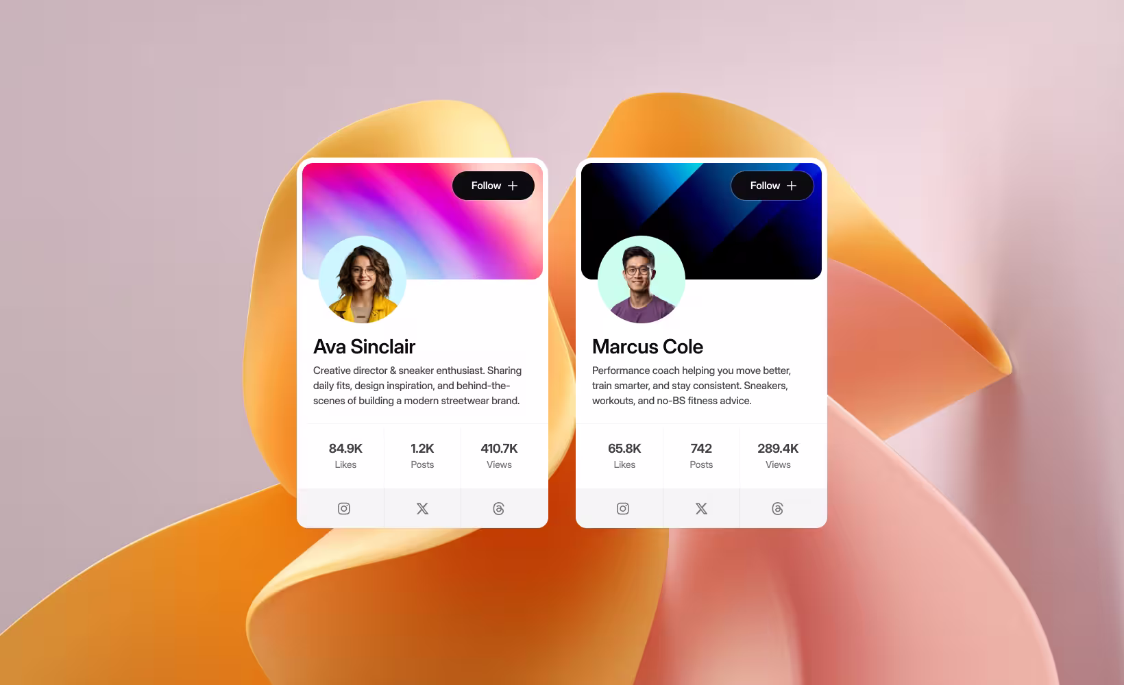
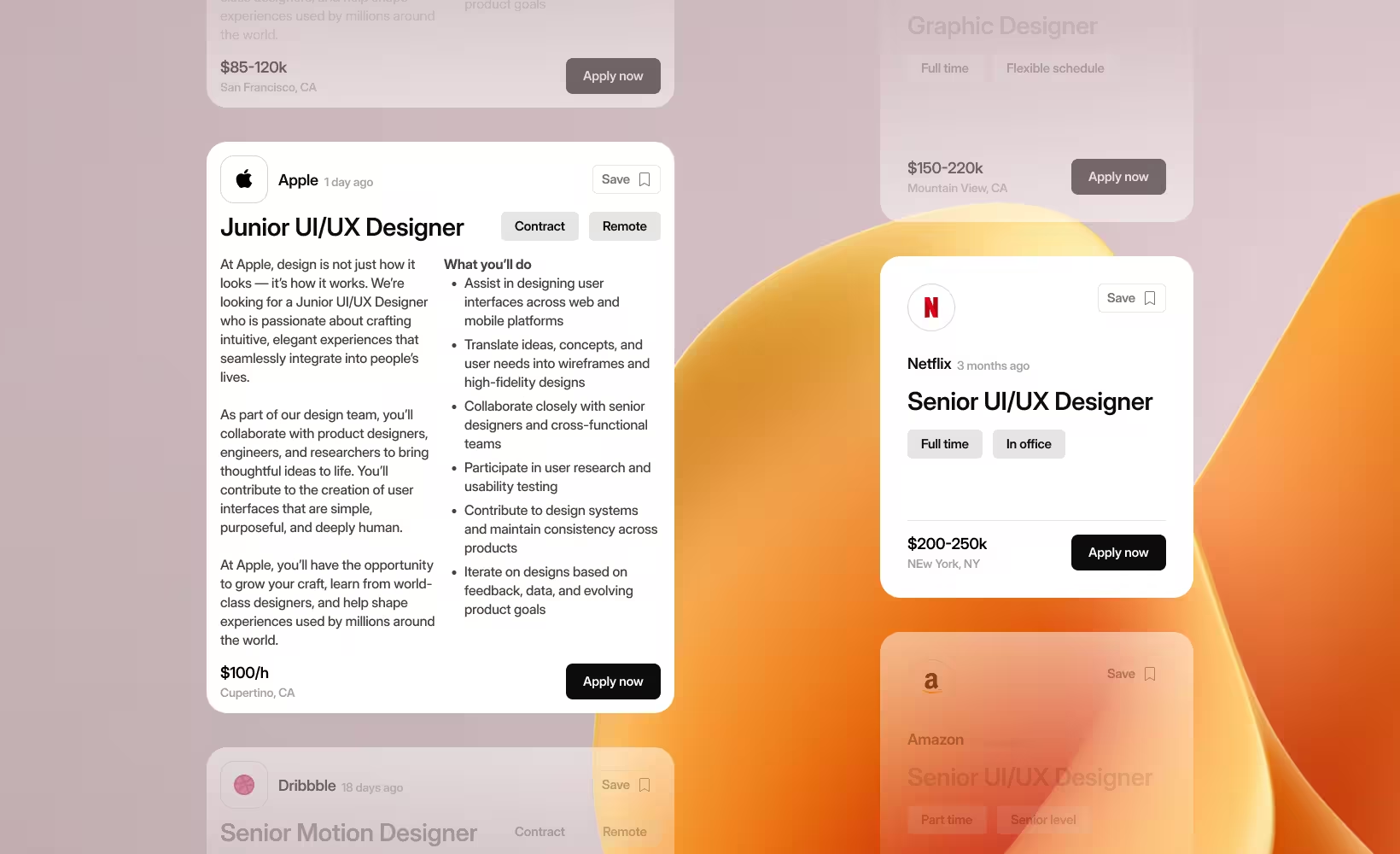
Profile and user cards
Profile cards are digital business cards. Avatar, name, role, a Follow or Connect button, maybe a stats row. LinkedIn, Twitter/X, GitHub, Dribbble — they all use this pattern.
The key decision is information density. Twitter’s hover cards show just enough to decide whether to follow someone. LinkedIn packs in mutual connections, headline, and company. Slack keeps it minimal — avatar, name, status, and a Message button.
The mistake we see most often in SaaS? Treating profile cards as mini-resumes. In a collaboration tool we worked on last year, user cards initially showed name, title, department, location, timezone, email, phone, and last active date. Eight data points for a card that appears on hover. We cut it to four — name, role, status, and one action button. Hover engagement went up, support tickets about “cluttered UI” went down.
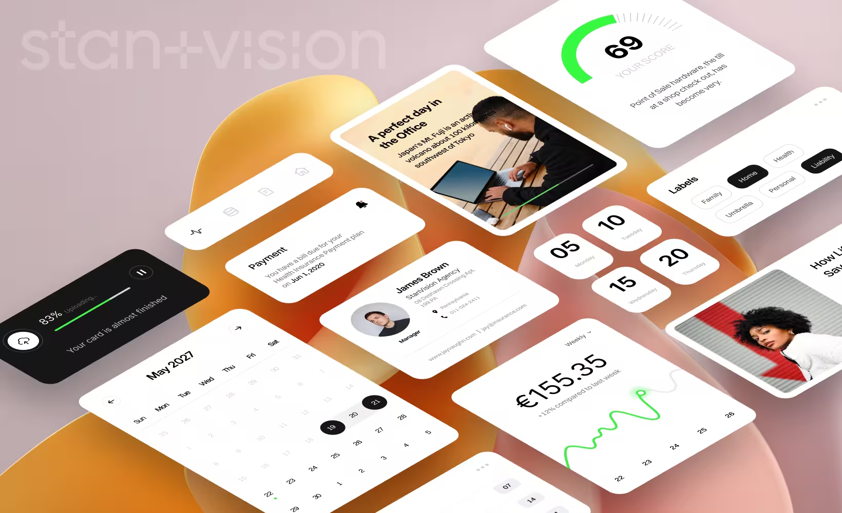
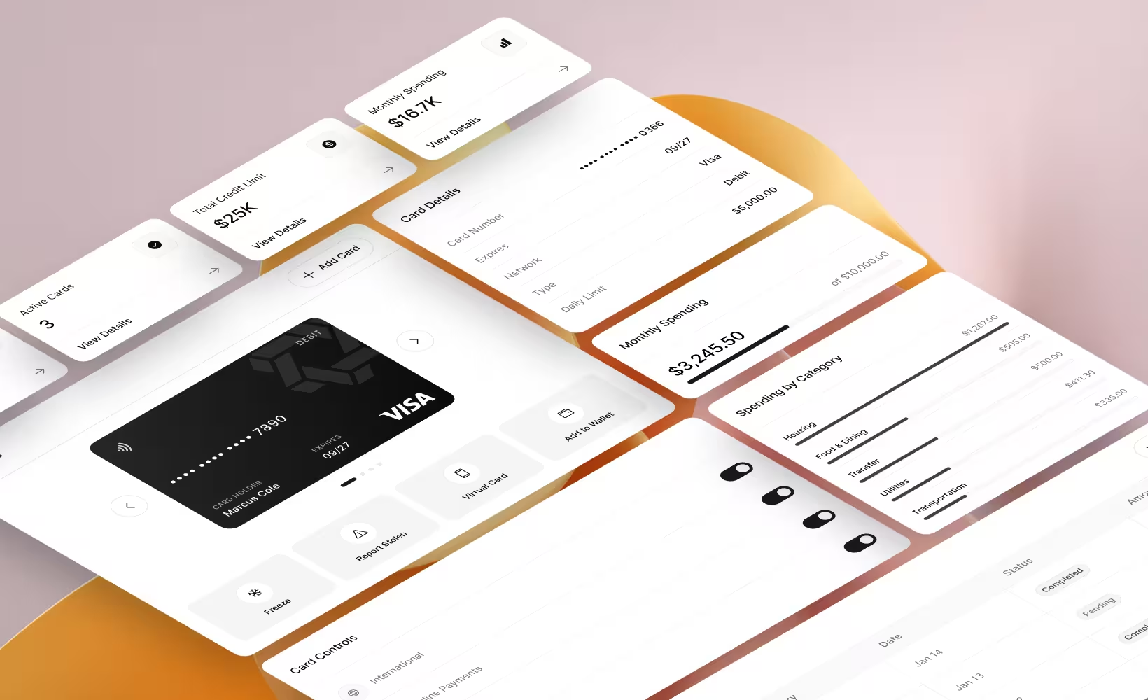
Dashboard and stat cards
If you build SaaS, you build dashboards. And dashboards live or die by their stat cards. A well-designed dashboard card answers one question at a glance: is this number going up or down?
The pattern: a big number, a label, a trend indicator (green arrow up, red arrow down), and sometimes a sparkline. Stripe does this beautifully — revenue, payments, customer count, each with percentage changes and mini graphs.
The trap is showing too many metrics at once. We worked with a B2B SaaS company whose analytics dashboard had 14 stat cards visible without scrolling. Users told us the dashboard was “overwhelming.” We grouped them into three priority tiers, defaulted to showing only the top five, and let users expand the rest. Time-to-insight dropped from over 45 seconds to under 15.
A stat card that requires explanation has already failed. If someone needs to read a tooltip just to understand what the metric is, the card isn’t doing its job.
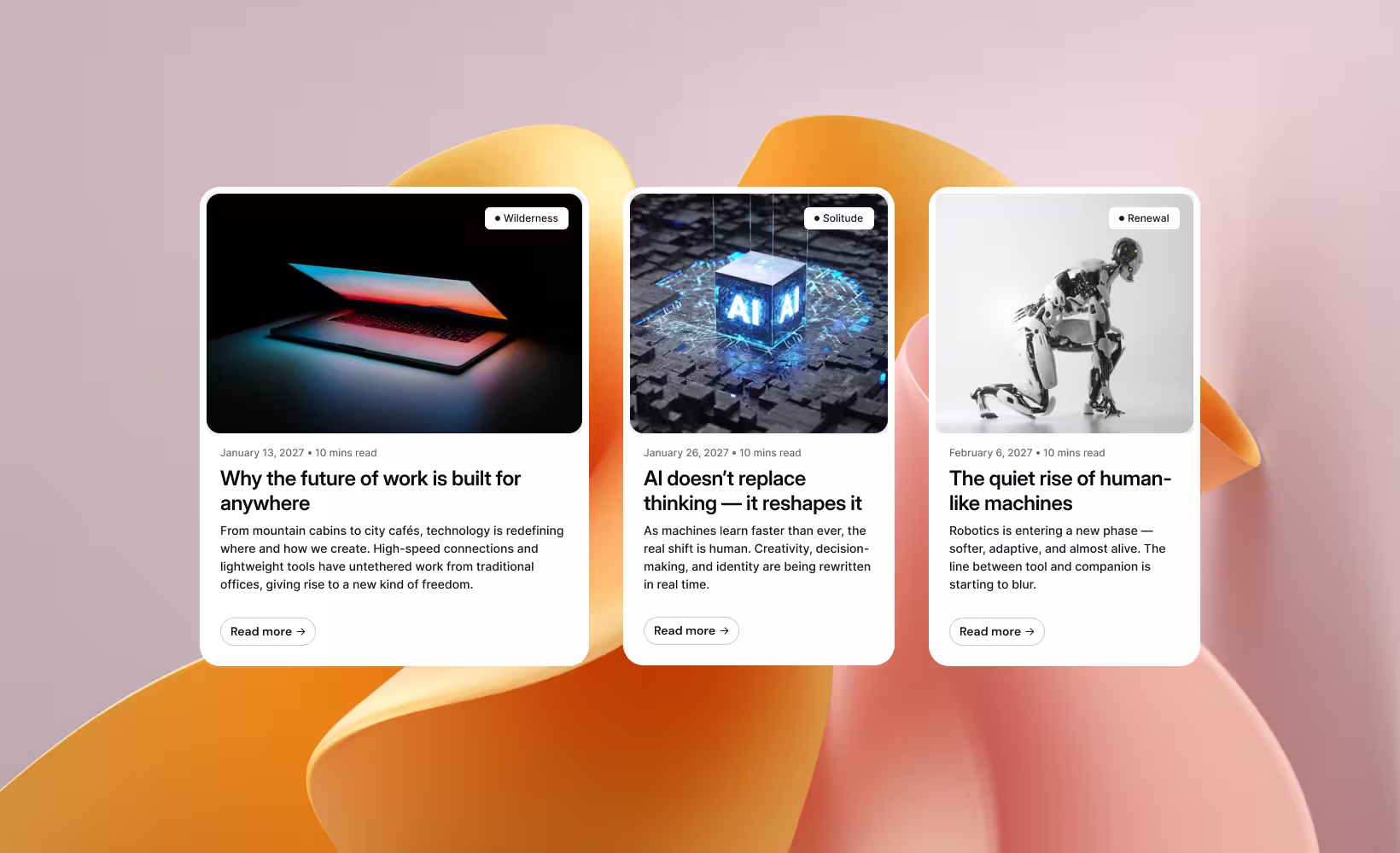
Article and blog preview cards
Featured image, headline, excerpt, author, date, read time. Medium popularized this pattern and it hasn’t changed much since.
The hierarchy matters: image grabs attention, title gives the topic, excerpt earns the click. Dev.to adds tags and reaction counts. BBC keeps it minimal — image, headline, category tag. Both work because they match their audience’s browsing habits.
One thing we’ve learned building content-heavy SaaS platforms: the excerpt makes or breaks the card. Two lines, maximum. If you’re truncating at 150 characters and the sentence cuts off mid-thought, you’ve lost the click. Write excerpts specifically for cards — don’t just auto-truncate the first paragraph.
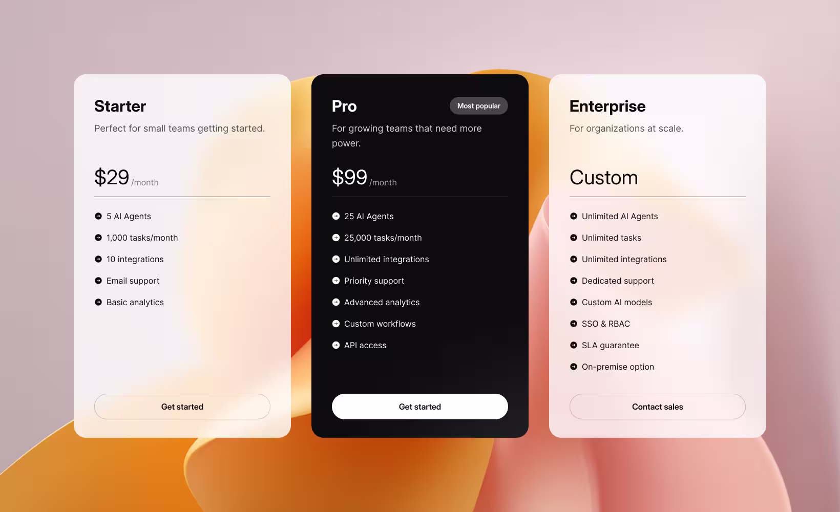
Pricing cards
Pricing cards aren’t really cards in the browsing sense. They’re comparison tools disguised as cards.
Every SaaS company from Slack to Notion to Figma uses the same basic structure: plan name, price, billing toggle, feature list, CTA button, and a “Most Popular” badge on the middle tier. It works. Don’t reinvent it.
But here’s our strong take: most SaaS pricing cards are too long. They list 15+ features per tier when research consistently shows people compare 3–5 features maximum before deciding. Mailchimp, Shopify, Dropbox — they all fall into this trap.
After redesigning pricing pages for three SaaS clients in the past year, our rule is this: show the five features that actually differentiate the tiers on the card itself. Put the full comparison in an expandable table below. Conversion rates improved between 8% and 22% across those three projects.
Notification and alert cards
Toasts, push notifications, snackbars, in-app alerts — they’re all card variants with one thing in common: they interrupt.
The best notification cards acknowledge that interruption and get out of the way fast. Toast notifications auto-dismiss in 3–8 seconds. Gmail’s “Message sent” snackbar includes an Undo button. Slack’s notification cards show channel, sender, and a message preview — just enough to decide if it’s worth switching context.
The number one mistake: notification cards that demand too much attention. If your alert card has more than two action buttons, it’s not a notification — it’s a modal pretending to be one.
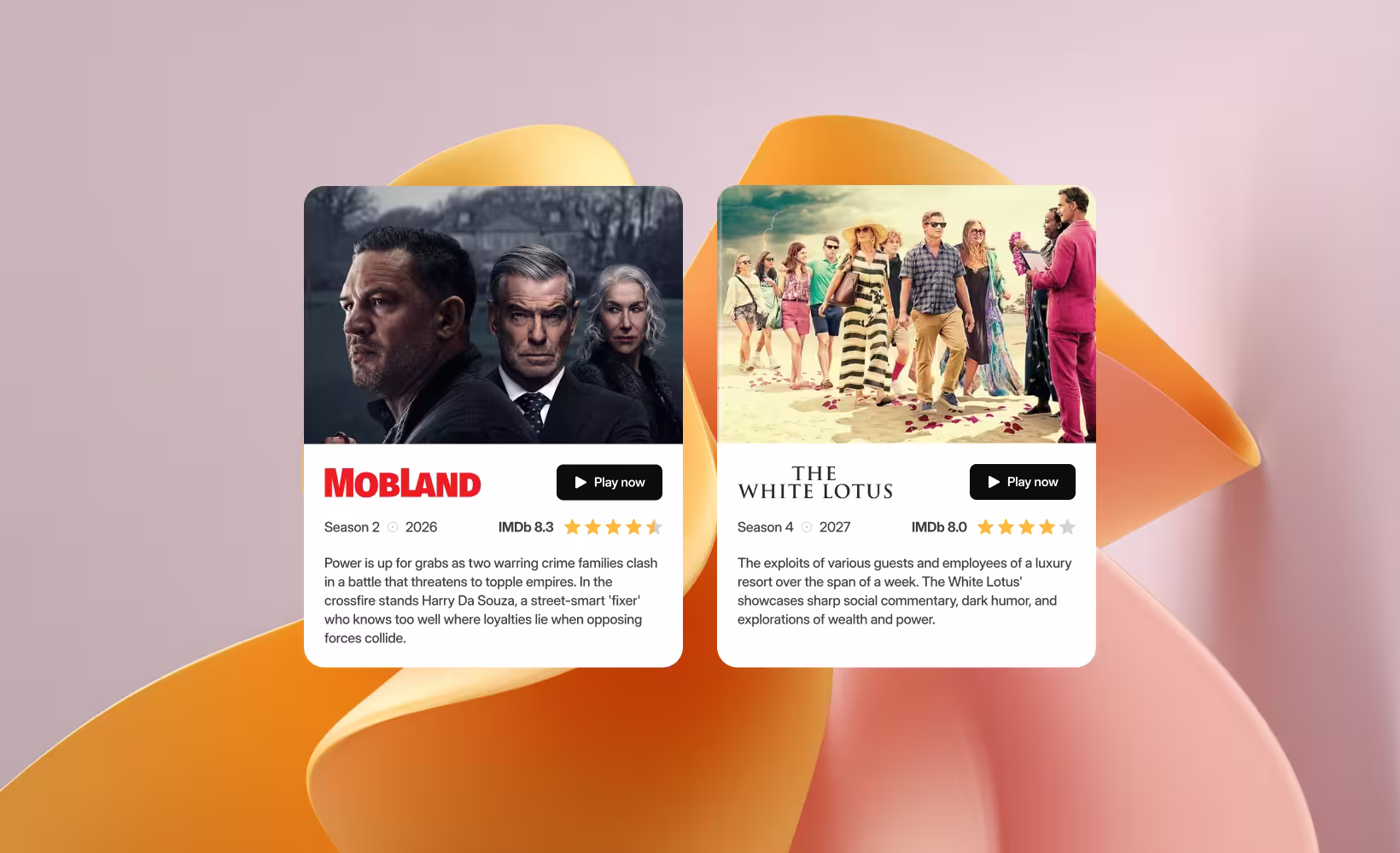
Media cards
Pinterest, YouTube, Netflix, Spotify, Instagram. Media cards let the visual content speak — the media element takes up 60–80% of the card area.
Netflix’s implementation is still the gold standard. On hover, cards expand to show a trailer preview, match percentage, and action buttons. YouTube shows a silent preview on hover with a duration badge. Both reduce the cost of deciding what to watch next.
The lesson: media cards should front-load decision-making information. If someone has to click through to figure out what the content is, the card has failed at its one job.
Best practices for card design
1. One idea per card — no exceptions
Material Design states it plainly: a card is a single, contained unit. It can’t merge with another card or split into multiple cards. We’ve seen SaaS dashboards where a single card displays revenue AND user count AND conversion rate. That’s not a card — it’s a compressed spreadsheet. One card, one concept. Every time.
2. Keep text under 100 characters
Cards are entry points, not destinations. If you’re writing paragraphs inside a card, you’ve lost the plot. Under 100 characters for the summary text. Two short sentences max. Everything else lives on the detail page.
3. Establish a clear visual hierarchy
The user’s eye should move from most important to least important without thinking about it. Material Design recommends placing primary content at the top or using typography to create emphasis. In practice: your title should be noticeably larger than your description, and your CTA should be visually distinct from everything else on the card.
4. One primary action per card
Each card gets one clear primary action — usually, the card itself is the click target. Secondary actions like share or bookmark should be visually quieter and limited to two at most. Andrew Coyle, formerly at Google and Intuit, puts it simply: don’t include inline links. A card is a singular link or a limited set of actions. If you need more than two supplemental actions, use an overflow menu.
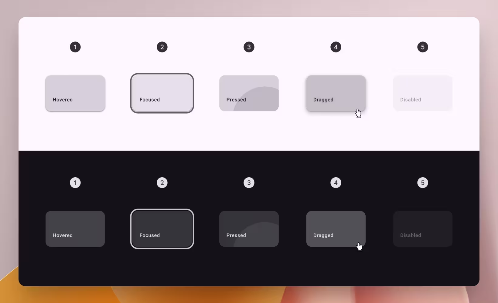
5. Make cards visually distinct from the background
Borders, shadows, or contrasting backgrounds — pick one. NNGroup notes that drop shadows act as clickability signifiers, telling people the card is interactive. Material Design offers three approaches: elevated (shadow), filled (contrasting surface), or outlined (border). Cards default to 2dp elevation and gain 8dp on hover. Whichever you choose, make sure the card reads as a separate, tappable object.
6. Design responsively from mobile up
Square cards work better on mobile. Rectangular cards work better on desktop. Start with a single-column mobile layout, then expand to two columns on tablet and three or four on desktop. Material Design’s 12-8-4 column grid handles this well. And test with real content at every breakpoint — placeholder text at 320px wide is a lie.
7. Use cards for mixed content — lists for uniform data
This is where most teams go wrong. NNGroup is clear: cards work for heterogeneous content — mixed types, varied formats, browsing scenarios. But if you’re displaying a list of identical items that need sorting or comparing, a table or list view is better. Cards are terrible for search results. They hide ranking, waste space, and slow scanning. Yet we see SaaS products using card grids for everything from search results to settings pages.
8. Lock down your spacing system
Consistent internal padding (16px is the standard), consistent gutters, consistent image aspect ratios. Material Design specifies margins and gutters of 8, 16, 24, or 40dp on an 8dp grid. Shopify Polaris defaults to 8px border radius with 16px padding. Pick your numbers, document them, and don’t deviate. Inconsistent spacing is the fastest way to make a polished product feel amateur.
Common mistakes in card design
Overloading cards with content
Wrong: Cramming title, description, tags, author, date, read time, share buttons, bookmark icon, and a 3-line excerpt into a 280px-wide card.
Right: Title, one line of metadata, one visual element, one action. Everything else goes to the detail page.
ALF Design Group has a useful rule of thumb: if you need to shrink text below 14px to fit content, your card has too much information. We use this as a literal checkpoint in our design reviews.
Scattering actions across the card
Wrong: A gear icon top-right, a trash icon bottom-left, an inline text link in the description, and a button at the bottom.
Right: One primary action (the card itself as the click target), secondary actions grouped at the bottom, an overflow menu for the rest.
When actions live in unpredictable locations, people hesitate. That hesitation compounds across a grid of 20 cards into genuine frustration.
Jagged card heights from uneven content
Wrong: One card has a 3-word title, the next has a 15-word title. One has a 2-line excerpt, the next has 5. The grid looks like a broken staircase.
Right: Truncate text at fixed character counts. Use consistent image aspect ratios. Or lean into masonry layout where variable heights are the design choice, not an accident.
NNGroup’s eye-tracking research found that irregular card layouts cause people to scan in semirandom patterns — looking back and forth repeatedly, wasting time and mental energy.
Ignoring accessibility
Wrong: Wrapping the entire card in a single link tag, which makes screen readers announce all card content as one continuous, unstructured string.
Right: Make the card title the primary link, use CSS pseudo-elements to extend the clickable area visually, provide keyboard focus indicators, and follow WCAG contrast guidelines.
UC Berkeley’s accessibility guide specifically calls out the whole-card-as-link pattern. It’s the single most common card accessibility failure we encounter in audits.
Forcing cards where they don’t belong
Wrong: Using a card grid for search results, data tables, sequential forms, or settings pages.
Right: Lists for ranked content. Tables for data-heavy comparisons. Cards for browsing diverse collections.
Cards de-emphasize hierarchy and ranking. That’s a feature when you’re browsing Netflix. It’s a bug when you’re looking for a specific setting in a SaaS admin panel.
Designing desktop-first, then squishing for mobile
Wrong: A 4-column card grid that shrinks to four tiny, unreadable cards on a 375px screen.
Right: Design mobile-first: single column on phone, two on tablet, three or four on desktop. Test with real content at every breakpoint.
With over 70% of web traffic from mobile in many markets, this isn’t optional. Yet we still see it in nearly half the design audits we do.
Card types at a glance
Use this as a quick reference when deciding which card pattern fits your use case.
The card design checklist
Before you ship any card-based interface, run through these seven questions. We use this list internally at StanVision, and it catches problems before they reach real people.
- Does each card represent exactly one concept? If it covers two, split it or pick a different layout.
- Is the summary text under 100 characters? If you’re writing paragraphs, you’re building a detail page, not a card.
- Is there one clear primary action? If you count more than three clickable elements, simplify.
- Would a list or table work better here? If the content is homogeneous and sortable, cards are the wrong pattern.
- Have you tested at 375px wide with real content? Placeholder text hides layout problems that real data exposes.
- Can a keyboard user navigate every card? If you can’t tab to it and activate it with Enter, it’s not accessible.
- Are card heights consistent across each row? If the grid looks like a staircase, truncate or switch to masonry.
Our take: stop defaulting to cards.
Here’s the opinion most design teams won’t say out loud: cards are overused. They’ve become the default layout choice for everything from dashboards to settings pages to search results — not because they’re the best solution, but because they’re the safest.
The best interfaces we’ve built at StanVision mix patterns deliberately. Cards for browsing. Lists for searching. Tables for comparing. The layout should match the user’s intent, not the designer’s comfort zone.
Next time you reach for a card grid, ask yourself one question: would a list work better here? If the answer is even “maybe,” prototype both and test. You’ll be surprised how often the list wins.
Frequently asked questions
What is a card component in UI design?
A card is a contained UI pattern that groups related information — typically an image, title, short description, and action — into a single, flexible unit. It acts as an entry point to more detailed content and borrows from the physical metaphor of playing cards, which is why people understand them immediately.
When should I use cards instead of lists?
Use cards when people are browsing mixed content types and visual presentation matters — product catalogs, dashboards, social feeds. Use lists when people need to scan, sort, or compare uniform items quickly — search results, email inboxes, data tables. Cards favor discovery. Lists favor efficiency.
How do I make card layouts responsive?
Design mobile-first with a single column, then expand to two columns on tablet and three or four on desktop. Use a consistent grid system like Material Design’s 12-column grid with 8px-based spacing. Test with real content at every breakpoint — not placeholder text.
Is card-based design good for SaaS dashboards?
Yes — dashboard stat cards are one of the strongest card use cases. They chunk KPIs into scannable units and give each metric its own visual weight. The key is restraint: show five to seven priority metrics by default and layer the rest behind expandable sections.
How many actions should a UI card have?
One primary action and a maximum of two secondary actions. The card itself is usually the primary click target. Secondary actions like share or bookmark should be visually quieter and grouped consistently at the bottom. If you need more, use an overflow menu.
Why do my card grids look uneven?
Almost always it’s inconsistent content lengths. Titles, descriptions, and images that vary in size create jagged heights across the row. Fix it by truncating text at set character counts, enforcing consistent image aspect ratios, or using masonry layout where variable heights are intentional.