Definition of responsive web design and its role in enhancing user experience (UX)
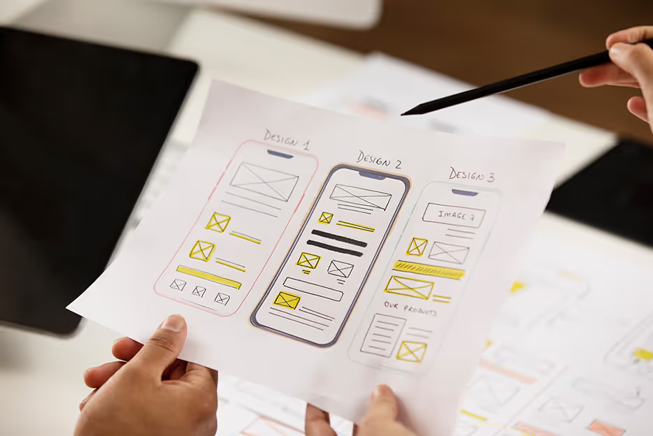
Responsive web design refers to creating websites that automatically adjust their layout and functionality based on the screen size and the device’s orientation. To create responsive designs, one must work with fluid grids and flexible images, specify breakpoints, and use media queries to ensure the website or application adapts to different screen sizes and devices. This adaptability ensures that users have a consistent and enjoyable experience whether they are on a desktop, tablet, or smartphone. By focusing on user experience, responsive design helps retain users, reducing bounce rates, and boosting overall engagement.
Impact of seamless transitions between devices on user engagement
Imagine starting to read an article on your mobile devices during your commute and seamlessly continuing on your desktop when you get home. This fluidity is the hallmark of responsive design, fostering uninterrupted user engagement. Users appreciate this continuity, making them more likely to stay on your site longer and return in the future.

Principles of responsive design
Fluid grids and flexible layouts
Responsive design starts with fluid grids, which use relative units like percentages rather than fixed units like pixels. This flexibility allows designs to adapt to different screen sizes. Think about how a blog layout changes when viewed on a phone compared to a laptop. On a laptop, you might see multiple columns of content, but on a phone, these columns stack vertically to remain readable and navigable. It is crucial to maintain consistency in UX design by ensuring uniform design elements and a unified design language.
Media queries
Media queries in CSS enable developers to apply different styles based on the device's characteristics, such as its width, height, and resolution. Ensuring content remains readable across multiple devices often involves using media queries to adjust font sizes, images, and layout configurations dynamically. This keeps the user experience consistent on smartphones, tablets, and desktops.
Flexible images and media
Images and videos must be optimized to scale appropriately for the screen space and different resolutions without losing quality. An image that looks great on a desktop should also load quickly and display correctly on mobile devices. Using responsive images (like the < picture> element in HTML) helps achieve this by allowing different image sources based on the display size.
Progressive enhancement vs. graceful degradation
Balancing robustness and accessibility involves choosing between progressive enhancement and graceful degradation.
- Progressive enhancement: This approach builds a robust core experience that works for all users, regardless of their browser or device capabilities. Advanced features are layered on for browsers that support them, ensuring a consistent experience across devices. Progressive disclosure can hide non-critical content and prioritize important information, achieving a clean and effective user experience.
- Graceful degradation: This method starts with a fully-featured experience and scales back functionality for less capable browsers, ensuring that all users access the core content, even if they can't use every feature.
Techniques for achieving responsive design
Bootstrap framework:
- Think of it as a pre-built toolbox: Bootstrap provides a collection of pre-designed components like buttons, forms, navigation bars, and more. This saves developers time by not having to code these elements from scratch.
- Responsive by default: One of Bootstrap's biggest strengths is responsiveness. Websites built with Bootstrap automatically adjust their layout for different screen sizes, ensuring a seamless user experience on desktops, tablets, and phones.
- Rapid prototyping: Since Bootstrap offers pre-built components, it allows developers to quickly create basic layouts and test website functionality before diving into the custom design.
CSS grid layout:
- Power up your layouts: CSS Grid Layout is a powerful tool for creating complex layouts that involve multiple columns, rows, and nested elements. It provides more flexibility and control compared to traditional methods using floats or flexboxes.
- Grid areas for clarity: With CSS Grid, you can define specific areas within your layout. This makes it easier to manage complex layouts with many elements and ensures they stay organized and responsive.
- Media queries for perfect fit: Media queries allow you to adjust the layout of your grid based on screen size. This allows for fine-tuning the position and size of elements on different devices.
Flexible typography:
- Readability matters: Flexible typography ensures that text on your website is clear and readable regardless of screen size. This is crucial for a positive user experience.
- Scalable fonts, big impact: By using scalable fonts, the size of the text automatically adjusts based on the device. This eliminates the need for setting different font sizes for various devices.
- Viewport units - the secret weapon: Using viewport units like "em" or "rem" for font sizes allows the text to scale proportionally with the viewport size. This ensures consistent readability across different screen resolutions.
- Usability testing - the final check: While scalable fonts improve readability in theory, usability testing is vital to ensure they work as expected on various devices and for users with different visual abilities.
Examples of responsive design in action

E-commerce websites
Responsive design is vital for e-commerce sites, where optimizing user journeys across devices can significantly impact sales. Balancing product display and navigation ensures intuitive shopping experiences. Progressive disclosure techniques, using design patterns like modals and accordions, hide non-critical content to create a cleaner, more minimalist user interface on all devices.
News and media websites
Delivering news effectively across platforms is crucial for media sites. Adapting content presentation for mobile consumption without sacrificing depth ensures mobile devices users can easily read articles on the go while retaining access to the full content on larger screens.
Corporate websites
Maintaining brand consistency across devices is key for corporate websites. Aligning user goals, visual identity and functionality creates a cohesive user experience, reinforcing brand trust and recognition.
Challenges and solutions in responsive design
Performance optimization
Load times and performance can vary widely across devices, so optimization is critical. Implementing lazy loading for images and other assets can significantly reduce initial load times, enhancing the overall user experience.
Complex navigation menus
Creating intuitive navigation for a mobile website is often challenging. Using collapsible menus, visual hierarchy and gestures helps streamline navigation, making it easy for users to find what they need without overwhelming them.
Device fragmentation
Ensuring compatibility across a range of devices and screen sizes can be daunting. Thorough testing strategies, including using emulators and real devices, are key principles that ensure comprehensive coverage and a consistent UX across the board.
Understanding user needs and expectations across different devices is crucial, and this often means to conduct user research with methods such as interviews, focus groups, contextual testing tool, inquiry, and shadowing.
User experience (UX) considerations
Consistency across devices
Keeping a consistent design across different devices is important for several reasons. Users trust the brand more when they see the same design elements like colours, fonts, and logos on all their devices. If the look and feel change too much between devices, users might get confused or doubt if they are still interacting with the same brand. A consistent design helps users recognize the brand quickly and creates a seamless user experience.
Users often switch between devices, like moving from a phone to a tablet or computer. If the design is consistent, this transition feels natural and easy, reducing the time they spend figuring out how to use the app or website. Familiar design elements make the experience more efficient and enjoyable.
User feedback is essential to know how they interact with the design. This feedback helps identify problems and improvement areas, ensuring the design stays focused on user needs. Regularly updating the design based on this feedback helps keep it user-friendly and responsive to changing preferences.
Touch-friendly interfaces
Making interfaces work well on touch-based devices is key to improving usability. Bigger buttons with enough space between them help prevent accidental taps, especially on smaller screens where accuracy can be hard. Ensuring touch targets are the right size also makes the interface easier to use for everyone, including those with less dexterity.
Adding common touch gestures, like swiping and pinching to zoom, makes interactions feel more natural. Giving visual or haptic feedback when users touch the screen helps them know their actions have been registered, improving the overall experience.
Content prioritization
Presenting important content clearly on smaller screens needs careful planning. Organizing information so that the most important parts stand out is crucial. This can be done with headings, subheadings, and bullet points. Using sections that users can expand or collapse helps keep the interface neat and focused while still giving access to detailed information.
Using enough whitespace helps break up the content and makes it easier to read. Whitespace guides the user's eye to important parts and improves the design. Changing the size, weight, and color of text can help users see the hierarchy of content, making the interface easier to navigate and more visually appealing.
Future trends in responsive design
AI and responsive interfaces:
- Imagine a website that reads your mind (almost): AI can analyze user behaviour and preferences to personalize the content and layout of a website. This could mean highlighting relevant products, adjusting font sizes based on user reading habits, or even dynamically changing the overall design aesthetic for a more tailored experience.
- Predictive design - a step ahead: AI can anticipate user needs and proactively adjust the interface. For example, an e-commerce site might suggest a phone case after a user views a phone model. This creates a more intuitive and efficient user journey.
- Ethical considerations: As with any powerful technology, ethical considerations are crucial. User privacy must be respected, and transparency in how AI personalizes experiences is essential.
Enhanced interactivity:
- Micro-interactions for macro impact: Small, well-designed animations and interactions can significantly improve user experience. Think of subtle animations that guide users through forms, provide feedback on clicks, or make scrolling more engaging. These micro-interactions add a layer of polish and make using the website feel more enjoyable.
- Beyond static pages: Interactive elements like carousels, expanding content sections, and subtle animations can make websites more engaging and dynamic. This can keep users interested and encourage them to explore further.
- Finding the right balance: While interactivity can be great, it's important not to overdo it. Flashy animations or overwhelming interactions can distract users from the core content. The key is to use them strategically to enhance, not detract, the user experience.
Internet of things (IoT) and responsive design:
- The internet of everything: The growing number of connected devices (IoT) presents unique challenges for responsive design. Websites and interfaces need to adapt to seamlessly interact with smartwatches, voice assistants, and other connected devices.
- Designing for a multi-device world: Responsive design will need to encompass a wider range of screen sizes and interaction methods beyond traditional desktops and phones. This could involve voice-controlled interfaces, touch-based interactions, and even wearable technology integration.
- Cohesive user experience: The goal is to ensure a smooth and consistent user experience regardless of the device used to access the website. This means designing interfaces that are adaptable, intuitive, and work seamlessly across the entire IoT ecosystem.
Responsive design is pivotal in modern UX strategies, ensuring that users have a seamless and enjoyable experience regardless of the device they use. By continuously adapting and innovating in responsive design practices, we can meet the evolving needs of users and stay ahead in the ever-changing digital landscape. Embracing new technologies and trends will further enhance our ability to deliver top-notch user experiences in the future.


