Same button, five versions. We're the design system agency that makes it one.
We analyze every screen and flow, then build the tokens, components, and documentation your designers and engineers actually reuse, in Figma, code, Webflow, or zeroheight. A system takes 3 to 4 weeks. We've built them for emerchantpay, Tolstoy, and Selfipay, and released our own, Atomus, as a product other teams use.

Product teams that build from our systems





A messy interface is rarely a talent problem. It's a system problem
Your designers are good. Your engineers are good. The screens still don't match, because everyone builds from memory instead of from one set of parts.
The same button exists four ways, the spacing is a guess, and every new feature starts by rebuilding something that already exists somewhere. That's what a design system fixes, and what its absence costs you every sprint.
The same component, built five ways
Three button styles, two date pickers, a modal that behaves differently on every screen. Nobody decided this. It piled up because there was no source to build from.
Figma and production have drifted apart
The design file says one thing, the live product says another, and nobody is sure which is right. Every handoff turns into a negotiation.
Every feature starts from scratch
Designers rebuild patterns that already exist. Engineers implement the same component a third time. It's slow because none of it is reusable.
New hires copy the wrong screen
With nothing documented, a new designer or engineer copies whatever screen they opened first, and the inconsistency spreads with every hire.
What our design system services include
A design system is the single source of truth for a product's interface: the design tokens, reusable components, patterns, and documented rules every designer and engineer builds from. A style guide tells you what things should look like. A design system gives you the parts, and the rules for keeping them in sync.
As a design system agency for B2B SaaS, fintech, and AI products, we build that source of truth and the workflow around it. We work in your tools, not ours, and hand it over so your team can run it without us.
Design system audit
We go through every screen and flow and inventory what you already have: components, colors, spacing, patterns. You see the duplication and the gaps in one place, and that becomes the plan for what to keep, merge, and rebuild.
Design tokens
The named values behind your interface: color, type, spacing, radius, and motion, stored once and used everywhere. One change updates every screen in Figma and in code, instead of a hundred manual edits.
Component library
Buttons, inputs, tables, navigation, modals, the full set, with every state and variant. This is the work behind Atomus, our own Figma design system, which other teams now use as a product.
Documentation
A component nobody can find gets rebuilt. We document every component, token, and pattern with usage rules and examples, in zeroheight, Storybook, or a hosted doc site.
Multi-platform and native
One system across web, iOS, and tablet. For Selfipay we built the product's system, then split it into components for native iOS, so the app feels like one product on every screen size.
Governance
A system decays the moment two people add the same button twice. We set who owns it, how changes get proposed and approved, and how new patterns get in.
Building inside an existing system
Sometimes the system is set by the platform. Consentmo runs as a Shopify app, so we designed it on Shopify's own design system rules instead of fighting them.
Design-to-code, and Webflow
We hand off to your engineers or build the coded components ourselves, with the component API matched to the design. If your marketing site runs on Webflow, the system goes there too.
Maintenance
Systems need an owner after launch. We add components, handle version updates, and fix what breaks, on a retainer or alongside your team.
Design system, style guide, or component library: what's the difference?
Short answer: a style guide is the rules, a component library is the parts, and a design system is both, plus the workflow that keeps them in sync. Most teams have one of the three, call it a design system, and wonder why the UI still drifts.
| Style guide | Component library | Design system | |
|---|---|---|---|
| What it is | Documented rules for brand and UI | A set of reusable UI components | Tokens, components, patterns, docs, and governance as one system |
| What it covers | Color, type, voice, visual standards | The building blocks: buttons, inputs, tables | The standards, the blocks, and the rules for using and maintaining them |
| Keeps design and code in sync? | No | Partly, the parts can still drift | Yes, through shared tokens and governance |
| Best when | A small site, or brand consistency only | One product, one team | Several teams, products, or platforms |
How we build a design system, step by step
A design system takes 3 to 4 weeks, because the work starts by analyzing every screen and every flow you already have. The order matters: a system only pays off when people adopt it, so documentation and ownership are part of the build, not an afterthought.
Results our clients reached
Real business milestones the teams we partnered with hit during the engagement. The work is ours; the wins are theirs.
$200M+
Raised at a $1B valuation. All three rounds closed after our redesign went live.
$175M
Raised while scaling its global payment infrastructure.
$13M
Raised while building its AI planning platform.

$73M
Combined value of the SMSBump and NitroPack exits.
Average partnership
3+ years
Average length of a client partnership. People stay when the work keeps shipping.
7 years
Across strategy, branding, and product, 2018 to 2025.
AI portfolio
15+ companies
AI companies designed for, from first launch to scale.
Enterprise portfolio
10+ clients
Enterprise clients, the kind with procurement departments.
24%
Higher conversion rate after the website relaunch.
Products launched
10+
Software products designed and taken to market with our clients.
Products running on design systems we built
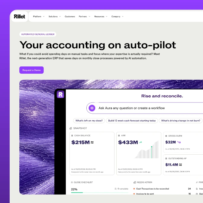
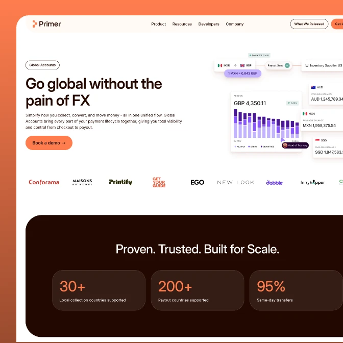
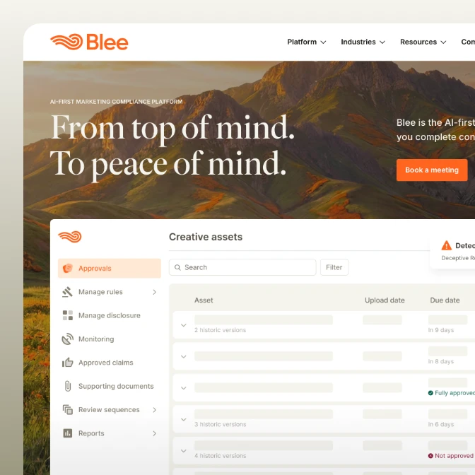
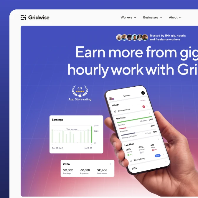
The best proof of a design system is what stops happening: the rework, the mismatched screens, the week lost to "which button is the real one." We built the system behind emerchantpay's core product, Tolstoy's platform, Contiant's product, and Selfipay's app across web, iOS, and tablet. A closer look below:
1st
facial-recognition payment in Bulgaria, live with DSK Bank
59%
better first-time understanding in user testing
42%
more merchant inquiries after launch
39%
more users publish in their first session
54%
growth in daily active users after the redesign
44%
higher CTR after the messaging rework
$1B
valuation reached 15 months after the site went live
3x
traffic in the two months after launch
50+
pages designed and shipped, up from 5
Who should build your design system? The honest version
Most teams weighing a design system choose between four options: a partner like us, a generalist agency, a freelancer, or a dedicated in-house hire. Here's where each one wins, including the rows where we don't.
| StanVision | Generalist agency | Freelancer | In-house design system lead | |
|---|---|---|---|---|
| Design system experience | Several product systems plus Atomus, our own published system | Often one deliverable among many | Depends on the person | Deep, once you find them |
| Starts with | An audit of every screen and flow | Often a fresh UI kit | Often a fresh UI kit | Whatever is most urgent |
| Code | Coded components or a matched handoff | Often design files only | Usually design files only | Needs engineers alongside |
| Platforms | Web, native iOS, tablet, Webflow | Usually web | Usually one | Depends on the hire |
| Timeline | 3 to 4 weeks for the system | Varies | Depends on availability | Months to hire before work starts |
| After launch | Ongoing partnership hours, or your team owns it | New contract | Moves to the next client | Owns it full time |
| Best for | B2B products that need one system across design and code | Large programs across many channels | A small UI kit on a tight budget | Companies big enough for a full-time system team |
Industries
we go deep in
We specialize where design and growth decisions carry the most weight.
Awards
25 awards from Awwwards, CSS Design Awards, and Behance. And since 2023 Stan sits on the Awwwards jury, which is rarer than winning.
1x SOTD + 1x DEV + 13x HM
1x Jury member

Awwwards: 15 awards in total. 1 Site of the Day (SOTD), 1 Developer Award (DEV) and 13 Honorable Mentions (HM). Stan Kirilov is an Awwwards jury member.
2 SOTD + 4 SK
1x ex. Jury member

CSS Design Awards: 6 awards in total. 2 Sites of the Day (SOTD) and 4 Special Kudos (SK). Stan Kirilov is a former CSS Design Awards jury member.
4x Featured in Web design

Behance: StanVision projects featured 4 times in the Behance Web Design gallery.
Frequently asked questions
Design system questions, answered.
What is a design system?
A design system is the single source of truth for a product's interface: design tokens, reusable components, patterns, and the documented rules for using them. It connects design and code, so a team builds from one set of parts instead of recreating them screen by screen.
What does a design system agency do?
A design system agency audits your current interface, builds the tokens and component library, documents them, and sets the governance that keeps the system consistent as the team grows. We work in your tools, whether that's Figma, code, Webflow, or zeroheight, and hand it over so your team can run it.
How do you create a design system?
Start with an audit of every screen and flow, then define the foundations as tokens: color, type, spacing, radius, motion. Build the components on top, with every state and variant. Document how to use them, and decide who owns the system and how changes get in. Most failed systems skip the last two steps, so nobody adopts them.
How long does a design system take?
A design system takes 3 to 4 weeks with us. Most of the first week goes into analyzing every screen and flow you already have, because that's what tells us what to keep, merge, and rebuild. A system that spans several platforms, like web plus native iOS, is scoped to match.
Which tools do you work in: Figma, Storybook, Webflow, or zeroheight?
All of them, matched to your stack. Figma is usually the design source of truth, coded components live in Storybook or your codebase, documentation sits in zeroheight or a hosted site, and if your marketing site runs on Webflow, we build the system there too.
Do you hand off to our engineers, or build the coded components?
Either. Some teams want tokens and a Figma library to build from; others want coded components in Storybook or their framework. We scope it to how your team ships and match the component API to the design, so the two stay aligned.
Can you work inside an existing system, like Shopify's or Material?
Yes. When a platform sets the rules, we design within them instead of fighting them. Consentmo is a Shopify app, so we built it on Shopify's design system rules and added only what the product needed on top.
Do you maintain the design system after launch?
Yes. A design system needs an owner or it decays. We can maintain and extend yours on a retainer through an ongoing partnership, or set your team up to own it with the governance already in place.
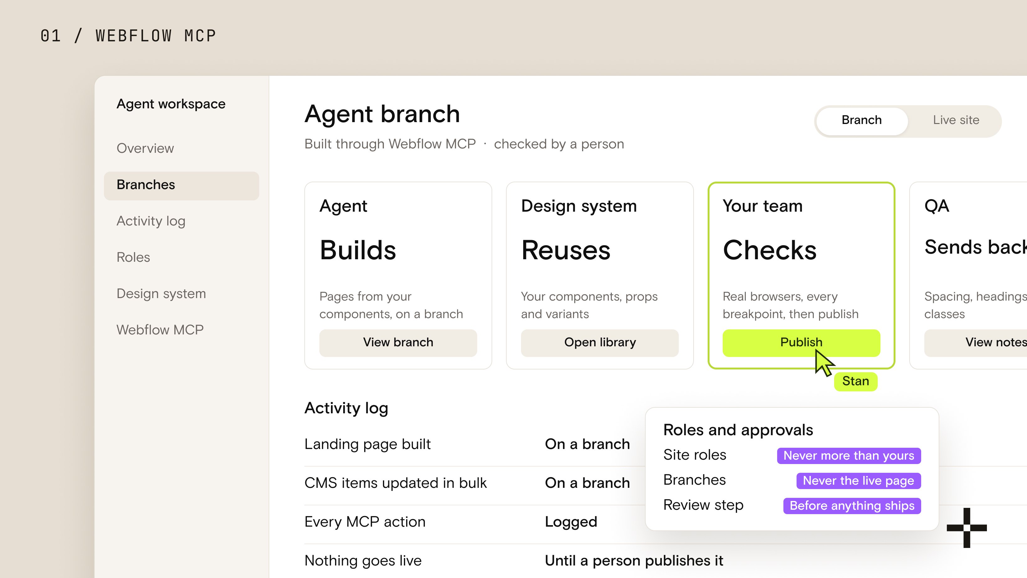
Webflow MCP: what it is, and how we actually build with it
Webflow MCP lets an AI agent build inside your site. What it can't do is decide what good looks like.

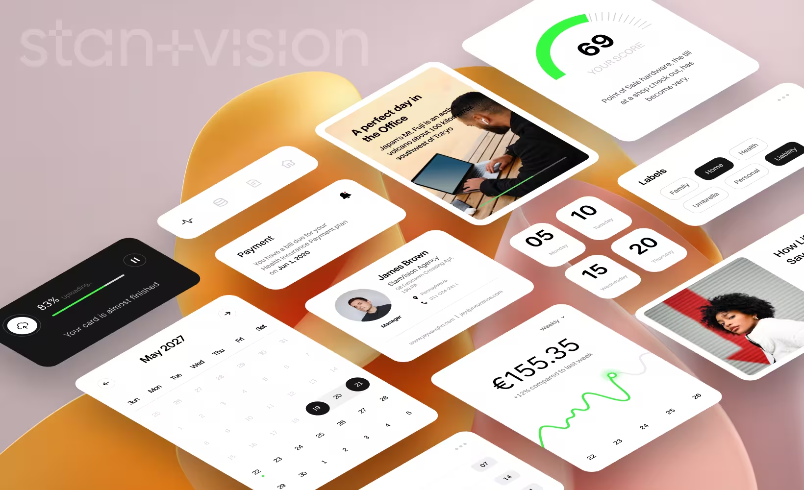
UI card design: examples, best practices and common patterns
Most teams use cards everywhere. The best teams know when not to.

Fintech UX in 2026: what users expect from modern financial products
Fintech users in 2026 expect clarity, personalization, and trust. They don't care about features; they care about how confident they feel when making financial decisions. The winning products simplify complexity, explain actions, and guide users with transparency.
Product design and development workflow optimization
In the world of product design, “creative chaos” sounds romantic, until it derails your timeline, confuses your team, and leaves you with five versions of the same wireframe named final_final_v3_reallyfinal.fig. Sound familiar?