Designing trust for a new way to pay: how SelfiPay reimagined biometric payments

Results
- 59%Better first-time understanding of biometric payments
- 42%Increase in merchant inquiries post-launch
- 100%Scalable design system in active use across brand, product, and Webflow
Initial brief
- Challenge
SelfiPay wasn’t launching another payment app. They were introducing something people had never done before: paying with their face. No physical cards, no familiar habits, just biometric authorization at a terminal.The technology worked, but trust didn’t come for free.
At MVP stage, users liked the idea but didn’t fully understand it, while merchants were curious yet hesitant.
The biggest risk wasn’t usability — it was confidence. If people didn’t feel safe, they wouldn’t use it. If merchants didn’t trust it, they wouldn’t integrate it. - Approach
We treated trust as a design problem, not a marketing promise. Instead of starting with screens, we started with perception: how to make something entirely new feel familiar, how to explain a complex payment flow without overwhelming users, and how to speak to two very different audiences without splitting the product.
Our role quickly became larger than execution. We worked as a full-stack design partner, shaping how SelfiPay looks, feels, and explains itself across brand, hardware, product, and web.
Every decision came back to a simple question: would I feel comfortable using this in real life?
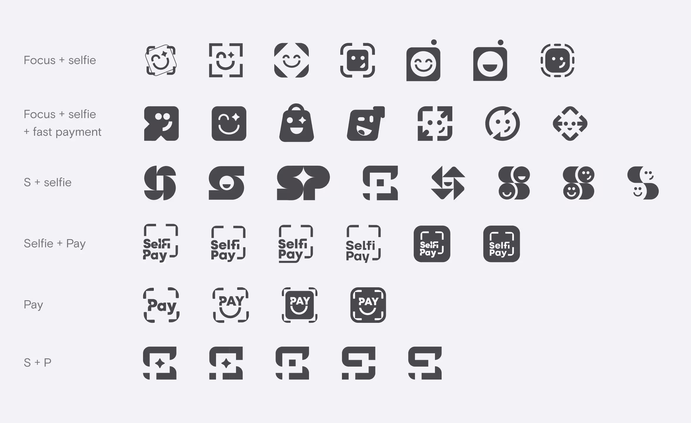
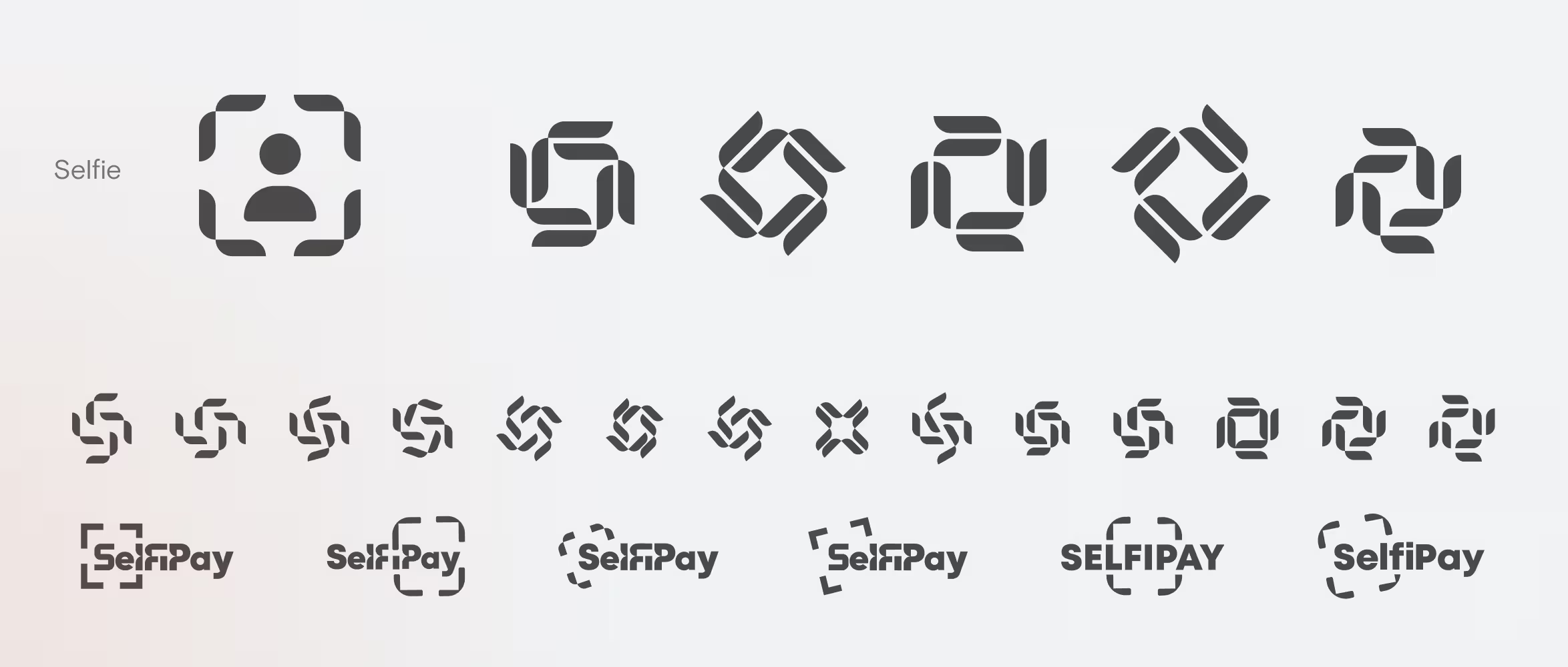
Brand design
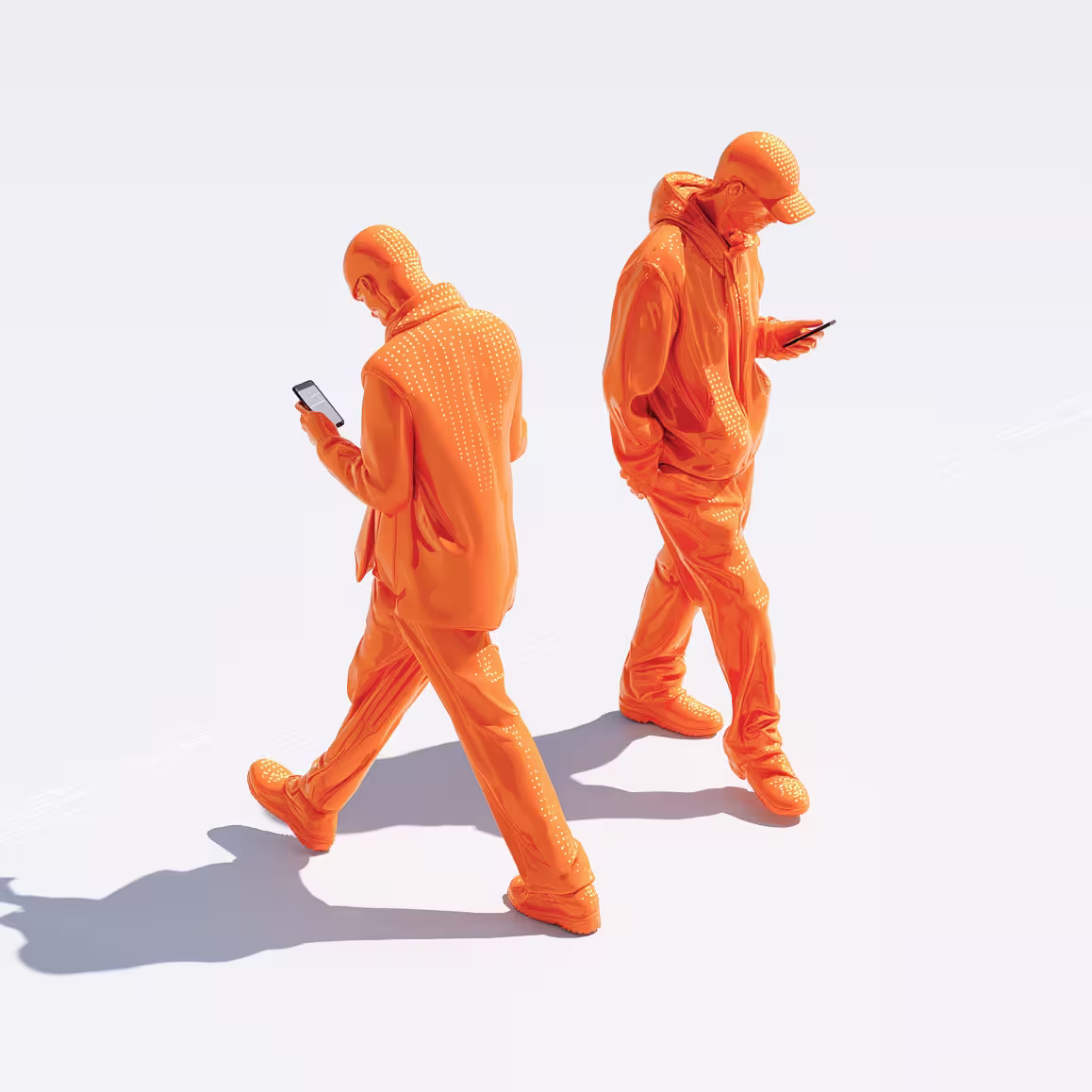
A bold identity built to signal confidence
We wanted the brand to feel modern and progressive — but never cold or experimental.
The visual direction leaned into bold orange, not as decoration, but as a statement. Confident. Visible. Impossible to ignore. A color choice that says this works.
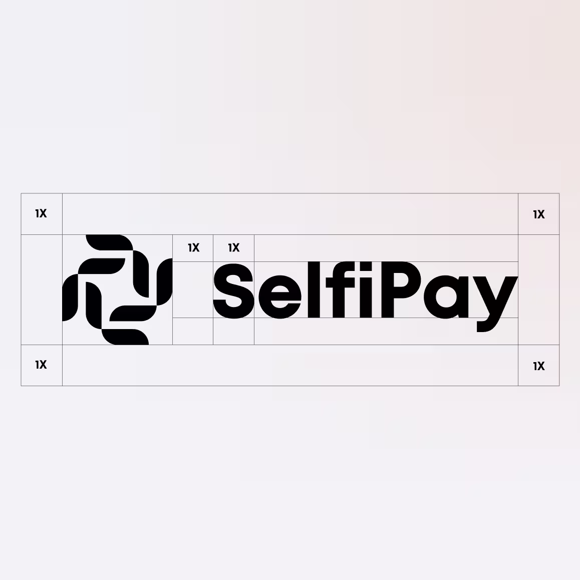
We explored multiple logo directions, pushing for something that felt new without losing recognizability. The goal wasn’t to look like every other fintech — it was to feel trustworthy on first contact.
The final identity set the tone for everything that followed:
- Clear
- Approachable
- Confident enough to carry a new payment behavior

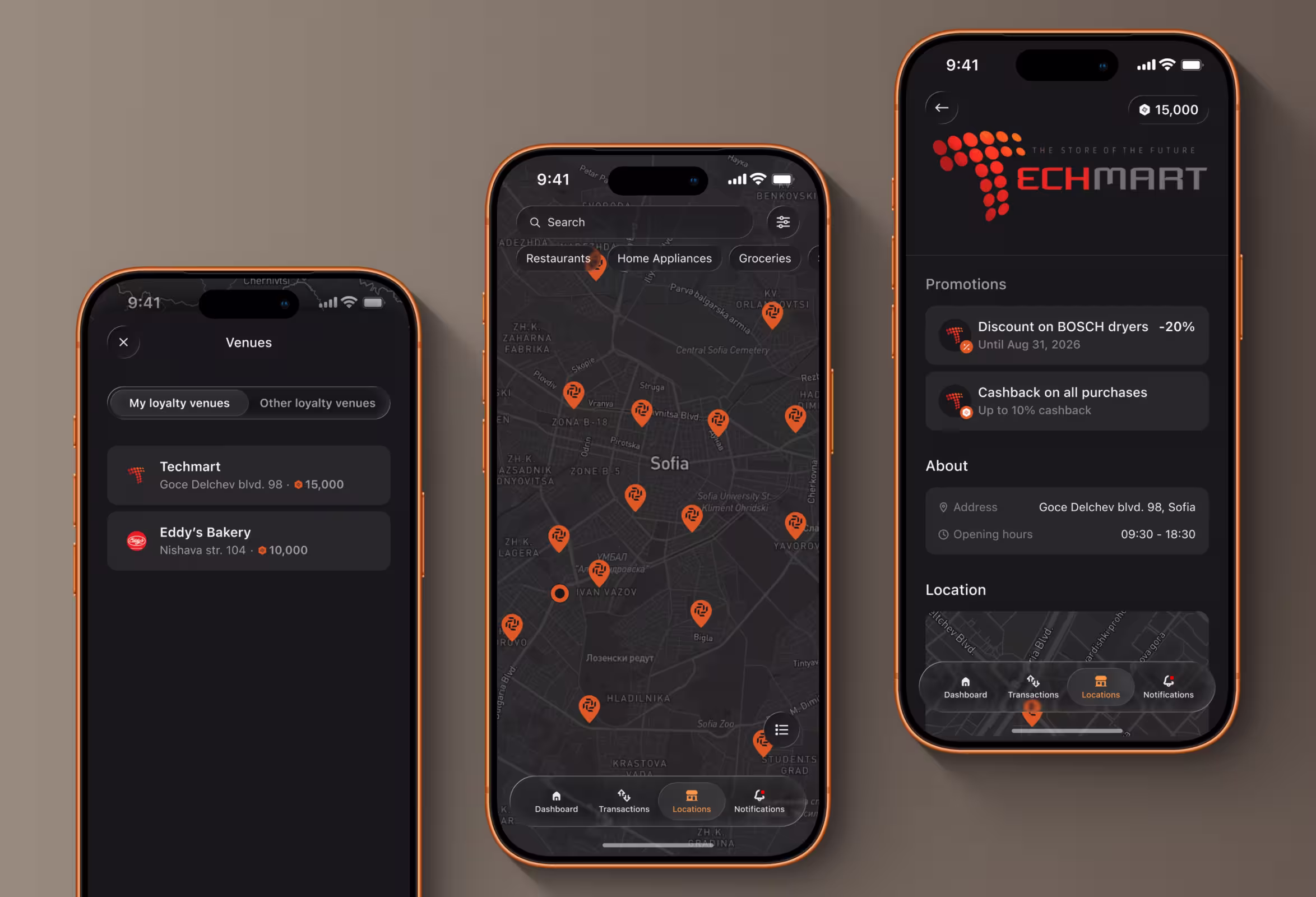
App design
Designing the moment where trust matters most
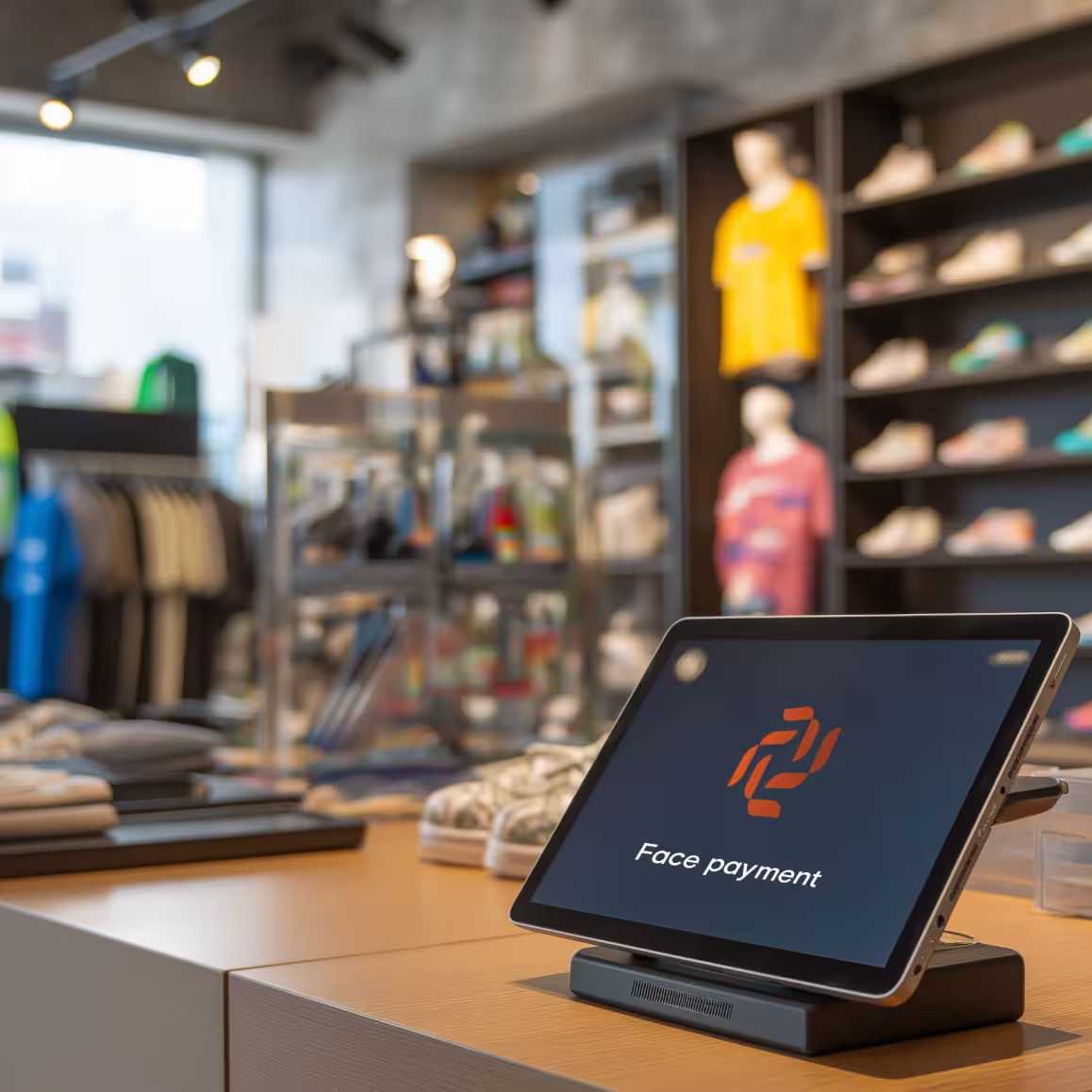
The terminal was the hardest part — and the most important.
This was the first time users would authorize a payment with their face. No fallback. No familiar patterns to rely on. The experience had to feel calm, fast, and obvious.
We designed the terminal UI to do three things:
- Clearly explain what’s happening
- Reassure users in real time
- Get out of the way as quickly as possible
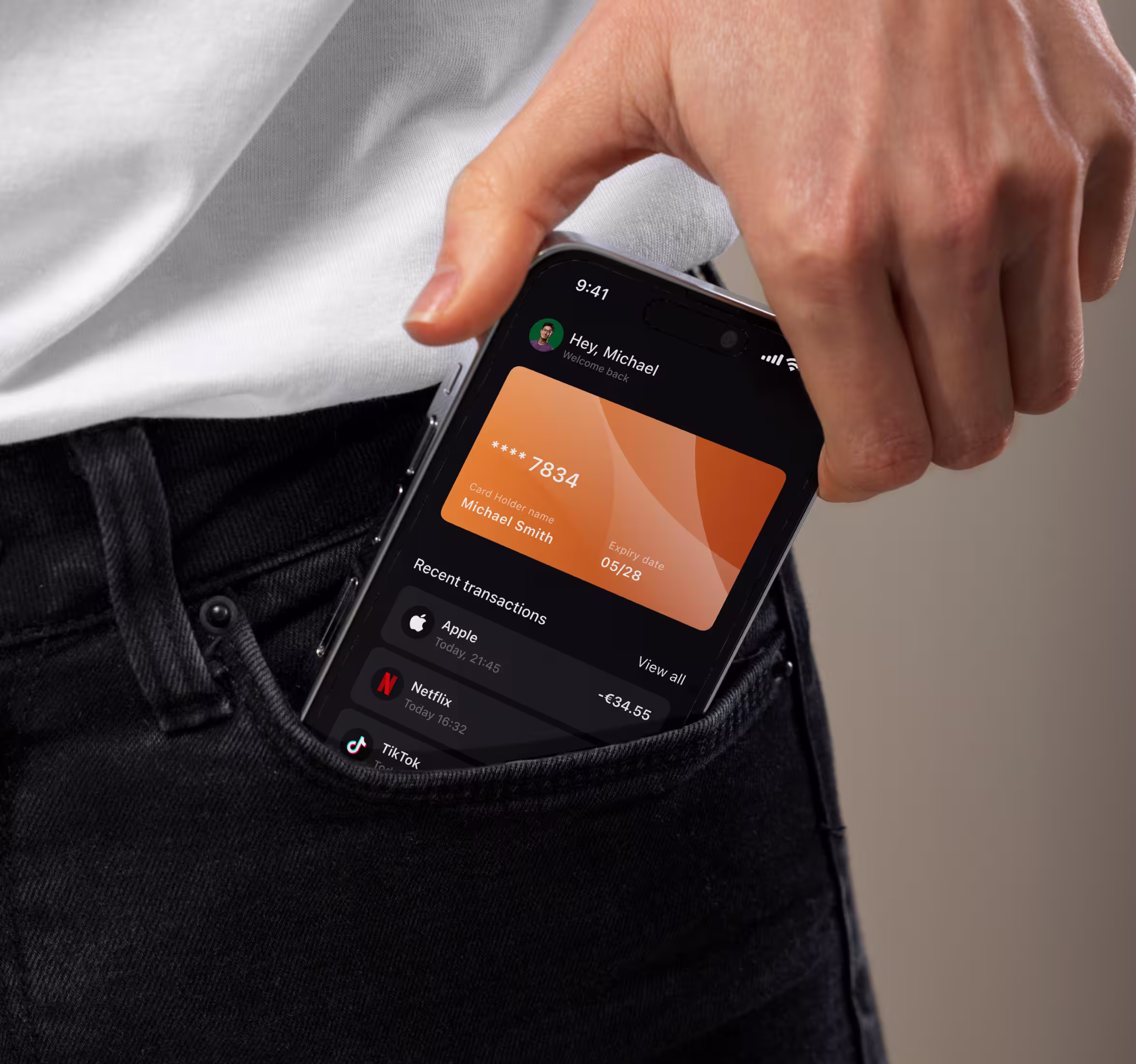
The mobile app supported that same mindset.
No over-designed flows. No unnecessary steps. Just a clear explanation of how SelfiPay works, what data is used, and why it’s secure.
Every screen was designed to reduce hesitation — not impress.
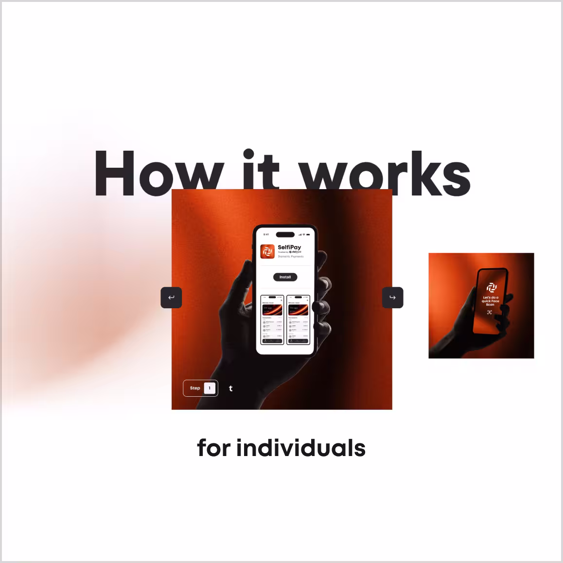
Website design
One website. Two audiences. Zero confusion.
SelfiPay had a unique problem:
They needed to speak to merchants and end users — on the same website — without duplicating content or losing clarity.
Our solution was a live audience switch.
Visitors can toggle between “Merchant” and “Individual” views at any moment. The page stays in the same section, but the content adapts.
“How it works” becomes how it works for you.
This allowed:
- Easy comparison
- Clear positioning
- One scalable website instead of two fragmented ones
Built in Webflow, the site was designed to grow with the product — fast updates, clear structure, and flexibility for future expansion beyond the pilot phase.
Trust-first for users.
Results
- 59%Better first-time understanding of biometric payments
- 42%Increase in merchant inquiries post-launch
- 100%Scalable design system in active use across brand, product, and Webflow