
Key takeaways
- Fintech web design has one job: make trust visible before the signup. The website is where a visitor decides whether this company should be anywhere near their money.
- Branding is reassurance infrastructure. Consistent color, typography, and motion signal order and stability long before any transaction happens.
- Show the product, don't describe it. Real interface views and clear "how it works" storytelling build credibility faster than any marketing claim.
- The marketing site and the product are different design problems. This article covers the public website; product interface design follows different rules.
A fintech website has one job that most websites don't: make trust visible before the signup. From neobanks to crypto platforms to payments infrastructure, every fintech brand is asking visitors for something heavier than attention; they're asking to be near someone's money. The difference between a click and a conversion is whether the design answers that question before the copy does.
At StanVision, we treat fintech web design as a strategic investment that blends aesthetics, emotion, and engineering. An effective fintech website design communicates security, transparency, and innovation while guiding users toward an informed action. When design aligns with functionality, fintech websites convert insight into action.
One boundary before we start, because teams mix these up: this article is about the marketing website, the public pages that turn visitors into signups. Designing the product itself, the logged-in experience, is a different discipline with different rules; we cover that separately in our guide to fintech UX design.
Importance of user experience
Every successful fintech website is based on empathy. Unlike e-commerce or lifestyle products, financial technology deals mostly with trust, precision, and people's most sensitive data. Complex financial concepts must be simplified into clear, trustworthy experiences. Visitors should be able to navigate your site instinctively.
Web design for fintech relies on microinteractions, data visualization, and guided flows to make even the most technical offerings approachable. Design decisions such as how a confirmation appears, how a graph animates, or how form fields auto-complete turn anxiety into confidence.
This focus on usability doesn't just increase conversion; it supports compliance and accessibility, which matter more in a regulated industry than anywhere else. When people can easily find information, understand what you do, and take the next step without friction, trust follows naturally.
1. Role of branding in fintech
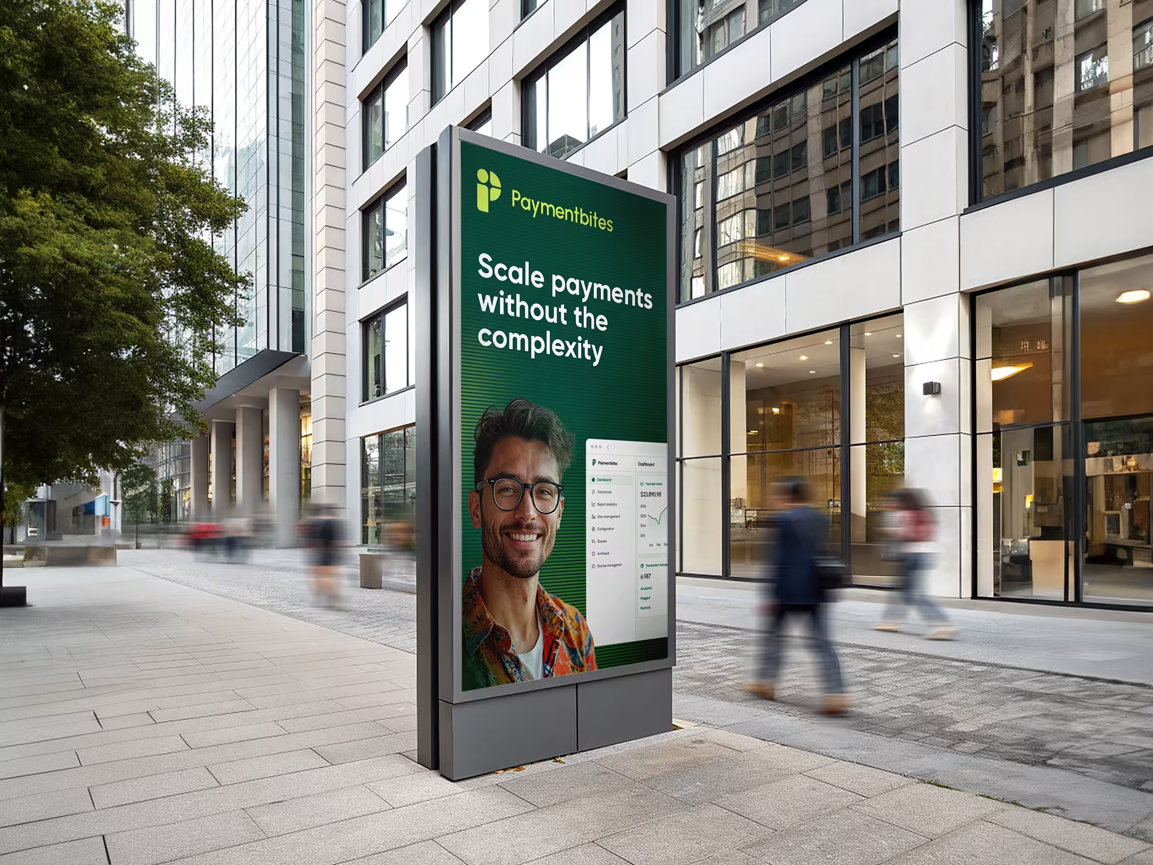
Branding in fintech is about consistency and emotion. Your brand must look secure, sound reliable, and act intuitive, all at once. The best fintech websites are built on systems that go beyond a logo: they craft a personality users can trust with their financial future.
Design language as reassurance
Whether it's a dynamic interface for a crypto startup or a calm presence for an investment firm, the tone of your visuals can either comfort or confuse. Cohesive use of color, structured typography, and consistent iconography signal order and professionalism long before a transaction happens.
Even microinteractions like how a button animates or how confirmation messages appear reinforce your brand's emotional reliability. A fintech brand that feels consistent creates a sense of control, and that sense keeps users coming back.
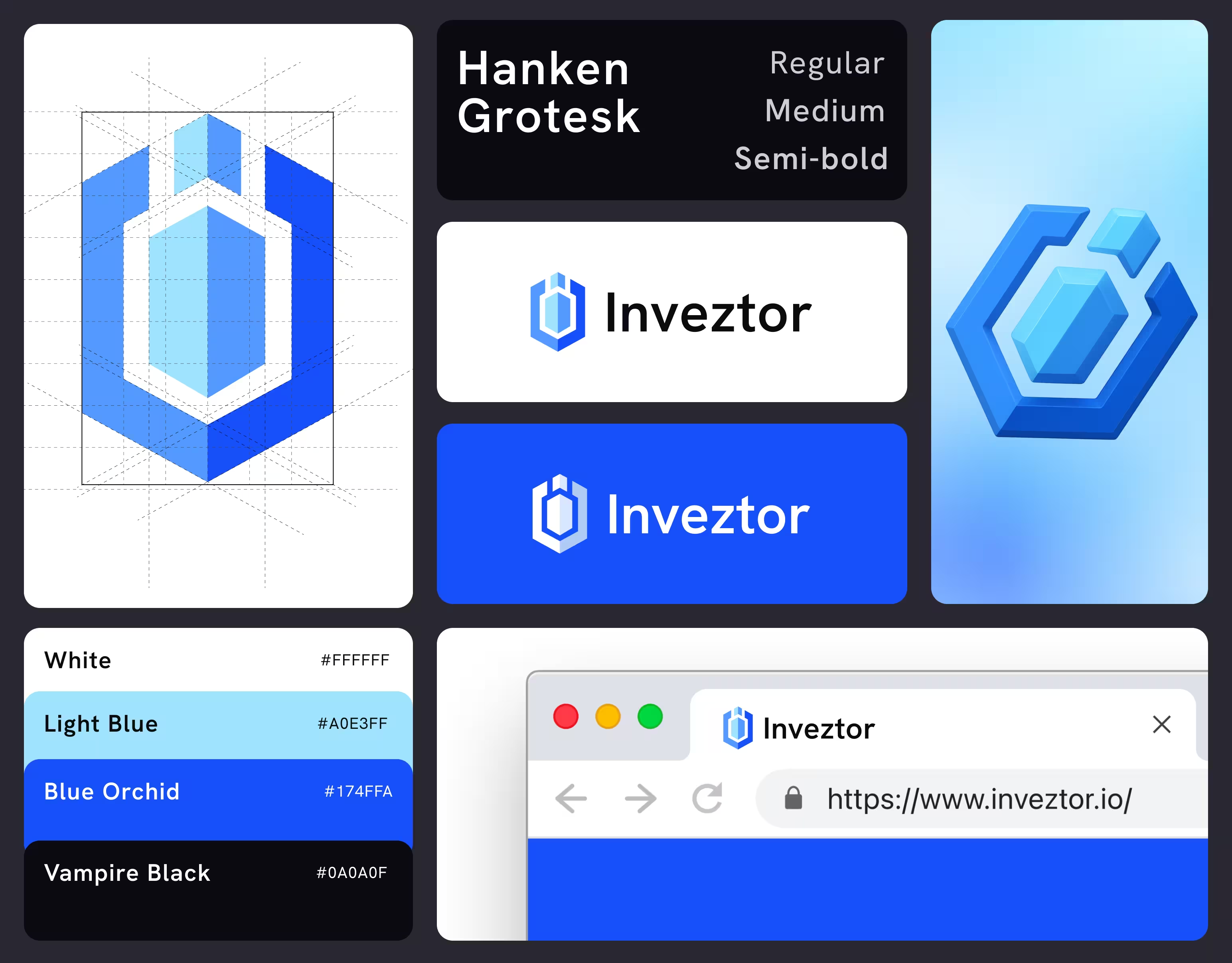
Scalable design systems
Consistency across your website, mobile app, and communications tells users: this brand is reliable, deliberate, and here to stay. At StanVision, we help brands build and maintain fintech marketing strategies through scalable design systems - ensuring every visual choice communicates stability and trust. Learn more on how we create fintech web design in our Contiant case study.
2. User-centric design
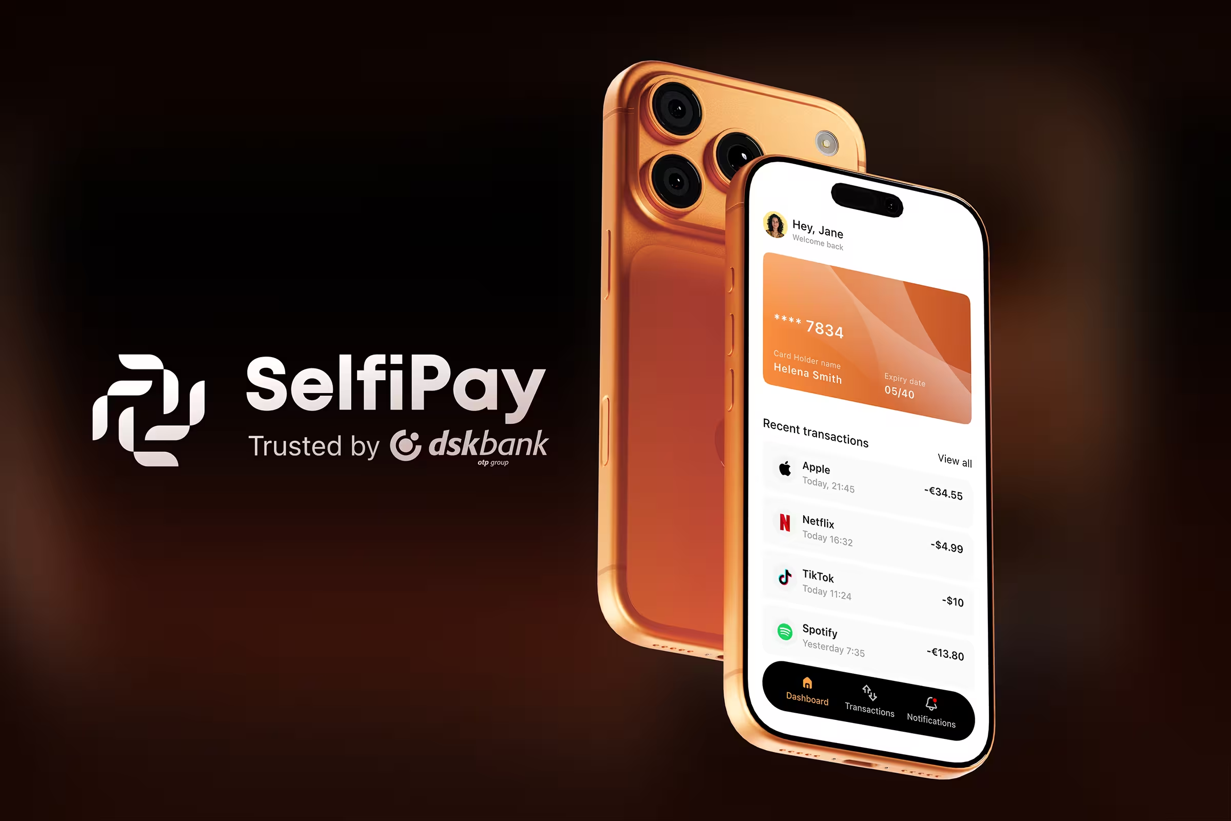
Visitors come to your site with specific intent: to open an account, compare plans, understand pricing. Our job, as designers, is to reduce friction along the way. A user-centric mindset stands at the core of every fintech design project.
Through analytics and user testing, StanVision identifies behavioral patterns that shape every touchpoint with one goal: to design for clarity, not complexity. We cover this approach in our comprehensive guide to user-centric design.
Designing for emotion
Money is emotional. Financial brands must respond to stress, ambition, or uncertainty with subtle reassurance. Visual cues like success animations, guided flows, and supportive microcopy create an experience that feels both efficient and human.
Responsive by default
Modern finance lives on mobile. Responsive fintech website design ensures visitors can explore services, compare offerings, and start signup seamlessly across devices. Every millisecond of loading time and every pixel of spacing shapes the sense of reliability, because precision builds trust.
Accessibility as inclusion
Accessible design is no longer optional. From high-contrast color palettes to screen-reader-friendly structure, inclusive design principles make fintech websites usable by everyone, and show that your brand stands for equality, not just efficiency.
3. Security features
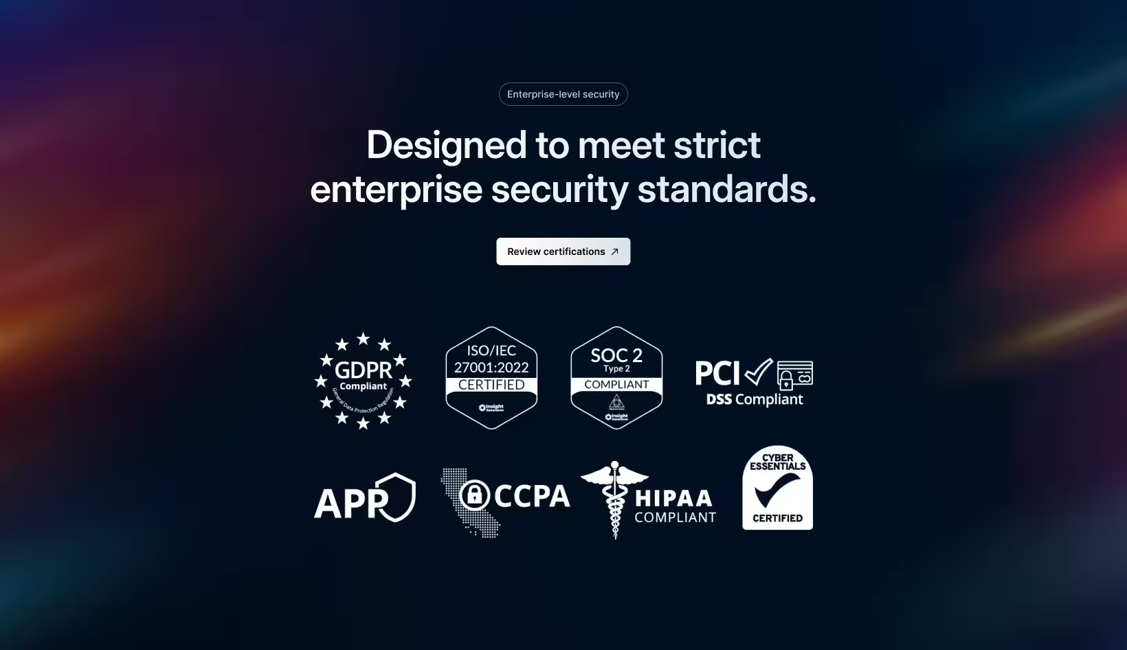
Security builds credibility long before login. Users need to feel their data and money will be protected, and the website is where that impression forms. Simple, human language that explains authentication, encryption, or data use reinforces your brand's trustworthiness.
Leading fintech websites highlight credentials such as PCI DSS or ISO certifications without cluttering the interface. Strategic placement, clear privacy sections, and plain-language security explanations balance professionalism and reassurance. One caution from our own practice: badges alone are wallpaper. They work when paired with content that explains what they mean; they do nothing floating in a footer.
When users feel calm and informed, they stay. After all, confidence is the most valuable currency in fintech.
4. Visual clarity
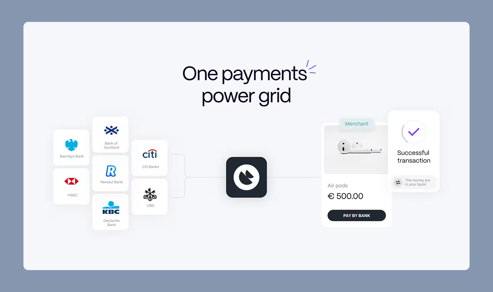
Simplicity in fintech is about organizing complexity so users can think clearly. Fintech websites carry heavy explanatory loads (products, pricing, integrations, compliance), and every visual choice either builds focus or creates friction. Good design doesn't hide complexity; it arranges it with intention.
Hierarchy and focus
White space, alignment, and consistent grids guide the eye to essential information. Clear hierarchy tells users where to look and when to act. A well-structured layout reduces mental load, turning explanation into understanding rather than confusion. We dive deep into this design approach in minimalist UI design: how less is more in web design.
Color psychology also plays a quiet but powerful role. Neutral tones, measured contrast, and subtle accents allow users to take in information calmly and confidently. Typography supports that clarity: clean sans-serifs convey transparency and modernity, while balanced weights and spacing make everything feel precise and controlled.
Designing data that tells a story
Charts and product visuals have evolved into storytelling tools. The way you visualize what your product does shapes how visitors perceive its value. Animations that highlight progress, contextual comparisons, and interface views that show real outcomes turn claims into evidence.
Microinteractions and motion cues guide emotion. A soft rise for growth, a fade for stability: visual reassurance that the system is under control. When information feels clean, balanced, and honest, users trust the numbers, together with the brand behind them.
5. Navigation and flow
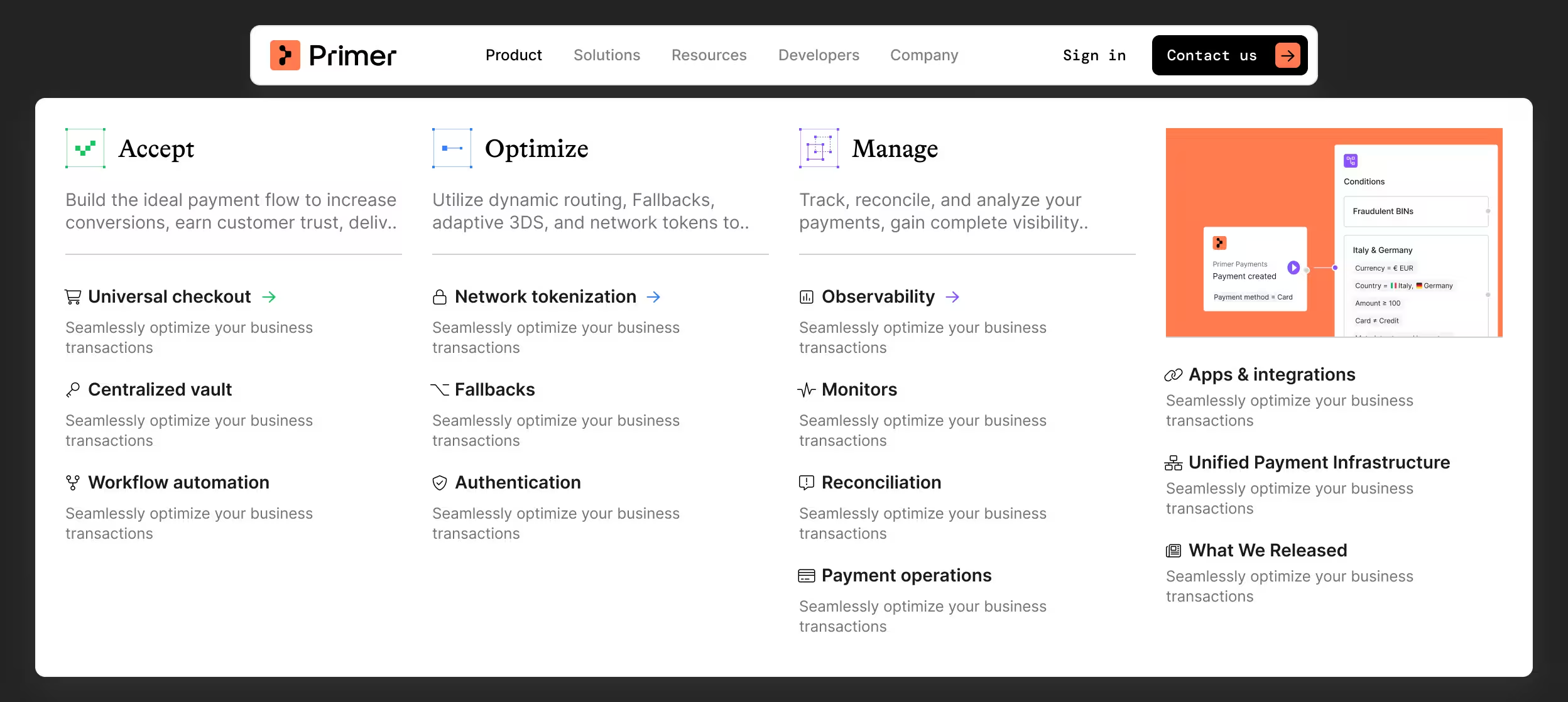
Navigation is the invisible architecture of a fintech website. If visitors need to think about how to find something, the design has already failed. Take a look at our analysis of bad navigation mistakes and how to fix them.
The structure of your site should feel effortless, guiding visitors naturally, without making them stop to decide what to do next.
Designing intuitive journeys
Group sections by intent rather than hierarchy: "For individuals," "For businesses," "For developers." This mirrors how people think, not how companies organize. Familiarity plays a huge role here: sticky menus, clear paths back, and predictable placement help visitors stay oriented and confident. The goal isn't innovation, it's flow.
Predicting user behavior and intent
The best fintech navigation feels one step ahead. When someone arrives from a search about payment orchestration, the path to that answer should be immediate. Anticipating what a visitor came to do, instead of making them decode your menu, is what turns usability into satisfaction.
6. Content that connects

Content transforms fintech from abstract technology into a human experience. A fintech website should speak to common user goals like saving time, managing money, building freedom. Storytelling helps connect logic with emotion, turning "innovative fintech solutions" into relatable benefits.
From features to stories
Storytelling is about translating capability into confidence: showing users how your innovation fits their lives, not just their screens. Instead of "AI-driven analytics," say "Insights that help you save more wisely." Design and copy should feel like one language. Interactive infographics, short videos, and real product views help users see results instead of imagining them.
Value-driven trust
Educational hubs, glossaries, and tutorials position your fintech brand as a source of knowledge, not just a service. When users learn something useful, they associate your brand with authority. This is how trust builds up, one helpful explanation at a time.
7. Strong call-to-actions (CTAs)
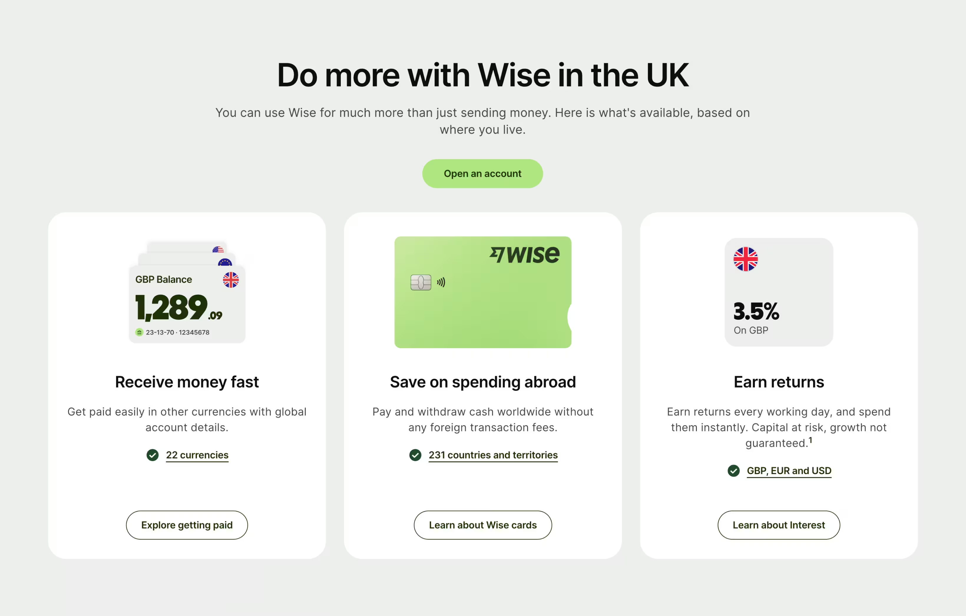
In fintech, people act when they understand, not when they're pressured. The most effective call-to-actions appear where a user's decision naturally peaks: after clear value is established. Visually, contrast and hierarchy matter. CTAs should stand out, while staying true to the brand's color palette and tone.
CTAs like "Open your account" or "Start investing" should appear naturally after value has been communicated. Supporting microcopy like "Takes under two minutes" or "You can cancel anytime" subtly eases hesitation and builds momentum.
Real-world feedback often reveals emotional blockers analytics can't measure: fear, confusion, hesitation. Continuous testing ensures your CTAs evolve with behavior; it's the same discipline we apply in CRO work across every fintech site we design.
Where fintech websites are heading
The short version: AI, personalization, and embedded finance are reshaping what visitors expect from fintech brands, and the websites keeping up are the ones treating those shifts as design problems rather than feature lists. We track this in depth, including what's working and what's already fading, in our breakdown of fintech UX in 2026. The principle underneath doesn't change: users don't notice great design, they notice when it's missing. The future belongs to fintech brands that create comfort through intuition.
Choosing the right fintech web design agency
Your website isn't just a digital brochure; it's the foundation of your customer relationship. Choosing a fintech web design agency should mean choosing someone who understands regulation, human behavior, and design scalability.
A true agency partner delivers systems that adapt. From compliance to conversion, the right team helps translate your business model into a digital journey users trust.
At StanVision, we specialize in creating fintech websites that convert trust into long-term growth. Our website design work for fintech combines strategy, UX/UI, and storytelling to build meaningful digital experiences, from landing pages to enterprise platforms. Every project begins with listening: to your goals, your data, and your audience. Then we go beyond designing a website that looks credible; we design one that proves your credibility.
Frequently asked questions
What makes a good fintech website?
A good fintech website makes trust visible before the signup: consistent branding that signals stability, real product views instead of abstract claims, security credentials explained in plain language, navigation grouped by visitor intent, and CTAs placed after value is established. The test is simple: would a first-time visitor hand this company their money based on the site alone?
How is fintech web design different from fintech product design?
Fintech web design covers the public marketing site, the pages that convert visitors into signups: positioning, storytelling, trust signals, conversion architecture. Fintech product design covers the logged-in experience: dashboards, transactions, KYC flows, data density. They share a brand but follow different rules, and treating them as one design problem usually weakens both.
How much does a fintech website cost?
It ranges widely with scope. A focused marketing site from an experienced agency typically runs from the low tens of thousands of dollars, scaling up with page count, custom illustration or 3D, interactive product demos, and design system depth. The bigger cost question is usually the wrong website: a site that fails to convert visitors who don't yet trust you costs more than any redesign.
What platform is best for fintech websites?
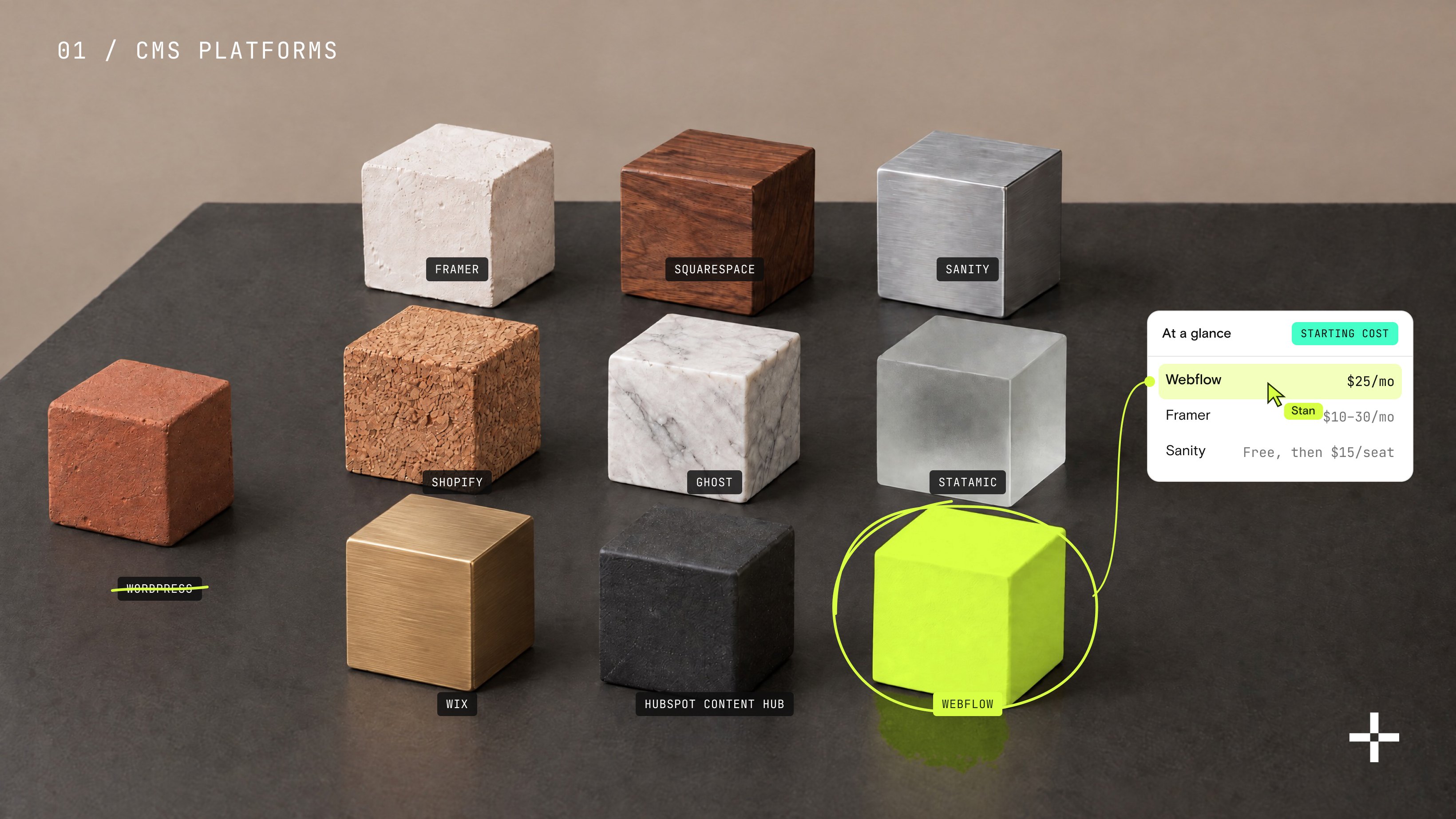
For the marketing site, Webflow has become the default for funded fintechs: fast, secure hosting, clean code that performs well in search, and a CMS the marketing team can run without engineers. The product itself is a separate build. This split, marketing site on Webflow and product in custom code, is the pattern most of our fintech clients run.
Should a fintech website show the actual product?
Yes, almost always. Real interface views, structured "how it works" journeys, and focused screenshots build trust faster than marketing claims, because visitors evaluating a financial product want evidence, not adjectives. The design work is choosing which views to show and sequencing them so a first-time visitor understands the product's value in seconds.

Stan Kirilov
Stan has led design for over 20 years, first as a hands-on designer, now as Experience Director at StanVision. He works with SaaS and fintech companies, from first-time founders to global brands, on products and websites built to convert, not just to look good.
He serves on the Awwwards jury and still reviews every project that ships. His standard is simple: if a design doesn't perform, it isn't finished.

.svg)