Brand design
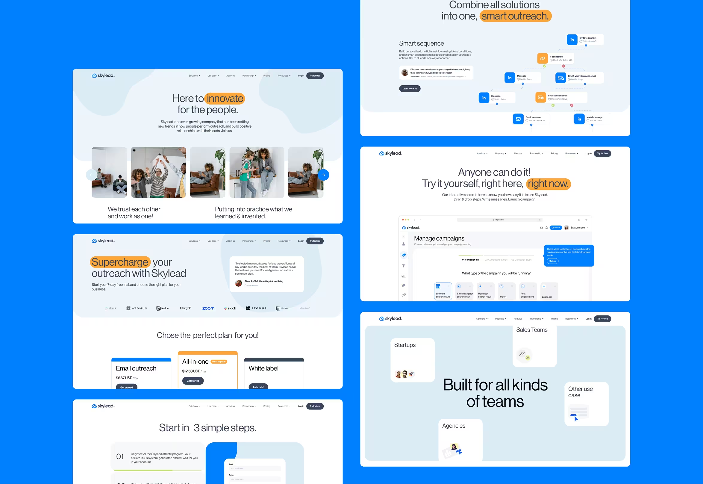
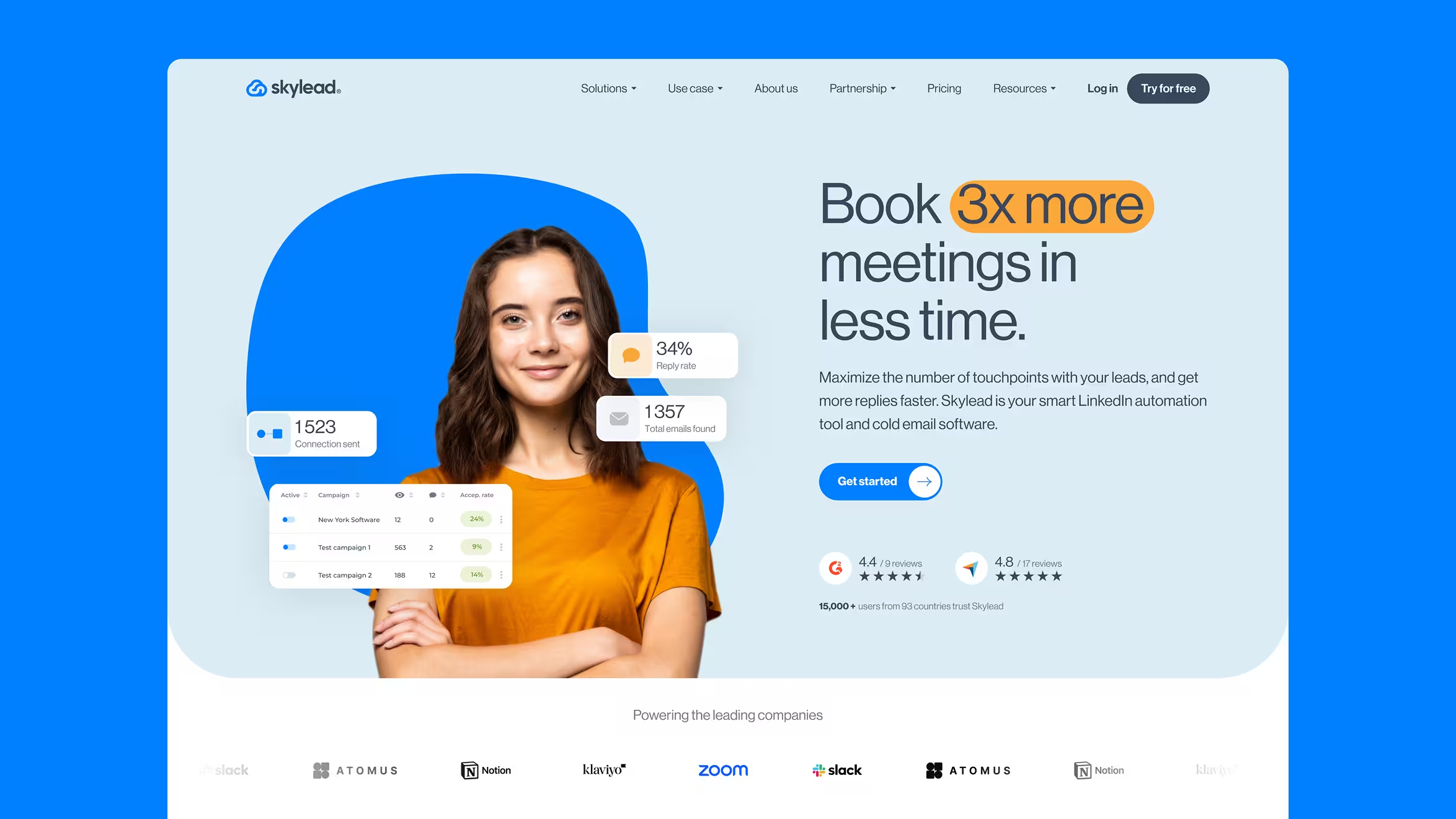
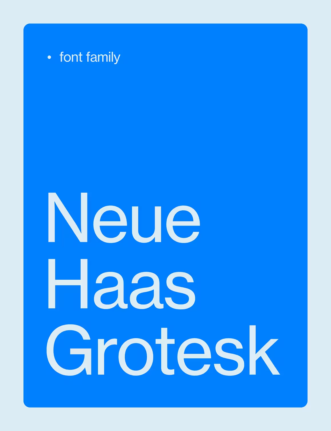
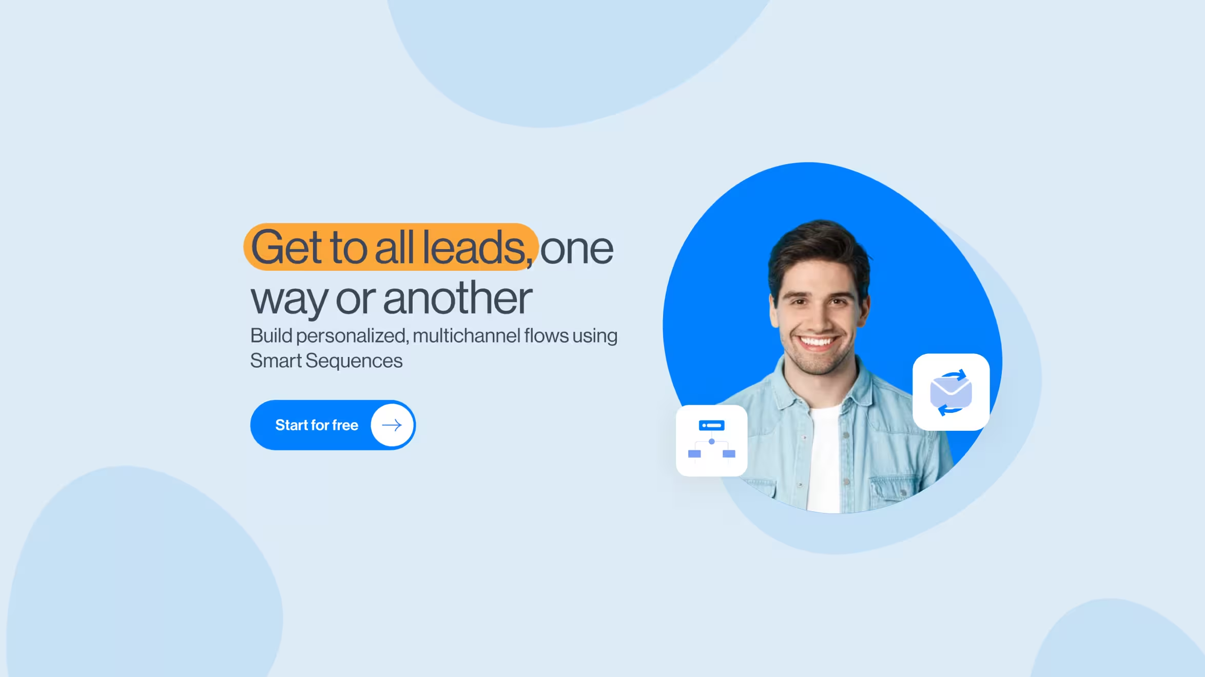
We crafted a light, human-focused brand identity that reflects connection at scale—using soft colors, rounded forms, and real imagery to match Skylead’s outreach ethos.


3.1x
increase in website traffic
2x
boost in user sign-ups
100%
redesigned brand and website experience
Skylead had the tech, traction, and results—but their old website didn’t reflect it. The structure was clunky, the visuals lacked clarity, and it didn’t feel human enough for a product rooted in personal connection. They needed a brand refresh, a scalable design system, and a website that could support long-term growth and better conversion.
We started by diving into user personas—mapping the journey of outbound marketers, SDRs, and founders using the product. Then we crafted a modular design system inspired by the brand name itself: light gradients, soft shapes, and a sense of openness. Finally, we rebuilt the site structure to prioritize storytelling, conversion, and performance—wrapping it all with thoughtful interactions and motion.
We crafted a light, human-focused brand identity that reflects connection at scale—using soft colors, rounded forms, and real imagery to match Skylead’s outreach ethos.
We crafted a light, human-focused brand identity that reflects connection at scale—using soft colors, rounded forms, and real imagery to match Skylead’s outreach ethos.
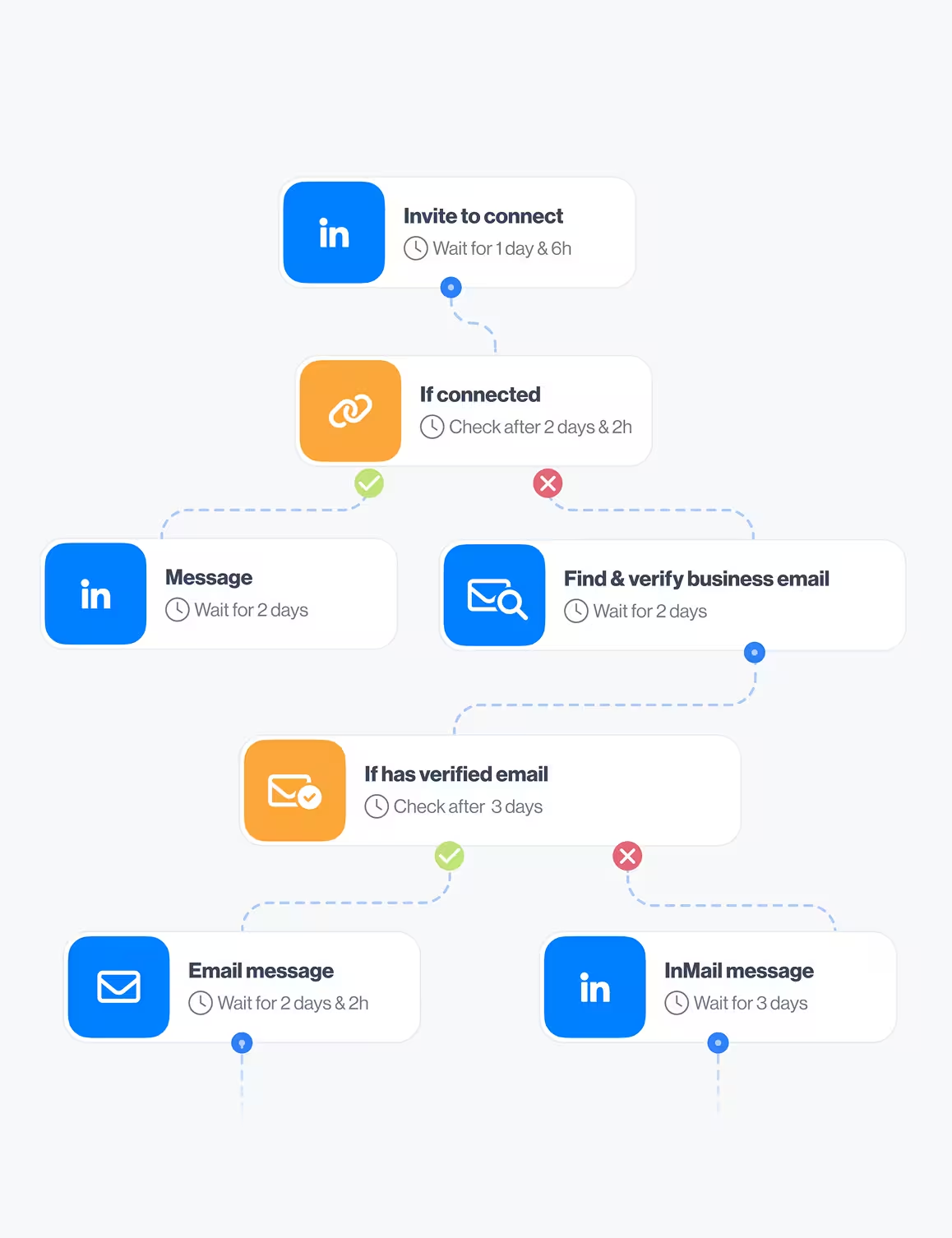
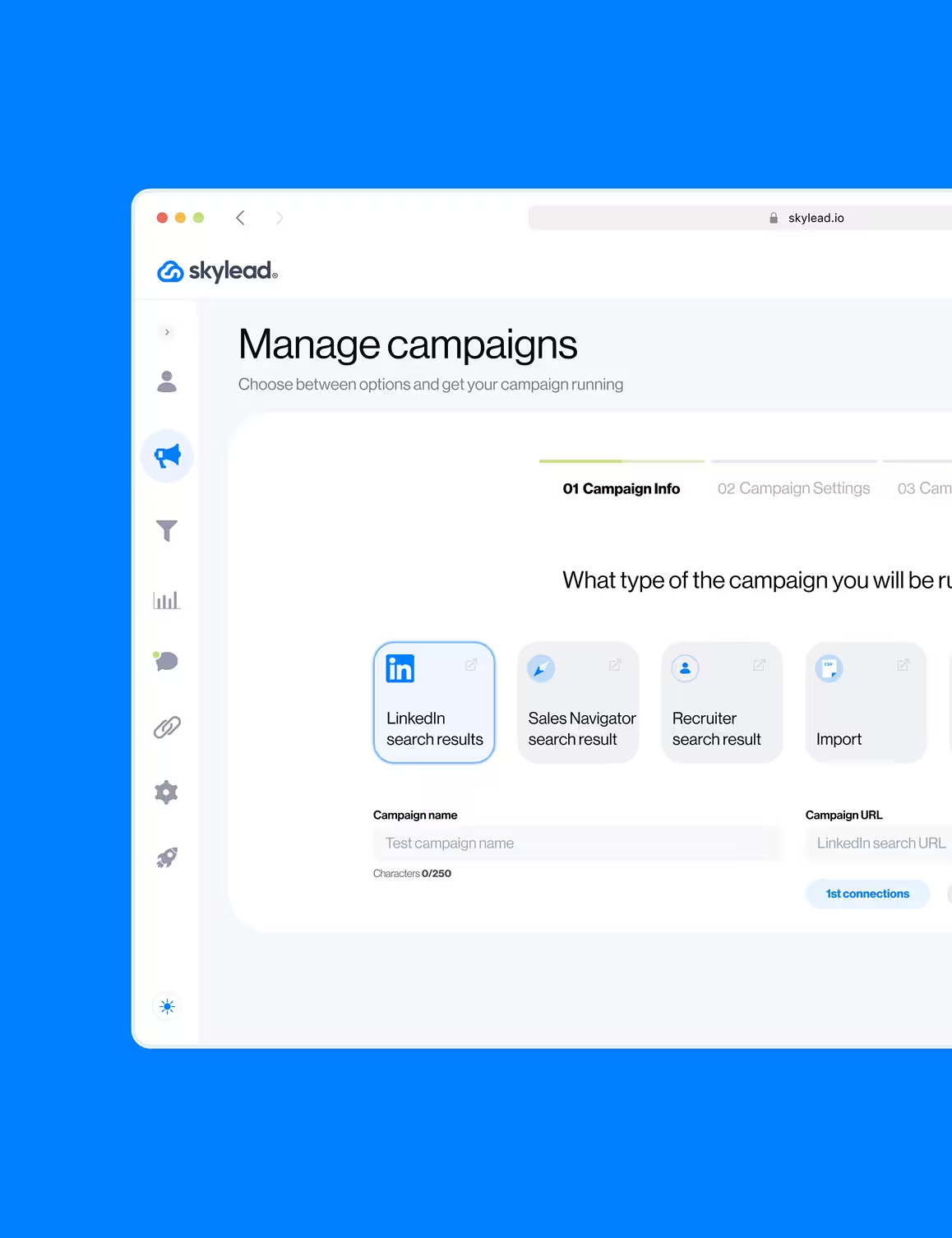
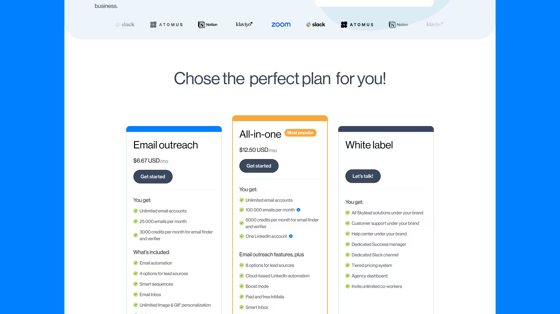
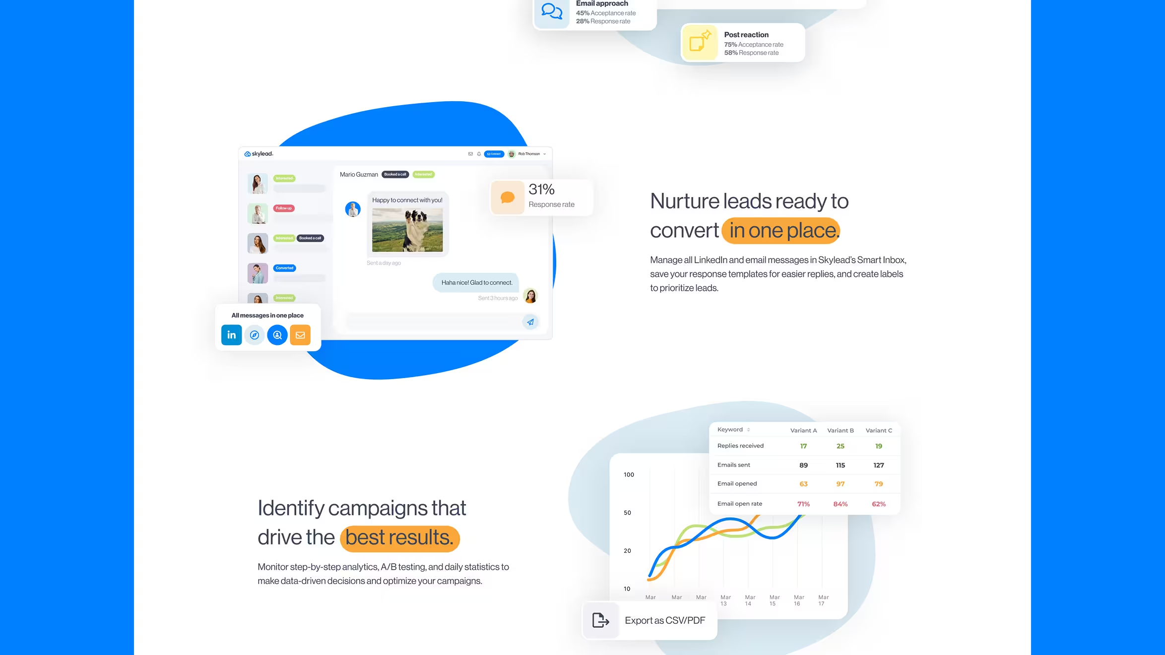
A modular, conversion-optimized website built to support scale—complete with restructured pages, storytelling-driven UX, and smooth GSAP interactions for a premium feel.