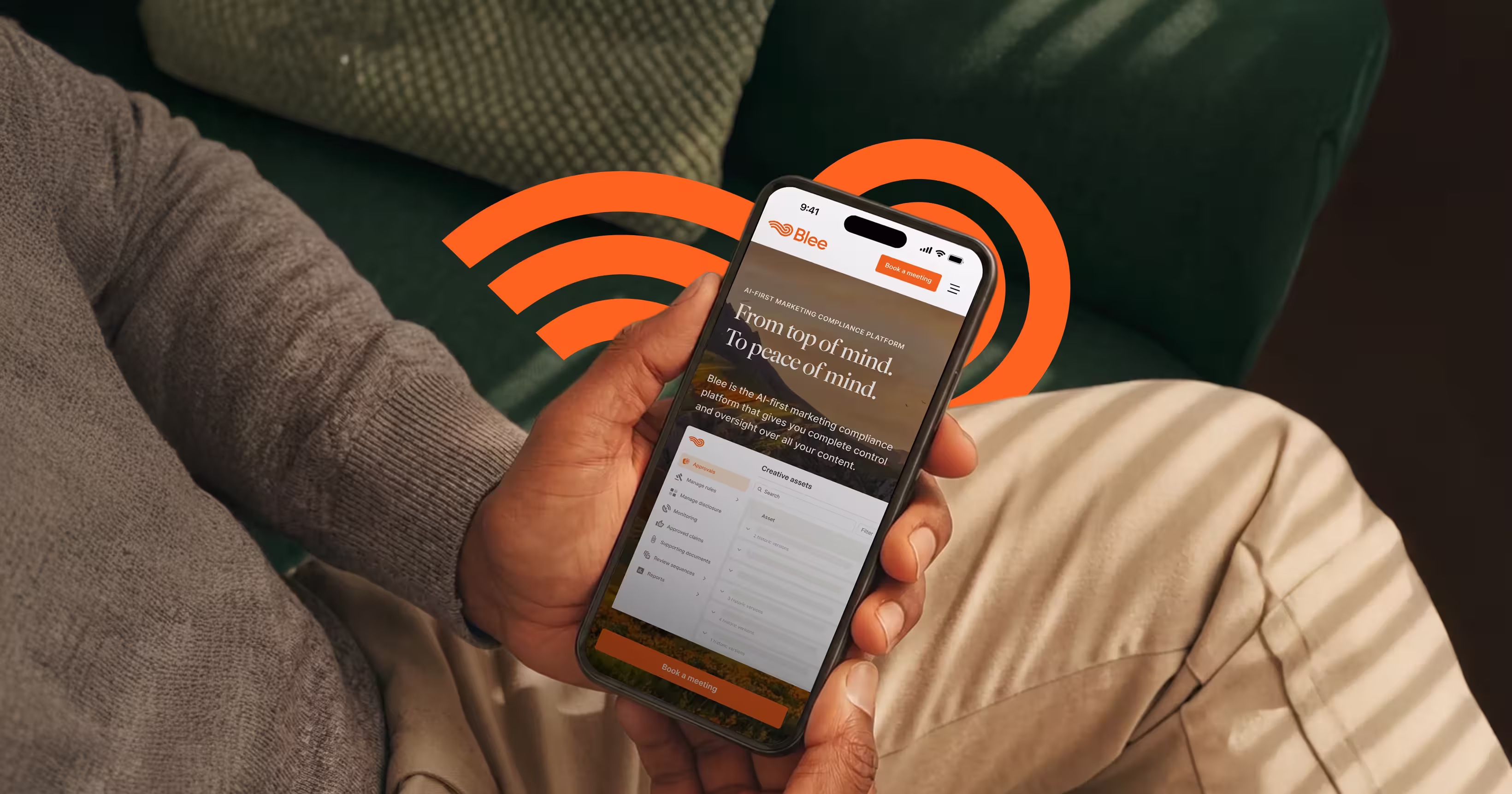
Case study - 
Blee

Designing a calmer future for AI-first marketing compliance

What we did
Branding
Website design
Webflow
Industry
SaaS
AI & ML
Ad/Martech
Headquarters
New York, US
Growth stage
Early-stage

Results

  • 37%Increase in engagement across product pages
  • 60%Increase in qualified demo requests after launch
  • 5xFaster landing page creation using reusable components

Initial brief

  • Challenge
    Blee had a strong product, serious customers, and growing momentum — but the brand didn’t reflect any of it. The website felt too young for the enterprise market they were entering, and the messaging sounded too close to every other compliance platform in the space.

    The bigger issue was emotional. Most competitors were building cold, technical experiences around compliance. But the people using these tools were already overwhelmed. Blee wanted to feel different. Calmer. More human. More like a quiet system that brings order to chaos instead of adding to it.
  • Approach
    We approached the project as both a redesign and a repositioning exercise.

    After reviewing product demos, workshops, customer insights, and competitor research, one thing became clear: every compliance platform looked and sounded the same. Dark interfaces. Technical messaging. Constant urgency.

    Blee wanted the opposite.

    So we built the visual direction around calmness, space, and emotional relief. A lot of the inspiration came from nature — soft light, open landscapes, gentle movement, and warmer textures. The goal was to make the experience feel less like enterprise software and more like stepping into a quieter, more controlled environment.

Brand design

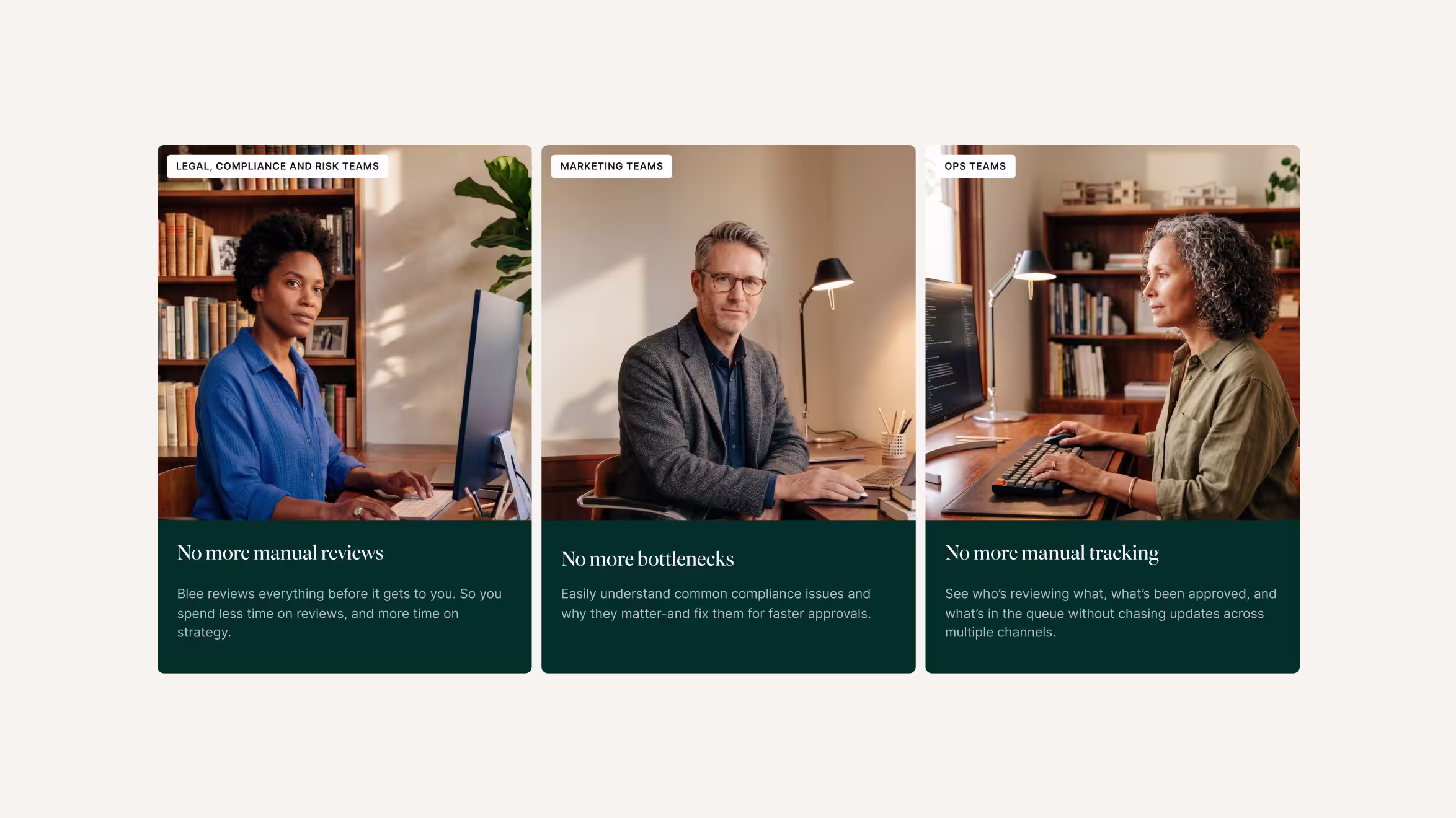
The brand direction was built around a feeling that almost never exists in compliance software: calm.

Instead of following the category with dark dashboards and aggressive SaaS visuals, we created a softer identity inspired by nature, light, and stillness. Warm landscapes, organic motion, and spacious layouts became a core part of the experience — making Blee feel grounded, reassuring, and quietly confident.

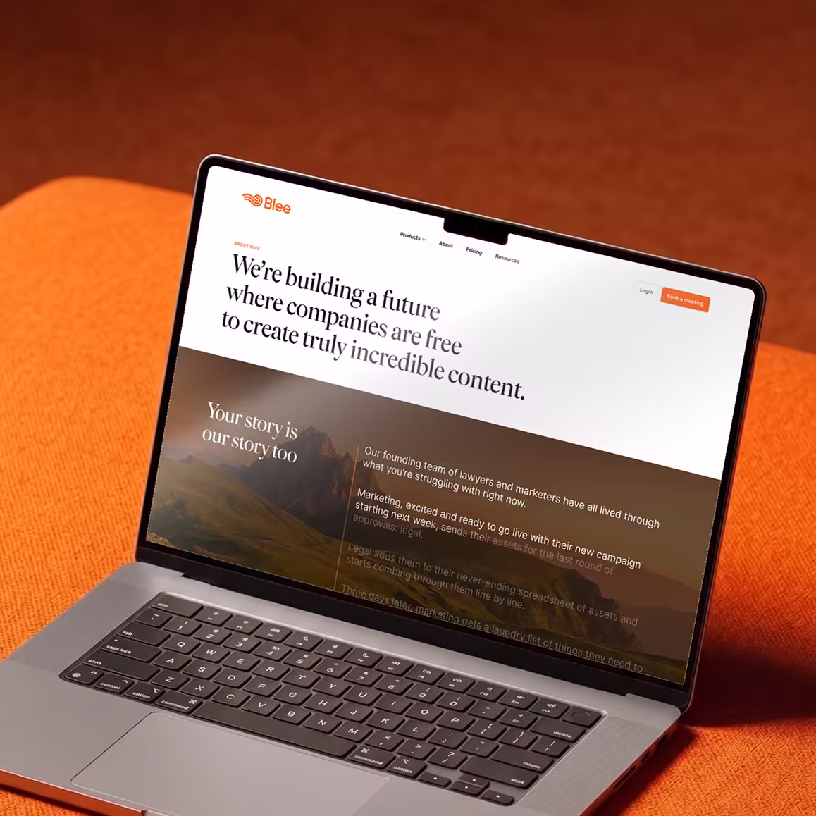
Orange became the emotional anchor of the brand. Not loud or overly corporate, but warm, energetic, and memorable inside a softer visual system. Combined with elegant typography and cinematic imagery, the identity helped Blee stand apart in a category where most competitors still look interchangeable.

Website design & Webflow development

The website was designed to feel lighter, calmer, and more intentional than the typical enterprise SaaS experience.

Instead of relying on heavy motion and flashy interactions, we kept the interface clean and restrained — using animation only where it helped explain the product or guide attention. Most of the storytelling came through cinematic visuals, spacious layouts, and carefully paced content that made the platform easier to understand without overwhelming the user.

The entire site was built in Webflow using a flexible system of reusable components and CMS-driven sections. This allowed the Blee team to quickly create new landing pages, update content, and launch campaigns in minutes — without needing a designer or developer involved every time.

Results

  • 37%Increase in engagement across product pages
  • 60%Increase in qualified demo requests after launch
  • 5xFaster landing page creation using reusable components